
17 Canva Font Combinations For Presentation Slides
This guide brings you a power pack of Canva font combinations for presentation slides, and great inspo for your projects, proposals, and lessons.

Canva Fonts That Go Well Together In A Presentation
In my decades of experience in business presentation and graphic design, the fonts used in presentation slides must be clear and readable. The different fonts used have to be paired to keep the audience engaged at all times.
Here are Canva fonts that look good together in presentations:
1. Aileron With Canva Sans

Aileron is a sleek and modern sans-serif font that exudes professionalism and clarity, making it ideal for the body text in your presentation.
Its clean lines ensure excellent readability. Pairing it with Canva Sans, which is known for its friendly and approachable character, creates a perfect balance.
Canva Sans works wonderfully for headings or call-outs, adding a touch of warmth and approachability to the overall design.
2. Barlow Condense With Karumbi And Heebo

Barlow Condense is a condensed sans-serif font that offers a contemporary and space-efficient choice for headings.
Its modern and sleek look is perfect for creating impactful titles. Karumbi, assumed to be a more decorative or handwritten font, adds a personal and artistic touch, great for accentuating special phrases or elements.
Heebo, known for its cleanliness and readability, complements Barlow Condense by ensuring the body text is easy to read, maintaining a modern and cohesive look throughout the presentation.
3. Belleza With Moontime And IBM Plex Sans Hebrew Te Bold

Belleza, with its elegant serif style, brings a refined and sophisticated touch to your presentation, suitable for titles or key points.
The addition of Moontime, likely a more decorative or script font, introduces a creative flair, ideal for highlighting quotes or special sections.
Related: Moontime Font Pairing Ideas: 9 Free Canva Templates
Complementing these with IBM Plex Sans Hebrew Te Bold, a bold and highly legible sans-serif font, ensures that your subheadings or critical details are clear and impactful. This combination balances elegance, creativity, and clarity.
4. Fraunces Thin With Open Sans Light

Fraunces Thin is a refined serif font that brings an air of classic elegance and sophistication.
Its delicate and fine structure makes it an excellent choice for titles and key phrases, adding a touch of luxury and exclusivity to your presentation.
When paired with Open Sans Light, a highly legible and neutral sans-serif font, it ensures that your body text is clear and easy to read.
Open Sans Light complements Fraunces Thin by providing a clean, simple backdrop, allowing your headings to stand out with their distinctive character.
5. Heading Now 71-78 With The Youngest

Heading Now 71-78 is likely a bold and contemporary font, perfect for creating strong, attention-grabbing headlines that make a statement.
It exudes confidence and modernity, ideal for key messages or section titles. The Youngest, presumably a more playful or unconventional font, adds a unique and creative twist.
It’s great for adding personality to specific sections, callouts, or quotes. This pairing combines strength with whimsy, creating a dynamic and engaging visual experience in your presentation.
6. League Gothic With Montserrat Light

League Gothic is a powerful, attention-grabbing condensed sans-serif font known for its impactful and slightly vintage appeal.
It works wonderfully for headlines or statements that need to stand out. Montserrat Light, on the other hand, is a clean, minimalist sans-serif font.
Its light weight balances the boldness of League Gothic, ensuring that your body text is not only readable but also aesthetically pleasing.
The combination of these two fonts brings together a blend of classic strength and modern simplicity, ideal for presentations aiming for a sleek and professional look.
7. League Spartan With Ubuntu

League Spartan is a bold and modern sans-serif font with a strong presence, making it perfect for headlines or key statements in your presentation.
Its geometric structure offers a contemporary and assertive look. Paired with Ubuntu, which is known for its clarity and readability, you create a harmonious balance.
Ubuntu, also a sans-serif but with a more humanist design, is ideal for body text, ensuring that your content is approachable and easy to digest.
This combination brings together strength and readability, suitable for presentations that aim to be both impactful and user-friendly.
8. Libre Baskerville With Muli

Libre Baskerville is a classic serif font that carries an air of tradition and credibility. Its elegant and timeless design is well-suited for titles or important text, adding a sense of sophistication.
When coupled with Muli, a minimalist sans-serif font, you achieve a stylish contrast. Muli’s clean and neutral appearance complements the formality of Libre Baskerville, making it great for body text or subtitles.
This pairing merges the charm of old-world typography with modern simplicity, ideal for presentations that require a blend of classic elegance and contemporary minimalism.
Related: Exploring Modern Typography: Trends And Applications
9. Marcellus With TT Norms

Marcellus is a serif font that offers a blend of classical elegance and modern sharpness.
Its distinct style, reminiscent of ancient Roman inscriptions, is perfect for headings or standout quotes that require a touch of historical gravitas.
Pairing it with TT Norms, a straightforward and highly legible sans-serif font, ensures a well-balanced layout.
TT Norms works excellently for body text, providing a clean and unobtrusive backdrop that allows Marcellus’ character to shine.
This combination is particularly effective for presentations that aim to present information with a hint of classical flair while maintaining modern clarity and functionality.
10. Megrim With Raleway

Megrim is a unique and stylized font that carries an artistic and contemporary flair. It’s ideal for titles or key elements in your presentation that demand a creative and eye-catching appearance.
When you pair Megrim with Raleway, a sleek and elegant sans-serif font, you create a balance of creativity and sophistication.
Raleway, known for its clean lines and excellent readability, is perfect for body text, ensuring that your content remains approachable and easy to read, while Megrim adds a distinctive touch to your presentation’s visual appeal.
11. Montserrat Classic With Lora

Montserrat Classic is a modern and versatile sans-serif font, known for its geometric shapes and contemporary feel. It’s great for headings or titles, giving your presentation a clean and professional look.
Complementing it with Lora, a well-balanced serif font with a touch of elegance, brings a contrast that enhances readability and aesthetic appeal.
Lora, with its smooth and flowing text, is ideal for body content, providing a comfortable reading experience.
This pairing merges modern minimalism with classic elegance, suitable for presentations aiming to be both stylish and functional.
12. Open Sauce With Sedgwick Ave

Open Sauce is a bold and dynamic sans-serif font, making it perfect for impactful headlines or key statements.
Its strong presence ensures that your main points stand out effectively. Pairing Open Sauce with Sedgwick Ave, which likely has a more informal or handwritten style, adds a personal and relaxed touch to your presentation.
Sedgwick Ave can be used for quotes, captions, or any element where a casual, friendly vibe is desired.
This combination brings together the robustness of Open Sauce with the playful charm of Sedgwick Ave, creating a presentation that is both commanding and approachable.
13. Roca One With Montserrat

Roca One is a distinctive and bold display font with a modern twist. Its assertive and slightly playful character is perfect for grabbing attention in titles or key points in your presentation.
Pairing it with Montserrat, a geometric and versatile sans-serif font, creates a harmonious balance.
Montserrat’s clean and uniform appearance is excellent for body text, offering readability and a contemporary feel. This combination is great for presentations aiming for a modern, energetic vibe while ensuring content clarity.
14. RoxboroughCF With Telegraf

RoxboroughCF is a serif font with a personal and artistic touch, evoking a sense of elegance and sophistication.
Its fine details and smooth curves are ideal for headings or important quotes that need to stand out with a classic flair.
Complementing this with Telegraf, a no-nonsense, functional sans-serif font, ensures a well-balanced and aesthetically pleasing design.
Telegraf, perfect for body text, provides a clear and straightforward reading experience that contrasts nicely with the decorative nature of RoxboroughCF. This pairing suits presentations that blend artistic elegance with modern simplicity.
15. Slopes With Six Hands Marker

Slopes is a font with a dynamic and forward-leaning design, suggesting movement and energy.
This makes it suitable for titles or sections where you want to convey action or progress.
Pairing Slopes with Six Hands Marker, which likely has a more informal, handwritten style, adds a personal, approachable element to the presentation.
Six Hands Marker is great for accentuating specific points, adding notes, or giving a casual, friendly feel to certain parts of your content.
This combination creates a lively and engaging visual experience, perfect for presentations that aim to be dynamic and personable.
16. Tenor Sans With Open Sans

Tenor Sans is a clean and modern sans-serif font that exudes elegance and simplicity. It’s ideal for headings and titles, offering a crisp and professional appearance.
When paired with Open Sans, a highly legible and versatile sans-serif font, you create a seamless and coherent visual flow.
Open Sans is perfect for body text due to its readability and unobtrusive design, ensuring that your content is both accessible and aesthetically pleasing.
This combination is excellent for presentations aiming for a sleek, contemporary, and clean design, maintaining a professional and approachable feel throughout.
17. WC Mano Negra Bold With Now

WC Mano Negra Bold is a distinctive and expressive font, likely with a hand-drawn or artistic style.
It’s great for making a strong visual statement in titles or key phrases, adding a unique and creative flair to your presentation.
Pairing it with Now, a straightforward and modern sans-serif font, balances the boldness of WC Mano Negra Bold.
Now, used for body text, provides a clear and no-nonsense counterpoint, ensuring that your content remains easy to read and digest.
This pairing is suitable for presentations that aim to blend artistic uniqueness with modern clarity, creating a dynamic and engaging viewer experience.

Marilyn Wo is a graphic design expert. She has spent over two decades creating branding and graphic design work for clients in United States and all over the world, including X (formerly Twitter) and Samsung.
She runs MeetAnders, a graphic design company where she trains and works with a team of reliable designers. Her team can also churn out unlimited Pins to grow your Pinterest accounts. Find out more here . Follow her on LinkedIn .
Similar Posts

17 Cute Canva Font Combinations With Free Templates

Brittany Font Pairing For Branding: 7 Free Canva Templates

10 Happy Fonts In Canva For Any Design Project

Best Sports Fonts In Canva: 17 Free Fonts To Score Big

Moontime Font Pairing Ideas: 9 Free Canva Templates

27 Canva Fonts With Long Tails
Leave a reply cancel reply.
Your email address will not be published. Required fields are marked *
Save my name, email, and website in this browser for the next time I comment.
Review Cart
No products in the cart.
- See All Buying Guides »
- Best Art Supplies
- Best Computers
- Best Courses
- Best Headphones
- Best iPhones
- Best Keyboards
- Best Laptops
- Best Monitors
- Best Office Hardware
- Best Photography Gear
- Best Printers
- Best Scanners
- Best Smartphones
- Best Smartwatches
- Best Software
- Best Speakers
- Best Tablets
- Best Video Gear
- Work From Home Tools
- Top Gear for Designers
- Buying Guides
- Illustrator
- Logo Design
- Popular Articles
- Top Tools & Resources
- What is branding?
- How much for a logo?
- Free Branding Briefcase
- Our Services
- Brand Strategy
- Cricut & Craft
- Deals & Freebies
- Digital Art
- Guest Articles
- Graphic Design
- NFTs & Web3
- Photography
- Tools & Gear
- Videography
- Web Design & UX
- After Effects
- Premiere Pro
- All Adobe »
- Adobe Discounts
- Google’s Apps
- State of Brand Report
- Envato Elements: Unlimited Stock Offer
- JUST Sans Font
- Logo Package Express
30+ Best Canva Fonts for Creative Designs in 2024
- Adobe Deals

We independently research, test, review, and recommend the best products—learn more about our process . If you buy something through our links, we may earn a commission.
Are you whipping up a big project on Canva ? No wonder you’re looking for the best Canva fonts!
Canva, the Australian graphic design platform, has united professionals and creative enthusiasts alike. Thanks to the ever-growing web app, thousands more can produce riveting content tailored for hundreds of different audiences.
sponsored message

It doesn’t even matter what your design background is, Canva empowers virtually everyone to create gorgeous designs in no time, especially with their beautiful array of Canva templates .
That said, the platform’s users have over a hundred font options. But how do you know which one best suits your designs?
Because most of the platform’s users turn to it for art cards and marketing materials, a safe bet you can count on would be display fonts. As the name suggests, display fonts are designed to capture one’s attention immediately.
As such, display fonts are generally flashy, exaggerated, or thick-structured. Contrary to, say, the best book fonts , display fonts are a lot wackier, more diverse, and more out-of-the-box.
Ultimately, the best Canva fonts should allow you to easily relay whatever message you want.
Can’t find what you’re looking for?
- Try Adobe Express – A great Canva alternative with thousands of Adobe Fonts built it. It’s free to use forever with no credit card required.
Adobe Express is an all-in-one design, photo, and video tool to make content creation easy . Quickly and easily make stunning social content, videos, logos and more with thousands of beautiful templates and more. All for free!
- Powerful & easy to use
- No credit card required
- Professional designers may find it too basic
Below, let’s review the most popular typography selections available on Canva today. Also, see our feature on Canva fonts that go well together for stunning Canva font combinations.
Best Canva Fonts Overview
- Merriweather
- Cy Grotesk Grand
- Playfair Display
- Tan Astoria
- The Seasons Light
- Migra ExtraBold
- Tan Meringue
Fonts you can Import into Canva
Fonts are not limited to just Canva’s default fonts, you can import any font into Canva . Here are some top ones to choose from.
Rallisa Display Font
Roclette pro display typeface, kleader – display font, janger – display font, bioned – modern display fonts, zighead display font, milne – a bold sans serif, vellyc – fun sans serif font, wave path – display sans serif, karolina – sans serif font.
For the complete list, scroll on!
UNLIMITED DOWNLOADS: 50 Million+ Fonts & Design Assets

Download all the Canva Fonts you need and many other design elements, available for a monthly subscription by subscribing to Envato Elements . The subscription costs $16.50 per month and gives you unlimited access to a massive and growing library of over 50 million items that can be downloaded as often as you need (stock effect & element packs too)!
START DOWNLOADING
10+ Popular & Trendy Canva Fonts in 2024
1. merriweather.

Merriweather currently holds a prominent position as one of the top fonts on Canva . This professionally crafted serif font is incredibly versatile, making it an excellent choice for a wide range of design projects and creative purposes.
Whether you need to create formal content or want to infuse a playful and artistic touch into your designs, Canva’s Merriweather is a reliable and winning choice.
Moreover, we can say that this is a semi-condensed typeface with medium contrast, carefully designed to maintain readability even at very small sizes.
It successfully combines a traditional and timeless aesthetic with modern shapes tailored for screen use, striking a harmonious balance between the past and present in its design.
2. Montserrat

Montserrat reigns as Canva’s premier choice for formal sans-serif typography . With its clean, precise lines and tastefully curved elements where it counts, this professional font is tailor-made for formal designs and corporate aesthetics.
When choosing a typeface, having access to various versions such as bold, alternative, italic, or underlined versions is undeniably advantageous. These variations offer creative possibilities, especially when using the font for headlines.
You can experiment with different thicknesses and inclinations to achieve the desired visual impact, allowing for greater flexibility and artistic expression in your design work.

Arvo , another serif gem available on Canva, may lean towards a more conservative aesthetic with its refined stems and curves. Still, it is an exceptional choice for a wide range of design needs.
Whether you’re crafting presentations, pitches, or eye-catching headlines , Arvo doesn’t disappoint.
Arvo is a geometric slab-serif typeface family meticulously crafted for both screen and print applications. The family encompasses four distinct cuts: Roman, Italic, Roman, and Bold Italic.
What makes Arvo truly intriguing is its unique flavor—a blend of influences that evoke the nostalgia of typewriter documents and the vintage charm of old British newspapers. However, it carries a more rounded and casual touch in its symbols and numbers.
4. Cy Grotesk Grand

If you’re looking for a sans-serif, then Cy Grotesk Grand is a promising contender. Slender, chic, and expanded, this font find is easy to appreciate and enjoy.
Use it for magazine headline designs, social media graphic designs , art cards, and web fonts! The choice is yours.
We can attest that Cy Grotesk is a captivating display typeface, characterized by its eccentric personality and distinctive rhythm. Its symbols feature sharp, elongated, angled spurs. This unique design is further complemented by smooth curves and a tight aperture, creating a striking visual impact.
In addition, the Cy Grotesk Family version offers a wide range of styles, spanning from pure thin to radically bold, accommodating various design needs.
It seamlessly transitions from a spacious, understated look to a bold and attention-grabbing presence. Each style includes an extensive set of Latin characters and basic Cyrillic characters, ensuring versatility and compatibility for a diverse range of projects.
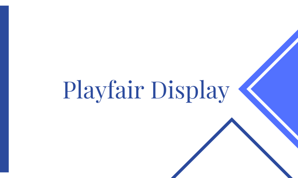
5. Playfair Display

Playfair Display is indeed an elegant serif font, distinguished by its rounded corners and slender characters. Its exceptional legibility and aesthetic appeal make it a splendid choice for marketing and social media advertising projects.
For those seeking superb Canva font pairings, consider the delightful combination of Playfair with Montserrat.
Furthermore, Playfair Display proves to be an excellent choice for website design. Its modern elegance, combined with a subtle feminine touch, makes it an ideal option for websites catering to a female demographic.
This font also shines in wedding and invitation designs, adding a touch of sophistication and charm to such special occasions.
6. Tan Astoria

What makes Tan Astoria such an easy favorite is its distinctness. Featuring uneven lines and sharp corners, this wavy-looking font is instantly an eye-snatcher. While it isn’t everyone’s go-to font, this pick is sure to thrive.

Download all the Fonts you need and many other design elements, available for a monthly subscription by subscribing to Envato Elements .
Get unlimited access to a massive and growing library of 14 Million+ items.
7. Quicksand

Quicksand is a curved sans-serif font that packs just the right balance of formal and playful. Featuring rounded edges, this font find is soft and light, allowing you to create easy-going marketing materials and headlines in a breeze.
8. The Seasons Light

The Seasons Light is one of the most versatile Canva fonts online today, thanks to its elegant-looking aesthetic. Displaying sharp corners and balanced weight, this font is suitable for fashion projects, lifestyle headlines, marketing initiatives, and a whole lot more!
9. Migra ExtraBold

Another distinct-looking font on the list is Migra ExtraBold . Combining sharp, bold, and triangular pieces, this pick is loud, strong, and easily demands attention. Great for web fonts, shopping mall posters, e-commerce updates, and more, there are plenty of things you can complete with this one.
10. Tan Meringue

If sophisticated and out-of-the-box is what you’re after, then you’re going to enjoy Canva’s Tan Meringue . A playful mesh of thick and slender, this font is fun, fresh, and easygoing.

Thanks to Rallisa Display Font‘s extended and thick stems, this Envato find will do well in Canva prints because of how eye-catching it is. Use it for menus, signage, headlines, and posters! The choice is yours.

The elegant Roclette Pro Display font belongs to the Roclette family. With controlled letterforms and contemporary touches, it has a style that is dependable and uncompromising. It looks great in movies, logos, magazines, and virtually anything you can think of!

The authentic typefaces on old posters served as inspiration for the Kleader – Display Font . Serif and sans-serif fonts are included in these font collections. Regular, rough, and stamp are the three styles of typeface included in each pack. What’s not to like?

This is Janger a fun, bold display font. It sports a reverse contrast style with a retro and psychedelic look that is just right for designing things like posters, t-shirts, branding, and logos, among other things.

Not all modern display fonts like Bioned have beautiful ligatures, smooth curves, and a refined appearance that easily make your work stand out. That said, this pick is a font that looks good in both small and large sizes and is very adaptable. Great for a lot of different projects, like invitations, logos, branding, magazines, cards, and product packaging, the sky is the limit with this font.

Zighead has sharp points and smooth curves, making it interesting and playful at the same time. Also featuring a wavy aesthetic, this wobbly-looking pack merits a second glance every time. It also easily gives you the zing you’re looking for!

Arguably one of the more formal-looking fonts on the list is Milne . Bold, heavy-structured, and featuring sharp edges, this font pack is best used for headlines and signage. On that note, this would make such a fantastic pick for Canva because of how easy it is to create art cards with this find.

Vellyc is another font option that’s great for headlines. Because of its thick and bouncy aesthetic, it’ll make for great attention-grabbers when you’re designing posts about announcements.

Inspired by summer waves and the vibrance of the ocean, Wave Path is a display sans serif that’ll also make for a superb addition to any Canva design. It’s fun to look at, easy to read, and packed with a lot of personalities.

There are plenty of things to like about Karolina , the first one being how clean and sophisticated it looks. It also sports a penmanship-like aesthetic, giving your Canva designs an intimate feel in no time.
Geora Sans Serif Font

Geora is a boxy geometric font that’s sure to send any message across. Clean, crisp, and perfectly designed, this font pack should be a stellar visual solution to whatever Canva project you have.
Quetry Serif Display

Quetry is a modern serif font with alternatives and ligatures that’s sure to look fantastic on logos, quotes, blog posts, and more.
Projects for branding, images for magazines, wedding invitations, and a lot more. Incorporate this font find in your Canva project to spice up your designs!
Stacion – Grotesk Type

Easily bring funk and attitude to your designs with Creative Market’s Stacion . Inspired by Brutalist bus stations in the Yugoslavian era, this pick is fun to look at, comes in 2 weights, and is suitable for a lot of designs, both online and off!
Redig – Condensed bold sans

This bold condensed display typeface is Redig . It has an assertive and athletic appearance. To avoid appearing overly aggressive, it has rounded corners and corners that have been chamfered. Additionally, this set has a generous x-height. too!
ARCADE Font

Arcade Font is a one-of-a-kind custom font with a vintage vibe. It’s ideal for any design project and comes in three different versions that can be combined: Arcade Regular, Arcade Italic, and Arcade Reverse-Italic.
Hamburg Hand – A Hand-Drawn Font

If your Canva designs require a handwritten or handwriting font, then consider Hamburg Hand to be a visual solution. Loaded with both uppercase and lowercase letters, this set is easy to read, light on the eyes and is a sure Canva companion.
Classico – Modern Serif Font

Fonts are either serif or sans serif, so consider Classico to be one-of-a-kind. A light, high-contrast font that works well for editorial design, fashion mastheads, and feminine logos, Classico supports multiple languages and comes in a bold and regular version.
Sophillia – Ligature Serif Font

The ligature font Sophillia is truly one of a kind. It’s a stylish serif with a lot of contrast, too! A contemporary take on the Caslon style, this pick is ideal for wedding invitations with big, bold headings.
Diaspora Modern Sans Serif Font

Diaspora is a fancy modern sans-serif font. Designed to give the impression of elegance and luxury, it packs uppercase & lowercase characters. If you’re looking for a font find that merges thick and slender lines, give this bet a try.
Neohead Condensed Sans Serif Font

The condensed font Neohead is contemporary and minimalist, with a neutral design and subtle decorative elements. It’s a sans-serif font with perfectly spaced, functional characters that can be read in small or large sizes. If the Canva project you’re brewing up warrants a formal look, you won’t go wrong with this one.
Frequently Asked Questions
1. are these canva fonts free, or do i have to pay for them.
Most of the fonts available on Canva are offered for free, allowing users to access a wide range of typographic styles to enhance their designs without incurring additional costs. However, it's worth noting that Canva also offers a selection of premium fonts that may require payment.
2. How do I install these Canva fonts on my computer?
You don't need to install these Canva fonts on your computer, as they are available within the Canva platform. However, you can download them from Canva's font library and install them on your computer if you wish to use them outside of Canva.
3. Can I upload my own fonts to Canva and use them in my designs?
Canva provides users with the flexibility to upload their own custom fonts and seamlessly integrate them into their design projects. This feature empowers designers to maintain brand consistency by incorporating proprietary fonts or exploring the power of typography that isn't included in Canva's standard font library.
Our Favorite Canva Fonts
Still undecided? Here are our top 12 favorite Canva fonts!
Related Canva Posts
- Best Canva Templates for Instagram
- Best Fonts for Signage to Attract Attention
Overall, the best Canva fonts are visual solutions that make it easy for you to remain spot-on with your messaging. Canva is one of the graphic design tools , produced to empower storytellers and everyday heroes alike.
Thankfully, the long list of available fonts on the platform, on top of the font packs we can find on Envato, for example, are all remarkable choices.
That said, we hope our roundup helps you narrow down what you’re looking for!

About Jacob Cass
Jacob Cass is a brand designer & strategist, educator , podcaster , business coach and the founder of JUST Creative, an award-winning branding & design consultancy that doubles as an industry-leading blog. Get in touch .
Meet our expert writers and contributors

15 Must-Have Professional Canva Fonts for Polished Presentations
Choosing the right fonts can significantly impact how your audience perceives your message. In this article, we’ll explore 15 must-have professional Canva fonts that can help you create polished presentations with ease. From classic and elegant to modern and sleek, these fonts have been carefully selected to cater to various design preferences. Whether you’re aiming for a sophisticated business presentation or a creative pitch, these fonts offer versatility and style to elevate your Canva projects.
What we cover
Why it is a must-have Professional font: Avenir is renowned for its clean, modern lines that exude professionalism. Its balanced proportions and geometric shapes make it ideal for corporate presentations where clarity and readability are crucial. Its versatility allows it to adapt well to various design styles, making it a must-have for polished presentations.
2. Bebas Neue
Why it is a must-have Professional font: Bebas Neue is a bold, impactful font that commands attention. Its strong, uppercase letters make it perfect for headlines and titles in presentations, adding a touch of modernity and emphasis to your slides. Its simplicity and readability make it a go-to choice for creating visually striking presentations.
3. Didot LP
Why it is a must-have Professional font: Didot LP is a classic serif font known for its elegance and sophistication. It adds a touch of luxury to presentations, making it suitable for industries such as fashion, beauty, and luxury brands. Its high contrast between thick and thin strokes creates a polished and refined look, making it a must-have for creating upscale presentations.

Why it is a must-have Professional font: Futura is a timeless sans-serif font with a clean, geometric design. Its simplicity and clarity make it a versatile choice for a wide range of presentations, from corporate to creative. Its modern aesthetic and easy readability ensure that your content is delivered with impact and professionalism.
5. Garamond
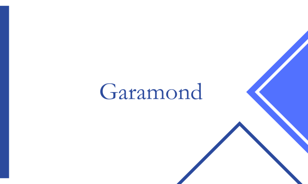
Why it is a must-have Professional font: Garamond is a classic serif font known for its elegance and readability. Its old-style serif design adds a touch of tradition and sophistication to presentations, making it suitable for academic, literary, and historical topics. Its balanced proportions and legibility make it a staple for creating polished and professional slides.
6. Helvetica
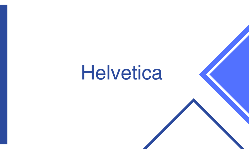
Why it is a must-have Professional font: Helvetica is a widely used sans-serif font renowned for its neutrality and versatility. Its clean, simple design and excellent readability make it suitable for a variety of presentation styles and themes. Whether you’re creating a corporate presentation or a minimalist design, Helvetica’s timeless appeal ensures a polished and professional look.

Why it is a must-have Professional font: Lato is a modern sans-serif font with a friendly and approachable feel. Its versatility and readability make it an excellent choice for a wide range of presentations, from business to casual. Its balanced proportions and clean lines ensure that your content is presented in a polished and professional manner.
8. Montserrat

Why it is a must-have Professional font: Montserrat is a contemporary sans-serif font with a geometric design. Its clean lines and modern aesthetic make it ideal for creating sleek and polished presentations. Its versatility allows it to be paired with various design elements, making it a must-have for professionals looking to create visually appealing slides.
9. Nunito Sans
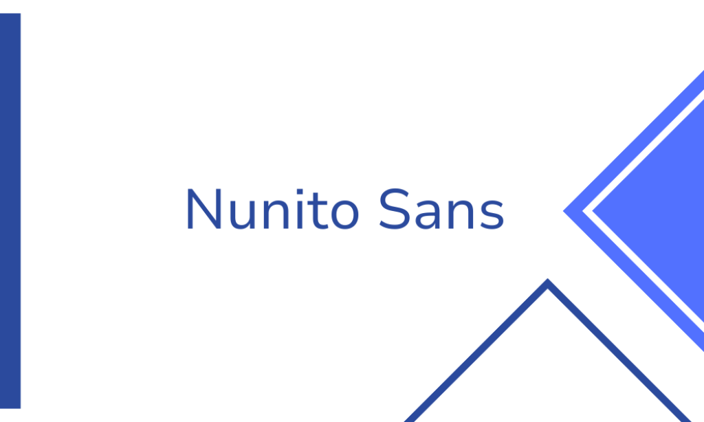
Why it is a must-have Professional font: Nunito Sans is a rounded sans-serif font known for its friendly and modern appearance. Its soft curves and excellent readability make it suitable for presentations that require a welcoming and approachable tone. Its versatility and clean design ensure that your content is presented professionally and polished.
10. Open Sans
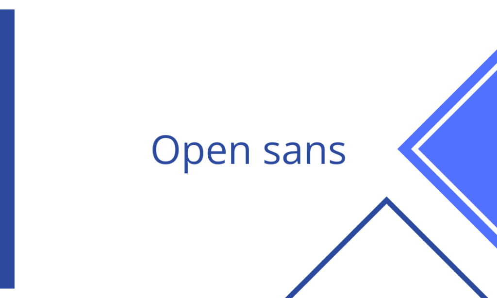
Why it is a must-have Professional font: Open Sans is a popular sans-serif font known for its neutrality and readability. Its clean lines and balanced proportions make it suitable for a wide range of presentation styles and themes. Its versatility and professional appearance ensure that your content is delivered with clarity and polish.
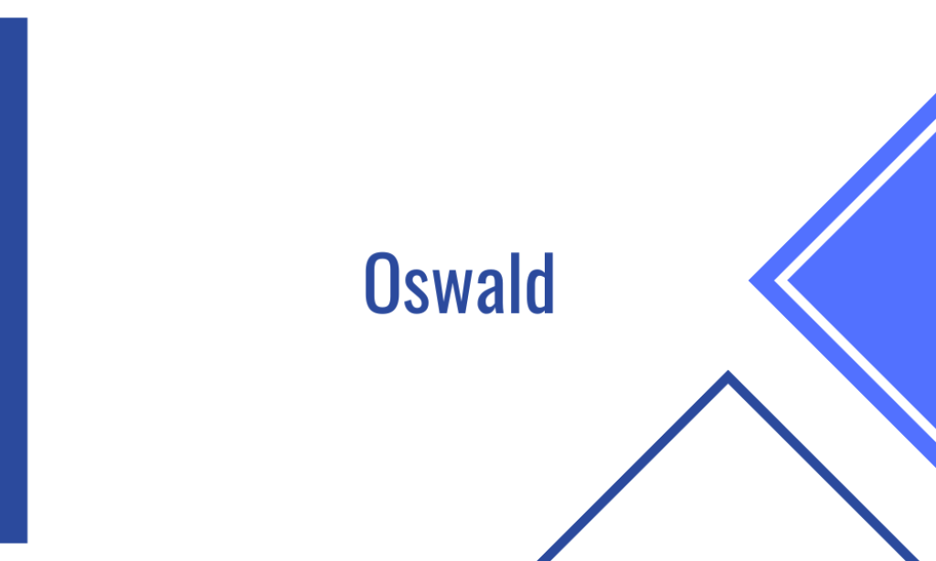
Why it is a must-have Professional font: Oswald is a bold sans-serif font with a strong and impactful presence. Its uppercase letters and condensed design make it perfect for headlines and titles in presentations, adding a touch of modernity and emphasis. Its versatility and readability make it a must-have for creating visually striking and polished slides.
12. Playfair Display
Why it is a must-have Professional font: Playfair Display is an elegant serif font known for its high contrast and classic look. Its sophisticated design makes it suitable for presentations that require a touch of luxury and refinement, such as fashion, beauty, and lifestyle topics. Its readability and timeless appeal ensure a polished and professional presentation.
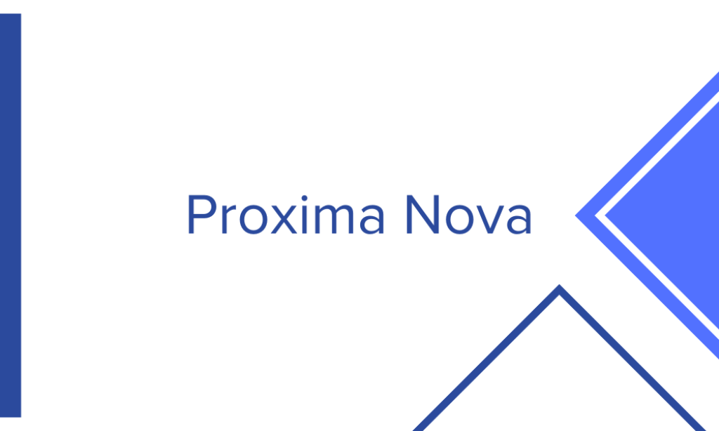
13. Proxima Nova
Why it is a must-have Professional font: Proxima Nova is a modern sans-serif font with a clean and versatile design. Its balanced proportions and excellent readability make it suitable for a wide range of presentation styles and themes. Its modern aesthetic and professional appearance ensure that your content is delivered with impact and polish.
14. Raleway
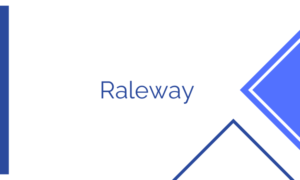
Why it is a must-have Professional font: Raleway is a stylish sans-serif font known for its thin, elegant strokes and modern appearance. Its clean lines and readability make it suitable for a variety of presentation styles, from corporate to creative. Its versatility and polished look ensure that your content is presented professionally and with impact.

Why it is a must-have Professional font: Roboto is a popular sans-serif font designed for digital interfaces, known for its clean and modern appearance. Its excellent readability and versatility make it suitable for a wide range of presentations. Whether you’re creating a professional business presentation or a creative design, Roboto’s polished look ensures that your content stands out.

15 Must-Try Serif Fonts to Elevate Your Word Documents

How To Install Stable Diffusion

15 Fonts Similar to Myriad Pro for a Fresh Look
18 Fonts Similar to Garamond for Elegant Touch
20 Friendliest Fonts for Inviting Designs
15 Best Canva Fonts for Cricut: Elevate Your DIY Projects
Leave a reply cancel reply.
Save my name, email, and website in this browser for the next time I comment.
No widgets added. You can disable footer widget area in theme options - footer options
Home » Canva » Canva Fonts » 23 Best Canva Font Combinations And Font Pairings
23 Best Canva Font Combinations And Font Pairings
- January 5, 2024

- Written by a professional
Summary: In today’s article, I've made a list of 23 outstanding font combinations and font pairings of Canva fonts and typefaces. Of these, my top three favorites are:
- Tan Mon Cheri + The Artist Script : A blend of playful elegance with artistic flair.
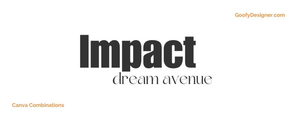
- Impact + Dream Avenue : Offers a great contrast, combining boldness with dreamy elegance.
- Margin + Marline : A harmonious combination of modern simplicity and stylish script.
Choosing the right font pairing in Canva isn't merely about matching styles; it's about creating a visual symphony that enhances the message and aesthetic appeal of your design. A well-selected font duo can elevate a simple concept to an engaging piece of art, reflecting the unique tone and personality of your project. That's why I've put together this selection of the best Canva font combinations. This guide is designed to help you navigate through the choices and find the perfect match for your design needs. Let’s dive into these font pairings and discover how they can transform your designs!
TOP 23 best Canva font combinations (font pairings)
- Tan Mon Cheri + The Artist Script (Free + Canva Premium)
- Impact + Dream Avenue (Free + Free)
- Margin + Marline (Free + Free)
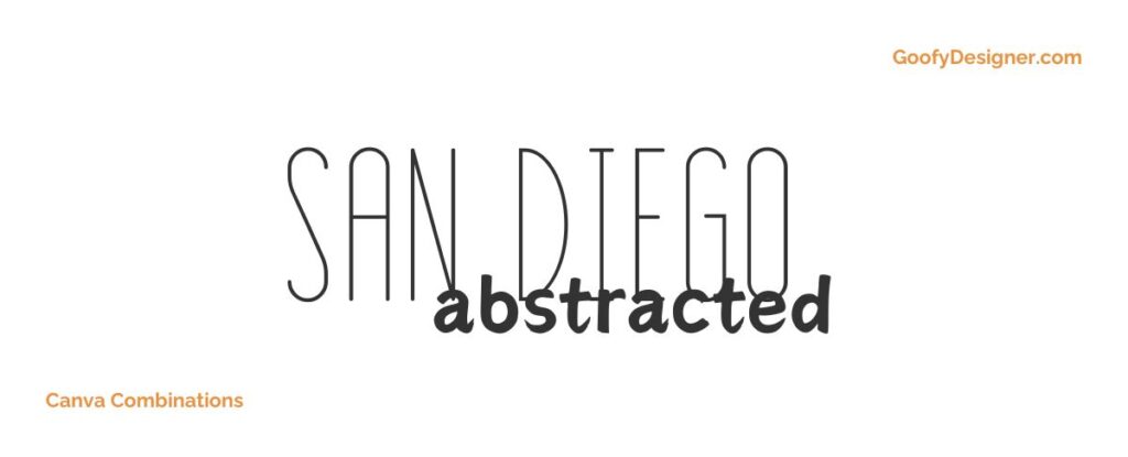
- San Diego + Abstracted Dream (Free + Free)
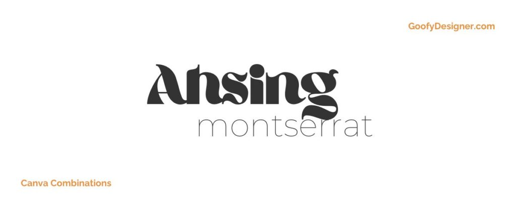
- Ahsing + Montserrat (Free + Free)
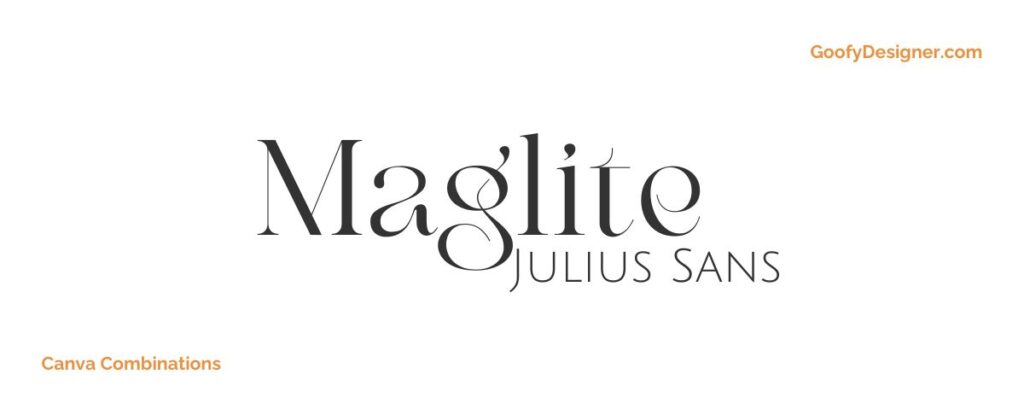
- Maglite + Julius Sans One (Free + Free)
- Architype Aubette + Alex Brush (Canva Premium + Free)
- Fabrica + Holiday (Canva Premium + Free)
- Pierson + Candice (Canva Premium + Free)
- Shrikhand + Amsterdam Four (Free + Free)
- Oswald + Brittany (Free + Free)
- Code + Magz (Free + Free)
- Versailles + Chunk Five (Canva Premium + Free)
- Kare + Mak (Canva Premium + Free)
- Giaza + Joliet (Free + Canva Premium)
- Brown Sugar + Gulfs Display (Free + Free)
- Broadway + La Luxes Script (Canva Premium + Canva Premium)
- Nectarine + Buffalo (Free + Canva Premium)
- Pacifico + Canva Student Font (Free + Free)
- Recoleta + Pinyon Script (Canva Premium + Free)
- Louisville II + More Suger (Canva Premium + Free)
- Donau + Malibu (Free + Free)
- Permanent Marker + Maleah (Free + Canva Premium)
1. Tan Mon Cheri + The Artist Script
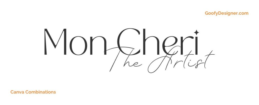
- Free or paid: Tan Mon Cheri (Free), The Artist Script (Canva Premium)
- About: Ideal for artistic or fashion-related content, this combo blends playful chicness with elegant script, perfect for stylish, expressive designs.
2. Impact + Dream Avenue
- Free or paid: Free
- About: A powerful choice for bold headlines paired with delicate subtext, suitable for impactful marketing materials and eye-catching social media posts.
3. Margin + Marline
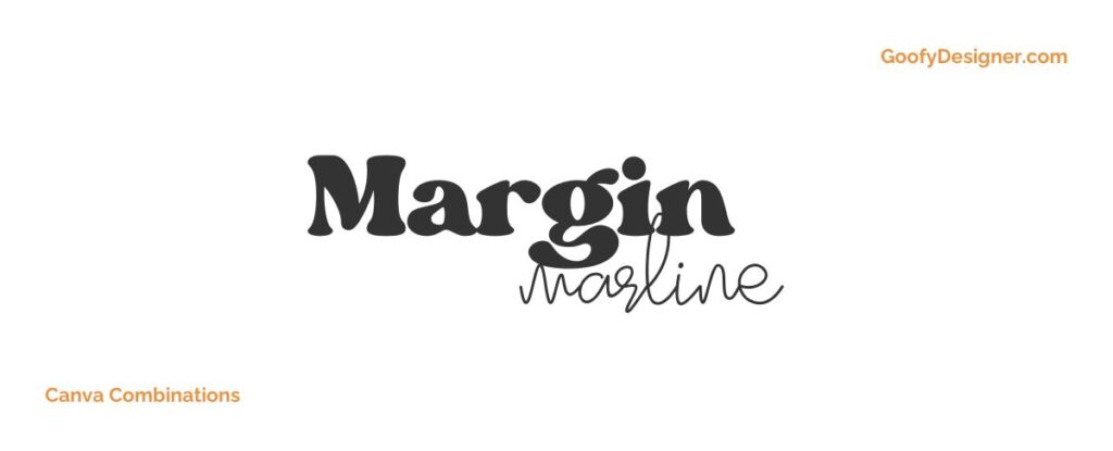
- About: The Margin and Marline font pairing combines a strong, contemporary sans-serif with a flowing script, perfect for modern professional designs that require a touch of elegance.
4. San Diego + Abstracted Dream
- About: Perfect for travel and lifestyle content, this pairing brings together a clean, modern style with whimsical script for a relaxed, adventurous feel.
5. Ahsing + Montserrat
- About: An excellent choice for contemporary branding, blending a unique decorative style with a clean, geometric sans-serif, suitable for modern, design-forward projects.
6. Maglite + Julius Sans One
- About: This combination is ideal for editorial and sophisticated designs, offering a balance of stylish flair and crisp, legible sans-serif.
7. Architype Aubette + Alex Brush
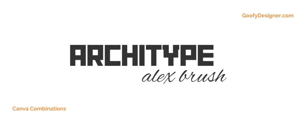
- Free or paid: Architype Aubette ( Free with Canva Premium ), Alex Brush ( Free )
- About: Suitable for elegant invitations and upscale branding, this pairing combines architectural precision with the softness of brush script.
8. Fabrica + Holiday
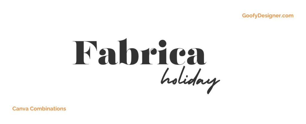
- Free or paid: Fabrica ( Free with Canva Premium ), Holiday ( Free )
- About: Perfect for casual and playful designs, like children’s content or party invitations, blending a straightforward sans-serif with a fun, decorative script.
9. Pierson + Candice
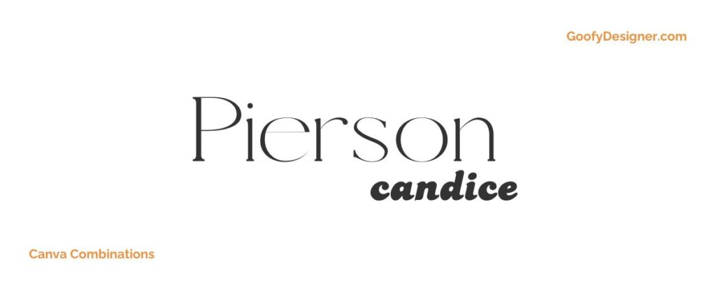
- Free or paid: Pierson (Free with Canva Premium), Candice (Free)
- About: Ideal for personal blogs or creative projects, this pairing offers a contemporary, clean look with a touch of playful script.
10. Shrikhand + Amsterdam Four
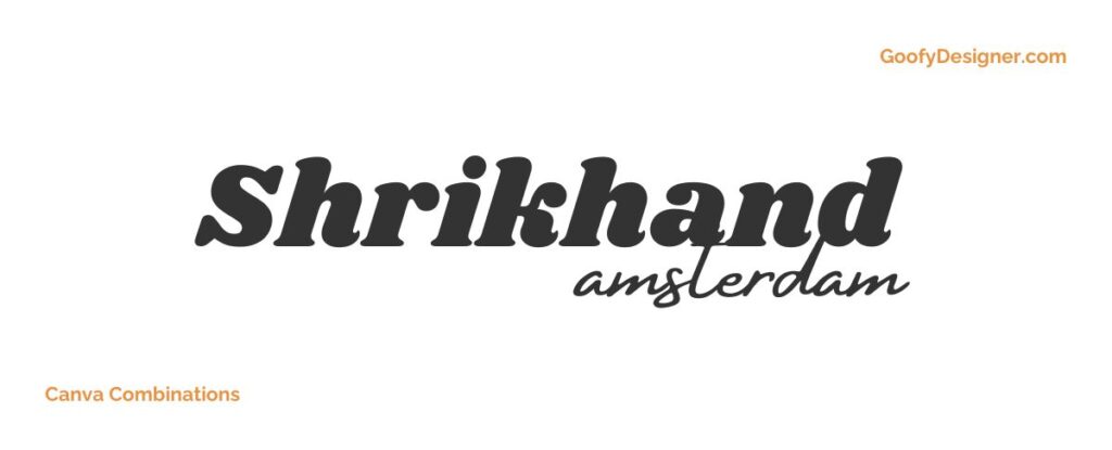
- About: Great for bold, artistic projects, combining a striking display font with an elegant script, perfect for creative headings and logos.
11. Oswald + Brittany
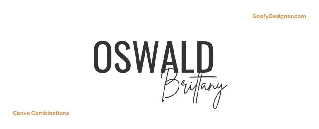
- About: A great combination for sleek and modern designs, offering a balance of stylish, contemporary sans-serif with a flowing script, ideal for fashion or tech branding.
12. Code + Magz
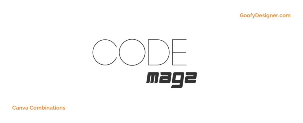
- About: Suited for tech and digital content, this pairing combines a futuristic, clean font with a bold, headline-friendly sans-serif.
13. Versailles + Chunk Five
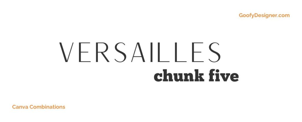
- Free or paid: Versailles (Free with Canva Premium), Chunk Five (Free)
- About: Perfect for historical or classic-themed projects, blending refined elegance with sturdy, impactful lettering.
14. Kare + Mak
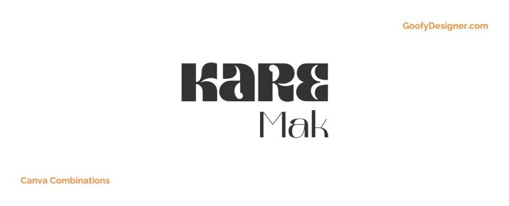
- Free or paid: Kare (Free with Canva Premium ), Mak (Free)
- About: Ideal for youthful and energetic designs, this combo offers a playful, hand-drawn feel paired with a modern, clean sans-serif.
15. Giaza + Joliet
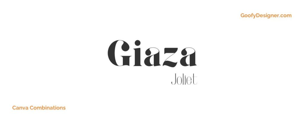
- Free or paid: Giaza (Free), Joliet (Free with Canva Premium)
- About: Great for luxury branding and upscale marketing, combining a sophisticated serif with an elegant, decorative script.
16. Brown Sugar + Gulfs Display
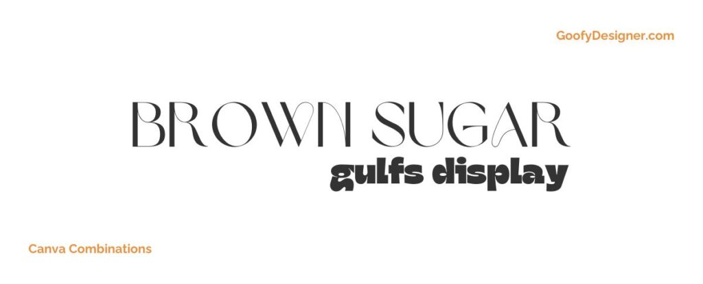
- About: Perfect for heartwarming, personal projects or artisan branding, blending a warm, handwritten style with a strong, characterful serif.
17. Broadway + La Luxes Script
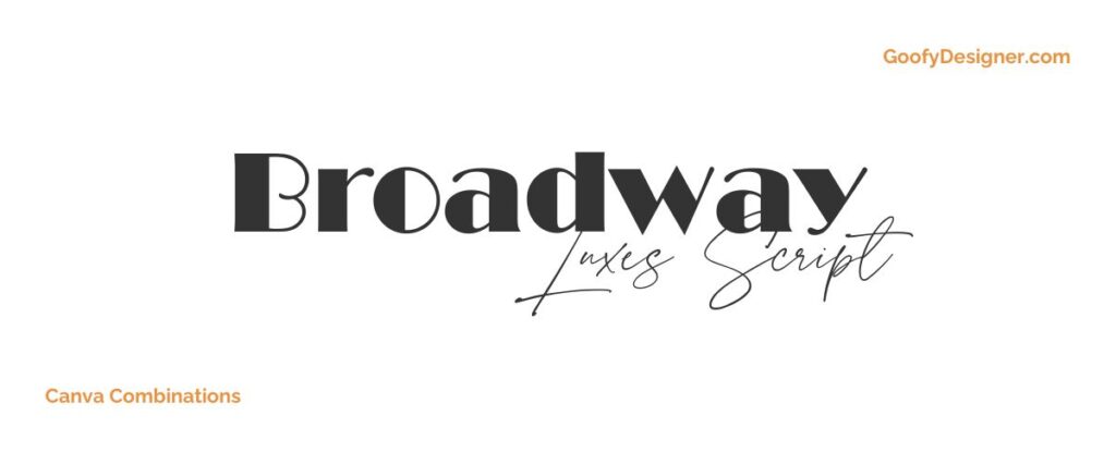
- Free or paid: Broadway (Free with Canva Premium), La Luxes Script (Free with Canva Premium)
- About: Ideal for theatrical or entertainment-themed designs, combining the glamor of Broadway with the elegance of La Luxes Script.
18. Nectarine + Buffalo
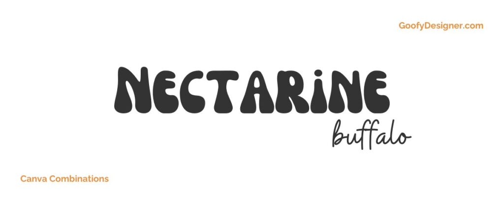
- Free or paid: Nectarine (Free), Buffalo (Free with Canva Premium)
- About: This combination is perfect for casual, upbeat designs, offering a friendly, approachable sans-serif with a fun, handwritten script.
19. Pacifico + Canva Student Font
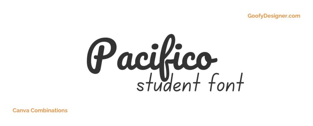
- About: Great for educational or student projects, blending a laid-back, friendly script with a clear, readable sans-serif.
20. Recoleta + Pinyon Script
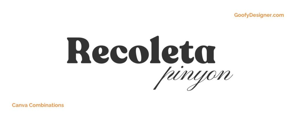
- Free or paid: Recoleta (Free with Canva Premium), Pinyon Script (Free)
- About: Ideal for vintage or retro-inspired designs, offering a combination of nostalgic serif with an elegant, flowing script.
21. Louisville II + More Suger
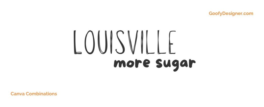
- Free or paid: Louisville II (Free with Canva Premium), More Suger (Free)
- About: Perfect for playful, trendy designs, combining a bold, modern font with a whimsical, decorative script.
22. Donau + Malibu
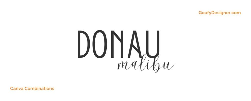
- About: Suited for minimalist and modern designs, this pairing offers a geometric, clean font with a sleek, contemporary script.
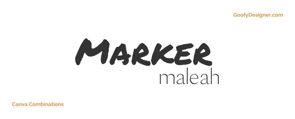
23. Permanent Marker + Maleah
- Free or paid: Permanent Marker (Free), Maleah (Free with Canva Premium)
- About: The Permanent Marker and Maleah font combination is perfect for casual yet striking designs, evoking a sense of individuality and creative flair in informal projects.
Want more font combinations for Canva?
If you want to find more fonts and get access to milions of elements for Canva, browse my favorite site: Envato Elements .
They have all kinds of assets such as:
- Fonts (40,000+)
- Stock photos (9,3M+)
- Graphic templates (270,000+)
- Presentation templates (110,000+)
- Stock videos (5,1M+)
- Video templates (96,000+)
- 3D elements (210,000+)
- WordPress assets (6,500+)
- Royalty-free music (140,000+)
How to choose the best Canva font combinations?
- Contrast is Key: Pair fonts that contrast well, such as a bold headline font with a more subdued body font, to create visual interest and hierarchy.
- Complementary Styles: Choose fonts that complement each other in style. For example, a serif font pairs well with a sans-serif for a balanced look.
- Consider the Mood: The font combination should align with the mood of your design. A playful project might use whimsical fonts, while a formal one might require more traditional fonts.
- Legibility: Ensure that your font combinations are easy to read, especially when it comes to body text. Avoid overly decorative fonts for longer texts.
- Brand Consistency: If you're designing for a brand, make sure the fonts align with the brand's personality and existing style guidelines.
What are Canva font combinations usually used for?
- Branding and Logo Design: Effective font pairings in logos and branding can establish a strong brand identity and convey the brand's personality.
- Social Media Graphics: Font combinations in social media posts can grab attention, convey a message effectively, and create a memorable brand presence.
- Marketing Materials: In brochures, flyers, and ads, font pairings are used to create a visual hierarchy, guiding the reader's eye through the content.
- Website Design: Different font combinations can be used for headings, subheadings, and body text to improve readability and user experience.
- Presentations: In presentations, font combinations can emphasize key points, maintain viewer interest, and convey professionalism.
Wrapping up this dive into Canva's font pairings, I've realized it's much more than just mixing and matching – it's about feeling and intuition. Finding that perfect duo, like Tan Mon Cheri with The Artist Script , Impact with Dream Avenue , or Margin with Marline , is really about what speaks to you. Each pairing has its own vibe: playful elegance, bold dreaminess, or sleek style. But at the end of the day, the perfect match is all about your story and your style. So go ahead, play around with these combos, and let your designs tell your unique tale. Happy designing!

Hana Terber
Latest articles on goofy designer.

10 Best After Effects Award Show Templates (My Favorites)
Summary: In this guide, I’ve picked out 10 amazing After Effects templates for award shows that I think will really make your video projects shine.

10 Best After Effects Hud UI Packs (My Favorites)
Summary: In this guide, I’ve meticulously curated a selection of 10 outstanding After Effects HUD UI template packs that I believe will perfectly complement your

10 Best After Effects Action Vfx templates (My Favorites)
Summary: In this guide, I’ve chosen a selection of 10 outstanding After Effects action VFX (visual effects) templates that I believe will perfectly complement your

10 Best After Effects Company Profile Video Templates (My Favorites)
Summary: In this guide, I’ve carefully selected a collection of 10 excellent After Effects company profile video templates that I think are perfect for improving

Stay notified

10 Free Canva Fonts You Should Be Using in Your Designs and Presentations

Your changes have been saved
Email is sent
Email has already been sent
Please verify your email address.
You’ve reached your account maximum for followed topics.
If you like designing things, especially social media graphics, marketing materials, and presentations, then you've probably already heard of Canva.
Canva is a free-to-use online graphic design tool, and it's full of handy features that make designing things incredibly easy. Here, we've compiled ten of the best Text-based Canva fonts you should try, plus some hidden fonts in Photos and Elements you may not know about.
1. BD Sans Thin

If you're looking for a minimal, simple, and classy font on Canva, then BD Sans Thin is an ideal pick. This font looks great on its own but can also be paired with a chunky, bold font such as Notable to create a layered effect.
If you want BD Sans Thin to look even more up-market, increase the spacing between the letters.
2. MOKOTO GLITCH 2

Decorative fonts can sometimes be unreadable, but MOKOTO GLITCH 2 manages to remain legible while also offering a pretty dramatic glitch effect. This font looks great in black but even better in a vibrant neon color on a black background. Give it a try and have a play around with Canva's built-in Glitch effect to take this font to a whole other dimension.
3. Body Text

Body Text may not be fancy, exciting, or bold, but what it lacks in personality, it makes up for in practicality. Great designs need readable body text, and as its name suggests, the Body Text Canva font was designed to do just that. Leave twirly-whirly fonts for headers and stick to something simple for paragraphs.
4. Retropix

Back to the cool fonts. Retropix is a personal favorite, and for obvious reasons. It's quirky and fun but still readable even at a small font size. For tech-based content or anything you want to add a retro vibe to, Retropix is a winner. If you want to take Retropix to another level, try the Canva Glitch effect with it.
5. Canva Student Font

Canva isn't short of handwriting fonts, but finding a readable one can be tricky. Canva Student Font is a great handwriting font for text that you want to be easily readable. It's still got a personal-handwriting vibe but is also simplistic enough to act as a body text.
Compared to handwriting fonts like Apricots, Canva Student Font isn't particularly elegant or fancy, but it's practical, and sometimes that takes priority.
6. Amsterdam Two

On the other end of the handwriting spectrum, we have fonts like Amsterdam Two. As its name suggests, Amsterdam Two is just one font in a series, and there are actually four different Amsterdam fonts to choose from.
Unlike Canva Student Font, which is quite uniform, Amsterdam Two really accentuates capital letters, making it great for short headers but not so great for long chunks of body text.
If you can't find a font you like for your project, then it's worth learning how to upload your own fonts into Canva . You can even create your own handwriting font and upload it!
7. CINZEL DECORATIVE

If you want a dramatic, classic, and elegant font then CINZEL DECORATIVE should be on your shortlist. It has a Disney Princess vibe and looks fantastic in headers and titles. It's also a great font for initials and wedding invitations.
If CINZEL DECORATIVE is a little too ornate for your needs, then take a look at its slightly more restrained sister, CINZEL.

CODE is another of those fonts that can really elevate a brand or heading. It's incredibly minimal, simple, and fine, which seems to be the style of choice for a lot of modern high-end branding. While you could use CODE as a body font, it really comes into its own for logos.
Like BD Sans Thin, CODE can be elevated by increasing the distance between the letters.
9. Archicoco

Archicoco is perhaps the opposite of CODE. It's a bold and striking decorative font, and while it can be a little tricky to read, it's also fun to play around with. While Archicoco can be used in lowercase, it comes into its own for capitalized headers. Give it a go and add a shadow for a really striking design.
Another way to level up the Archicoco font is to add an animated text mask layer . Archicoco is bold and distinct enough to work with a text mask, so give it a try.

Last but not least, we have Genty. For a groovy design, Genty should be your go-to, especially if the overall design incorporates elements from the 70s. Get creative with color and try the Canva Splice effect to take this font into a dimension of its own.
Another great thing about the Genty Canva font is its ability to work for both headers and body text. While it's decorative enough to be bold and interesting, it's not too decorative for short chunks of body text either.
Hidden Canva Fonts in Elements and Photos

There are hundreds of fonts to choose from in Canva, but did you know that you can also find hidden fonts in the Elements and Photos sections? That's right, there are lots of hidden features in Canva that people don't know about .
To find these hidden fonts, head to the Elements tab and type in a letter, filter by graphics , and when you see a style you like, hover over it, tap the three dots and then select See more like this . Some letters in Canva Elements are one-offs, but a surprising number are part of an alphabetical series, meaning you can create entire words using cool graphics in your designs.
The same process works for animated letters and also letters in the Photos section of Canva. The only downside to these hidden fonts is that many are only available with Canva premium, so you will need to upgrade if you want to use them in your design.
If you don't want to see premium elements, you can always filter your search by typing in the letter you want, tapping the filter icon, selecting Free, and then viewing your results.
Use Canva Fonts to Elevate Your Designs
Canva is a fantastic free design tool. There are hundreds of free elements to choose from, including these stylish fonts, and you don't feel overly restricted by having a free account.
That being said, if you enjoy Canva's free offerings, then you'll love Canva Premium.
The Creator Bundle: 600+ Fonts (336 font families) for just $275.
- Privacy Policy
- Affiliate Disclosure
- Refund Policy
- Your cart is empty.
- Blackletter Fonts
- Decorative Fonts
- Display Fonts
- Handwriting Fonts
- Sans Serif Fonts
- Script Fonts
- Serif Fonts
- Wedding Fonts
- Variable Fonts
- Famous Fonts
- Curated Collections
- Digital Assets

25 of the Best Canva Fonts for Any Design Project
With more than 135 million active monthly users, Canva is one of the most popular graphic design platforms to date. Its user-friendly interface and vast collection of graphics , templates, fonts , and photos are always a hit – from businesses to individuals, organizations and educators.
So when we say ‘Canva fonts,’ we mean fonts that are compatible with the platform. This compatibility ensures that users can access and utilize the font directly within Canva’s interface. Fonts that work well with Canva saves you time, money, and effort while giving gorgeous results.
How To Upload Custom Fonts To Canva Pro
1. First, log in to your Canva Pro account. Navigate to the Brand Kit section, which is usually found in the left-hand sidebar menu. From there, there should be an option to “Upload a font.” Click on it to start the font upload process.
2. Select the fonts you want to upload from your computer. Canva accepts various font file formats such as TTF (TrueType Font), OTF (OpenType Font), and WOFF (Web Open Font Format).
3. Confirm the upload process. Canva will process the fonts and add them to your Brand Kit. Once uploaded, your custom fonts should now appear in the font selection menu.
And that’s it! Now you can use them in your designs just like any other Canva font. Wondering what else to add to your Brand Kit? Check out our selection of the best Canva fonts below. Have fun!
Best Canva Fonts

Feminine, elegant, and classy, this sans serif from epdesigns is ideal for logos, invitations, packaging, fashion, editorials, social media, and branding. Pair it with any sans or script to realize your vision. The lowercase features over 50 beautiful ligatures to ensure your works are unique and eye-catching.
Download Verona

This sleek and stylish font just knows how to turn heads! It’s perfect for trendy projects like those in fashion, branding, magazines, as well as social media posts or invites. Plus, it comes with awesome ligatures that will give your designs that extra oomph.
Download Oyster

As a condensed art deco inspired typeface, this gem aims to please while remaining practical. Expertly restrained and with a modernized look, it perfectly captures the feel of the golden era. If its snazzy form doesn’t convince you to get it, perhaps its more than 50 lovely ligatures will.
Download Genesis
4. Prestige

All-caps doesn’t have to be boring – this classy serif is definitely proof of that. Look closer at its lowercase and you’ll discover sparkly details that will enchant and mesmerize spectators. Mix and match between these characters to unearth exceptional designs you’ve never thought of. Let it spark your creativity today!
Download Prestige
5. Gelato Sans

Use this sweet and simple sans serif for almost any project under the sun : be it magazine covers, urban branding, product packaging, premium logos, Canva projects, and more. There are 5 weights (Extra Light, Light, Regular, Demi Bold, Bold) to choose from so feel free to mix and match to your heart’s desire. Brought to you by TheGelato .
Download Gelato Sans
6. Meta Link

Inspired by future tech and sports, this modern sans from Logofonts includes ligatures and alternates to help you create powerful posters, logos, web pages, business cards, flyers, and social media promotions with ease.
It comes with 5 weights (Semi Bold, Medium, Bold Italic, and Extra Bold) to play with. Compatible Adobe Illustrator, Adobe Photoshop, Corel Draw – and yes, even Canva.
Download Meta Link
7. Isabella

This lovely sans serif stands tall and proud. Ideal for minimalist, feminine, or contemporary projects, it exudes class and sophistication, especially when combined with scripts fonts. The pack includes upper and lowercase characters, ligatures, alternates, numbers, symbols, and punctuation.
Download Isabella

Got a fashion or beauty brand? Then this sleek and chic font is for you! Put it on labels, logos, posters, business cards, product packaging, magazine covers, websites, and more. It’s ideal for headlines and titles, although it will also look great on short text and captions.
Download Felicia

Featuring bold lines and playful angles, this unique typeface is sure to get all your works noticed. Try it on over-the-top designs or quirky ads. It will look stunning on YouTube thumbnails, product packaging, and web pages, too.
Download Zuccini
10. Antigua

Stop dreaming of a magical holiday – and make it come true through your designs instead! Using this bold serif font family, you can now craft posters, ads, and flyers that are fresh, fun, and exciting. This font makes it possible to convey vintage charm and modern whimsy at the same time. You will get 2 styles (Regular and Outline) plus bonus ligatures.
Download Antigua

Loud, proud, and versatile, this extroverted font is a lively combination of past and future. With 2 styles (Bold and Regular) you can mix and match, you’ll be all set to create wedding invites, book covers, packaging designs, websites, mobile app titles, logos, and more. It also remains stunning in any size, whether used on titles or as body text.
Download Avalar

If you’ve been thinking about a multipurpose font to add to your arsenal, then you’ll get plenty of mileage with this clean and modern sans serif.
Offering 6 different weights (Thin, Light, Regular, Medium, Bold, and Black), upper and lowercase letters, along with numbers, symbols, and punctuations, it’s a must-have for creating clean, contemporary designs such as business cards, corporate presentations, blueprints, brand kits, logos, etc..
Download Amenti
13. Estrella

A super sleek font that screams modern and classy vibes, this font is perfect for professional and commercial projects. With gorgeous curves and clean lines, it can lend a fancy touch to just about any design you could think of.
It’s highly readable as well, both as headline or body text. There are 6 weights (Thin, Light, Regular, Medium, Bold, and Black) you can experiment with, so feel free to mix and match to achieve your desired results!
Download Estrella

Sometimes, you need a simple but classy typeface to set the mood for upscale or high-end designs. For such occasions, there is Benito . From postcards to labels, invitations to logos, allow it to give your works a timeless, vintage appeal. Featuring multilingual support and 9 versatile weights.
Download Benito
15. Pioneer Boulevard

Feel yourself transported to the 1800s along the French Riviera in this exquisite vintage style font. More than its 9 distinct weights, ligatures, and display features, this flexible gem can go from retro to contemporary in seconds. Elevate your ads, posters, labels, logos, and editorials into charming works of art.
Download Pioneer Boulevard
16. Oceania

Say goodbye to uninspired typography with this playful, decorative font! Rounded and chic, you will be enticed by its graceful curves and enchanting letterforms that have been meticulously crafted to perfection.
The pack includes upper and lowercase characters, numbers, punctuation, as well as multilingual support to ensure a seamless experience.
Download Oceania
17. Nebula Swirl

Have you always wanted to add expressive swirls to your designs but were too afraid it may not be readable? Worry no more – this decorative typeface has got you covered.
With its captivating wavy shapes and smooth edges, it will transform any dull design into something dynamic. Fluid yet precise, it balances readability with beauty. This makes it a wonderful choice for headlines, logos, editorials, and anything that needs a lighthearted touch.
Download Nebula Swirl
18. Hyperion

Uncluttered and effortlessly elegant, this sleek font redefines minimalist typography. Its 6 weights can be mixed and matched to align with your vision. Aside from logos, invitations, and business cards, it does well on résumes and mobile apps. It looks amazing on both digital and print.
Download Hyperion
19. Dekamor

Easily grab attention with an eye-catching font like Dekamor . Strong, confident, and classy, it was made for headlines, logos, and editorials. Crafted to stand out and make a statement, it remains legible even in small sizes. Use on its own or pair with other fonts, photos, graphics, and more for a polished outcome.
Download Dekamor

Sans and Sons proudly brings you this retro serif that’s as charming as it is practical. Featuring lots of alternates and ligatures, it’s also PUA Encoded and super easy to use. It’s compatible with most design software, including Canva. You will get: OTF, TTF, and WOFF files.
Download Grande

This stylish serif from craftsupplyco comes in 9 weights (from super thin to bold black) that work well for almost any type of design, from print to digital. No need for fancy software or additional plug-ins either.
It’s great for sprucing up a website, creating a logo, or putting together a brand kit. The well kerned characters are ideal for when you need to save space but still want to make a statement!
Download Galgey
22. Perfect Strangers

Inspired by luxury, this editorial display typeface from Pentagonistudio is perfect for those in publishing, fashion, or beauty industries. The pack contains Regular and Italic versions to match your desired aesthetic. It has multilingual support as well. You will receive OTF, TTF, and WOFF files.
Download Perfect Strangers
23. Brown Casalova

Make them fall in love at first sight with your designs using this luxurious typeface. Thin, sleek, and fluid, it includes ligatures, alternates, and Opentype features to create dozens of charming options. For best results, pair it with minimalist sans serifs for a clean, elegant outcome.
Download Brown Casalova
24. Sunday Afternoon

What does a Sunday afternoon look like? Something laidback, easy, but dignified – and that’s exactly what you can expect from this serif duo created by vuuuds .
Pack comes with standard glyphs, numbers, punctuation, and beautiful ligatures. Available in Regular and Italic styles. Works on both Windows and Mac.
Download Sunday Afternoon

If you can’t decide between regular or flowy characters, then you will like this modern display serif with a fashionable appeal. While the Regular characters are beautifully contemporary, the ligatures offer a touch of whimsy. Includes OTF, TTF, and WOFF file formats.
Download Kuano
Categories: Art Deco Fonts Bold Fonts Collections Cool Fonts Custom Fonts Decorative Fonts Display Fonts Elegant Fonts Fancy Fonts Hipster Fonts Italic Fonts Lettering Fonts Logo Fonts Modern Fonts Sans Serif Fonts Serif Fonts Urban Fonts Vintage Fonts Website Fonts Wedding Fonts Whimsical Fonts
- Creatype Studio Co
30 Best Canva Font: An Ultimate Resource for Every Graphic Designer

Fonts are more than simply letters. They tell a lot about you or your brand and aid in transmitting particular messages and emotions. Fonts can help you get the appearance and feel you want, whether you’re developing a logo, a business card, a website, or a birthday card. Luckily, you’ve got a great place where you can access fonts for free, like Canva. Not only graphics and colors, but Canva also provides Canva font that will surely boost your design.
Why we need good fonts in our design
Typography is the art of organizing type fonts to make written material legible and visually appealing by choosing typefaces, font sizes, and space between letters and lines of text.
Fonts are an essential aspect of a brand’s visual identity. Choosing the appropriate typeface for a design may make or break the message you’re attempting to convey.
On the other hand, using a distinct yet consistent collection of typefaces across all of your marketing pieces distinguishes you from competitors. In a market filled with visual stimuli, you must ensure that customers notice your brand right away.
Last but not least, legibility is as important as aesthetics. Using a clear typeface and adequate space may make reading a complex paragraph way easier. More powerful typefaces, on the other hand, can draw attention to a piece of material.
Fonts, like the colors of the rainbow, have a plethora of possibilities. So, how do you pick the best fonts? And why is this significant? All of these questions will be addressed in the next essay. We’ve compiled a list of 30 Canva fonts to try in 2021, as well as suggestions on how to utilize them in your creations.
1. Themysion

This is a handwritten calligraphy font with really lovely letter strokes designed by Creatype studio. Themysion is incredibly attractive and suitable for wedding invites because of the curled terminal lines in the capital letters.
2. Alegreya Sans HT

Don’t be hesitant to employ a single typeface throughout your whole brand. Finding fonts with style variants, such as Alegreya Sans Ht, is a brilliant approach to add subtlety to your designs without overcomplicating them. Offering 28 fonts within one typeface, this design is a serif that looks like a heading and easy-to-read body material.

Gistesy Signature is a highly elegant and refined typeface with brushed curves. The combination of italic and normal fonts creates a lovely and feminine impression. The typeface is trendy, but not so much so that it is difficult to read. It’s sophisticated and modest.
4. Stilu Open Source Typeface

Gistesy Signature is a sans serif typeface ideal for body text. The typeface performs nicely as a header when used in bold. The typeface’s enlarged x-height enhances the font’s already well-condensed look.
To make it look perfect, use smart spacing between your ascenders and descenders to put text to provide subtlety.

Twister is a fantastic typeface for a wedding or invitation design. The design produces a harmonic hierarchy worthy of a spectacle.
Color can have a big impact on how your fonts look—for example, the gentle tones from the sky in the background image above have been employed wonderfully to soften the text.

Aileron is a classic typeface with powerful arches and curves that may be used to distinguish your headings, subheadings, and body material. The text should be placed in geometric, contrasting areas of your backdrop image for this Canva font to look perfect on design.
7. Brittany
Brittany is a contemporary cursive typeface that is delicate and feminine. It features clean and fine lines, making it ideal for wedding cards. This is a handwritten typeface with a delicate cursive style. It has no slant and would look fantastic in logos or invites.
8. BONN Free Type 3 Weights

Villa created BONN, but it was never utilized. So they’re offering this Canva font to you in the hopes that you’ll make something wonderful out of it. BONN includes capital and small letters, numbers, and punctuation. The kerning is rather tight, but you can raise the letterspacing. BONN is now available in three different weights. This typeface is great for logotypes, headers, and posters, as well as general use.

This Canva font has a new modern and fresh script with a handwritten and script style that makes it seem elegant, natural, trendy, and suitable for any fantastic project.
Halimun is ideal for photography, watermarking, social media posts, ads, logos & branding, invitations, product designs, labels, stationery, special events, and anything else that requires a handwritten touch.
10. Sansita

Sansita is a diverse typeface family with six weight variants and corresponding italics. As Sansita explores the boundaries between typography, calligraphy, and lettering, each stroke weight has its own fascination. It’s great for any brief text that’s bound to catch someone’s attention. Because of its strong uppercases, it is an ideal option for branding.
Pablo Cosgaya created it with the help of Ana Sanfelippo and the Omnibus-Type Team.
11. Mistrully

Mistrully is a fashion-forward brush script created from natural handwriting and enhanced with distinctive swashes to help your project stand out.
Mistrully is ideal for branding projects, logos, wedding designs, social media posts, commercials, product packaging, product designs, labels, photography, watermarks, invitations, stationery, and any other projects that require a handwritten touch.
12. Archivo Narrow

Héctor Gatti created Archivo Narrow to be utilized in both print and digital formats. The font’s technical and visual properties are both designed for high-performance typography. Omnibus-Archivo Type’s is a grotesque sans serif typeface family. This Canva typeface was created to be used for highlights and headlines.
13. Porcelain

Porcelain is a hand-lettered sans serif font with a modest dip-pen texture that adds a personal touch.
With sharp and clean lines, this Canva font has a very minimalistic, elegant tone. The splash of color adds to the excitement and allows the typeface to take center stage in any design. Porcelain is ideal for titles and little text.
14. Reef Free Font

Reef is a large brush script font featuring a variety of linking letterforms. It contrasts wonderfully with the strong and more simple Canva fonts, both sans serif and serif.
Script fonts offer attractive, enriched short headers. Too many words are difficult to read. Therefore, restrict your script application to a minimum amount of words.
15. Brandsquest
Brandsquest Canva font can make your text look as natural as possible with strong ligatures and a comprehensive range of lowercase alternatives. It may be used for headlines, signatures, product packaging, greeting cards, branding, wedding and cards, and a variety of other things.
16. Sinkin Sans

Sinkin Sans is a simple, easy-to-read sans-serif that comes in all nine standard web weights, 100 to 900, including italics. Sinkin Sans has small, unobtrusive notches that descend into verticals at stroke intersections, providing highlights to crowded corners. Sinkin Sans was designed to be the web font for the K-Type site revamp, and it is freely available under the Apache 2.0 license.
17. Sabertooth

Sabertooth is a delicate new handwritten script typeface that is intended to appeal to modern shoppers. It has a relaxed, contemporary look with dry brush strokes and a distinct style. It may be used for element designs, weddings, events, t-shirts, logos, badges, stickers, and other purposes.
18. League Spartan

This is a new classic Canva font: a bold, contemporary, sans serif that has no qualms about kicking its opponents in the chest. Loud and proud.
It began with a single heavyweight, drawing heavily on ATF’s legendary Spartan family. After that, the developer added a few unique touches to a gorgeous, historical typeface and included a large character set – now comprising over 300 glyphs.
19. Wintter

The Wintter typeface provides a touch of elegance and rhythm. It is ideal for logotypes, garment design, letterheads, and many other applications. This Canva font also includes a variety of variant ligature styles, discretionary ligatures, and an extra swash font. These abilities will help you quickly create unique design projects such as lettering or handcrafted typography.
20. Rakesakesly

Rakesly is a typeface family that includes both sans serif and display sans styles. Typodermic Fonts Inc. released this typeface in twelve variations. It was created to provide hand-drawn logos and branding ideas with a personal touch. This typeface is ideal for branding, wedding designs, cards, and messages.

Creatype Studio’s Gaston & Jacklyn Canva font typeface incorporates geometric elements with a vintage style. Several alternate glyphs for many letters, multilingual support, ligatures, and standard numerals are all included in contextual and stylistic alternatives, starting and final forms. Furthermore, its lowercase letters will make you fall back in love with cursive handwriting.
22. Atzur Free Type Family

Atzur Pro is a Canva font with a little contrast. Initially, it represents typography traditionally influenced but with a drop and ends that make it more contemporary and unique. Atzur Pro boasts large, strong fonts that will catch anyone’s attention in an instant. It is ideal for headers and cover pages.
23. Rattiar

Rattiar is the Canva font of your dreams. This high-quality typeface is both adaptable and tastefully attractive. Use for headlines, logotype, branding, packaging, and short text runs. This handcrafted typeface is simple and elegant, with clean lines. Rattiar will pair wonderfully with many typefaces and function well with any project you’re working on, making it ideal for attractive logos and titles.
24. Aicubierre Typeface

Arial, Helvetica, and Franklin Gothic are some well-known sans serif fonts. However, employing standard sans serif fonts might result in bland, unoriginal, and uninspiring outcomes.
Alcubierre is a great typeface to keep on hand if you need to renew or expand your font library. This Canva font features a sleek look that matches well with any of your design project.
25. Judthing

Judthing is a natural hand brush Canva font that looks current and elegant and will be ideal for any project.
Judthing is ideal for photos, watermarking, social media posts, ads, logos & branding, invitations, product designs, special events, stationery, wedding, packaging, and anything else that requires a handwritten touch.
26. Choplin

Choplin font is a new Canva font for Instagram that is suitable for your branding and promotional materials needs. It will be your next creative partner-in-crime for the task.
With an amazing traditional style and edgy curves, the style blends nicely with any type of design, from automotive to luxury cafés to mural arts, you can have it all!
27. Barcelona 2

Barcelona is a playful and spontaneous hand-lettered typeface that is informal and trendy.
Barcelona typeface contains all you need to create a unique personal identity. Prepare to be praised by your clientele for this jewel, which is designed to accentuate your company’s distinct statements.
Do you want to try something new? Combine it with vibrant hues and let yourself be swooned by the end product.

A super-smooth typeface with a confident trademark style and a pen effect that provides a strong first impression. Medio provides a modern range of font styles and sizes, making it ideal for any business or personal project that requires a bit of edginess. Designed by Sora Sagano, use Media for your branding, label, packaging, or any creative project in store.

“I’m only going to download one more font,” no one ever says!
If you’re looking for a Canva font for your project, Edward could be the right person for the job. Edward is a daring and adventurous designer who excels in designing eye-catching headlines that catch people off guard. If you’re feeling daring, you may even use it for branding or social networking.

When you have a customer with a particularly difficult taste, why not show them the Fenix typeface and see how they react?
This Canva font, which combines a traditional brush stroke with an edgy edge, will turn any boring social media design into a share-worthy trend. Interested in giving it a shot? Fenix is also appropriate for headlines, posters, or messages to be printed on t-shirts.
Never let anything stand in the way of expressing your most creative side. This Canva font selection can assist you in reaching your full artistic potential while also catching the attention of one or two potential clients!
Related Post
A platform specializing on mobile design patterns: mobbin reviewed, get to know the difference between otf vs ttf, which is better, a typeface is not a font, here’s why, 8 coffee shop branding ideas you have to know, claim first, use later 10% discount code giveaway.
Act now! Enter your email to secure your exclusive discount before the giveaway ends.
- Presentations
- Most Recent
- Infographics
- Data Visualizations
- Forms and Surveys
- Video & Animation
- Case Studies
- Design for Business
- Digital Marketing
- Design Inspiration
- Visual Thinking
- Product Updates
- Visme Webinars
- Artificial Intelligence
20 Best Fonts for Presentations In 2024 [PowerPoint or Not]
![20 Best Fonts for Presentations In 2024 [PowerPoint or Not]](https://visme.co/blog/wp-content/uploads/2021/01/header-2.png "best fonts for presentations canva")
Written by: Chloe West
Choosing the best font for your presentation can mean the difference between an engaged audience and one that’s confused or distracted. A presentation font needs to be legible, agreeable, and not interfere with the content itself.
But choosing a font isn’t always straightforward.
To save you time and effort, we’ve selected 25 of the best fonts for presentations. This list will help you find the best font for your next presentation, whether you’re using PowerPoint, Google Slides, Keynote or any other tool to create it.
Simplify content creation and brand management for your team
- Collaborate on designs , mockups and wireframes with your non-design colleagues
- Lock down your branding to maintain brand consistency throughout your designs
- Why start from scratch? Save time with 1000s of professional branded templates
Sign up. It’s free.

Choose the font that you like from the list below and see when (and if) you should use it. And the best part? Each of these, and 500 more fonts are available for free in Visme's presentation maker .
Here's a short selection of 8 easy-to-edit Presentation templates you can edit, share and download with Visme. View more below:

26 Best Fonts for Presentations
- Archivo Black
- Libre-Baskerville
- Abril Fatface
- League Spartan
- Playfair Display
- DM Serif Display
- Dela Gothic One
Presentation Font #1: Lato

We’ve all seen a million and two presentations using standard fonts like Arial and Times New Roman. Lato often serves as a default font choice in many cases. This sans-serif typeface offers a more contemporary appearance.
Plus, the variety of weights that Lato is available in – from thin to light to bold and more – helps to ramp up this font’s overall appeal.
This font can be used in a variety of different ways, as we’ll see in the presentation templates below.
In this presentation below, we see Lato used as the header font in each slide. It’s paired with a thicker serif font to create a nice balance between the two types of fonts.
Here’s another presentation example using Lato as the main header. Both of these examples are using Lato Light to create a more sleek and modern look in their slide decks.

However, as we see in the above presentation, Lato’s normal and bold weights work perfectly for offsetting the light in various headings and designs.
Lato is a modern and readable font, making it perfect for nearly any type of presentation. However, it works perfectly for conveying your professionalism in a pitch deck as well, like we’ve shown you in these examples.
Presentation Font #2: Roboto

Another great font to use in your presentations is Roboto. Roboto is yet another basic sans serif font that works across a variety of industries and types of presentations .
Roboto is a suitable font to use for your body text, like we see below in this presentation.

All of the main body paragraphs are easy to read in Roboto, as well as professional and well designed.
We see Roboto used again below in this presentation sharing workout apps.

Here, it’s also used as the main font for body copy within the presentation. This just goes to show that this font can be used for nearly any type of presentation as well as any industry.
Roboto also pairs well with many other fonts, whether a serif like Garamond, a sans serif like Gill Sans or a script like Pacifico.
Presentation Font #3: Bentham

Bentham is a stunning serif font that works perfectly as a header font in your business presentations . It’s easy to read and gives your presentation a more traditional look and feel.
We use the Bentham font in our simple presentation theme, as you can see below.

This font can be used as uppercase, title case or even lowercase, whatever fits in best with the rest of your design. In the simple presentation theme, we have over 300 different slide styles to help you put together a unique and beautiful presentation.
Bentham is a free font that you can easily access inside Visme when creating your presentation design. Add letter spacing to create a different effect on your slides.
Pair Bentham with a sans serif font for your body copy like Open Sans (that we’ll cover shortly) or Futura .
Create a stunning presentation in less time
- Hundreds of premade slides available
- Add animation and interactivity to your slides
- Choose from various presentation options

Presentation Font #4: Fira Sans

Fira Sans is a stunning font that is incredibly versatile. In fact, you can utilize Fira Sans as both your header and body font, with another font in the mix to act only as an accent font.
See what we mean in this PowerPoint template below.

While Fira Sans is used in both normal and bold weights for the majority of the slide content, we see a nice serif thrown in as well to offset the single presentation font.
We can see Fira Sans used in multiple ways in this informational presentation template below as well.

This gorgeous sans serif font can be used in bold, italic, underline and more, giving you a wide variety of uses for this one font selection. Give it a try in your next presentation.
Presentation Font #5: Archivo Black

Archivo Black is a bold and strong font that looks powerful in all caps, like in the presentation example below. This font works perfectly on titles in both large and smaller sizes because it has a heavy presence.

In this presentation, Archivo Black is paired with Work Sans, a perfectly agreeable sans serif font that is easy to read in body text and captions.
When deciding what fonts to pair together, take a look at the Font Pairs collection in the left-hand toolbar of the Visme editor. In there, you’ll find hundreds of great pairings to use in your presentations.
Presentation Font #6: Montserrat

Montserrat is a big favorite of ours here at Visme given that a large majority of our own headings across our website are done in this font.
However, it’s one of the top font choices you can use as well for the headings on your PowerPoint slides.
Check out how we’ve used Montserrat as a header in this marketing plan presentation template.

It’s bold and helps your slide titles and headers to stand out to your audience, letting them know exactly what to expect each time you move to a new slide.
Here’s another example where we’ve used Montserrat, but this time we’ve used a thinner version in the header.

This versatile font almost looks like a completely different typeface when you switch up its weight, giving you even more flexibility for using it across your various presentations.
As you can see, Montserrat can be the font to choose when creating a marketing or business plan presentation as it’s both professional and visually appealing.
Montserrat also pairs well with a variety of different fonts. Try a thin sans serif for a nice contrast in your next PowerPoint.
Presentation Font #7: Open Sans

Open Sans is a commonly used font for body paragraphs in your presentation slides due to its legibility. Because it’s a basic sans serif font, it’s the perfect way to visualize the larger pieces of text you might need to include on a slide.
Here’s a presentation template that showcases Open Sans as the main font for the body copy.

However, Open Sans shouldn’t be discounted as only a paragraph typeface. In fact, you can also use it in professional presentations to help your headings stand out clearly, increasing readability.
Take a look at this stock pitch presentation that uses Open Sans as the large font for the title and headings on each page. We used Open Sans in two different weights, creating a font pair that looks balanced and unique.

If you’re looking for the right font to ensure your presentation is easy to read and digest, Open Sans is a great choice.
Presentation Font #8: Dosis

Dosis is another go-to presentation font for any industry. It’s a fun sans serif font with rounded edges and tall, thin letters, giving it a more futuristic look.
Here’s an example of how an industry focused presentation can use Dosis in – a slide deck for a restaurant’s marketing plan.

In this example, Dosis is used in all caps on the title slide and in the headings on each slide. This template has added a unique design that incorporates a two-color composition that makes the font contrast with the background.
Below, we have another impressive presentation template using Dosis in a similar fashion. It’s paired here with sans serif font Source Sans Pro, providing a modern combination fit for a tech startup pitch deck.

Similarly, we see that Dosis works well in all caps and can be used in a variety of designs in order to make the text stand out that much more.
Presentation Font #9: Libre-Baskerville

Another quality PowerPoint font to consider using in your presentations is Libre-Baskerville. This is a Google font that you can use for free inside many presentation software , Visme included!
Libre-Baskerville is a serif font style that can be paired with a variety of other fonts and color schemes, creating a more traditional look and feel for your presentation.
We use Libre-Baskerville in all caps as headings in our Modern presentation theme. This theme has over 800 different slide designs so you can pick and choose the ones that work best for your presentation needs.

However, this font can also be used in body paragraphs just as easily, as it’s clear and legible and easy to read.
In the presentation template below, we’ve paired Libre-Baskerville with Josefin Sans in the header, creating a classic look and feel for any presentation deck .

Libre Baskerville is a timeless font choice that never goes out of style and adds a sleek touch to any presentation you need to create.
Presentation Font #10: Muli

Muli is a versatile font that looks professional in both headings and body copy. As a sans-serif font, it’s bottom-heavy, so it sits well on the line, giving a sense of control. Its roundness makes it friendly and easy to read.
This presentation uses Muli for the titles in a medium size and a lower size for small headings. The pairing of Muli with Lato works well with the colors and shapes in the rest of the design.

Presentation Font #11: Abril Fatface

If you’re looking for a bolder font that grabs attention, a slab serif like Abril Fatface might be just the font you’re looking for. This could pair nicely with a standard font like Helvetica or Verdana or a thinner serif like Georgia or Palatino.
Check out how we’ve incorporated this bold font into the headings of the below annual report presentation design.

Abril Fatface is a great font for creating eye-catching headlines on your slides, but should only be used with short headings or pieces of text. A bold font like this can be hard to read in paragraphs or longer sentences.
Look at how good this Abril Fatface looks on the 3rd slide of this presentation.

The presentation below also uses Abril Fatface for the headings on each slide. The font has so much personality that it looks beautiful on its own and placed over bold colors.

If you’re looking for a slab serif font alternative, use fonts like Rockwell or a bolded Trocchi in your next Visme or PowerPoint presentation .
You could even look into custom fonts from sites like DaFont and import them into your Visme brand kit .
Presentation Font #12: KoHo

The next font on our list is KoHo, a unique sans serif font that can be used in more playful presentations.
Whether you’re creating a presentation for school , a video presentation to play in your office or something else entirely, KoHo can be one of the best fonts to utilize.
We incorporated KoHo into our Creative presentation theme in the various headings of each slide.

This is another one of our massive presentation themes, offering hundreds of slide designs for you to choose from. However, as the name suggests, this one has a more creative and playful feel to it.
If you need to create a pitch deck for investors or a sales presentation for new clients, KoHo and the Creative theme might not be for you.
However, if you’re embedding a slideshow onto your blog or sharing an informational presentation on SlideShare, KoHo could be a better suited choice to engage your audience.
Presentation Font #13: Helvetica

Helvetica is a classic sans serif font that has a very loyal fanbase, and for good reason.
As seen most clearly in capitalized texts, the upper half of the texts are quite large when compared to other san serifs fonts.

This allows the Helvetica fonts to have near-symmetrical proportionality when measuring the upper and lower portions of a text. These proportions make the identification of letters easier at a distance, like in the template example above.
This fact makes Helvetica a great font to use for headers and titles in live presentations where there may be people “sitting in the back row ” and viewing your presentation from a distance.
To clearly communicate your main points, be sure to use Helvetica as a bold text on headings and titles.
Presentation Font #14: Cormorant

Cormorant is a sleek and modern serif font.
We like to think of Cormorant as a good alternative for Times New Roman but with a moderate and tasteful change.
With a dynamic range of varying thicknesses, Cormorant appears to have a calligraphic feel and look while still maintaining a sense of professionalism.

While artistic and expressive, Cormorant is still fully legible and usable in a professional environment, as you can see in this presentation template.
Our recommendation is that you choose a font color that is a complementary color to the background. This helps separate the thin portions of the font from the background.
Should the variations in thickness prove too much for your taste, consider dialing back that expression by using Cormorant in its bold format. By thickening up the thinner lines, the variations are less noticeable and may be more suitable for a given context.
Cormorant is a modern serif font that works well in titles, headings, subtitles for subpoints or paragraphs.
Presentation Font #15: Prompt

Prompt is a geometric sans serif font designed for Latin and Thai languages. Its geometric quality gives it a solid and stable feel that will give your presentation a unique look.
In this modern presentation example, Prompt appears in all titles and subheadings. It’s paired with Montserrat, another san serif with personality. These fonts together do look a bit similar to each other but balance each other out in terms of weight and thickness.

Choose this font specifically if you’re creating a presentation in Thai and need the words to be legible and well-balanced.
Presentation Font #16: League Spartan

League Spartan is a simple sans serif font, that is bold, uniform and minimalistic by nature and is great for headings and titles.
Because it's hefty even with the bold setting turned off, you may want to take extra precautions when using League Spartan for paragraphs or letter bodies.

League Spartan works great as a header for infographics or cartoon-style presentations, like in the template above.
The purpose of an infographic is to take difficult or complex information and turn it into easy-to-remember points. The reason that League Spartan works so well with infographics is its simplicity.
To help set the overall tone of an infographic, you can use a simplified san serif font like League Spartan. A font like this will simplify an important or complex data point and make it feel easy to understand.
Presentation Font #17: Poppins

Poppins is a versatile and linear san serif font.
Poppins is linear because of its strong vertical terminals, which are the end of a stroke that is not a serif. This gives the font a sense of weight and vertical authority, making it great for strong, stand-out titles and headers.
Not only is Poppins a wonderful choice for titles and headers, but it also works well for titles, text bodies and subtitles, as you can see in our presentation template below.

The linear and versatile aspects of Poppins has made this font a favorite in the business and professional world. It feels casual, yet is still very professional.
Presentation Font #18: Playfair Display

What can we say about Playfair Display, other than it’s an incredibly chic and fashionable serif font.
This font has a strong box feel as most of the characters stay between the baseline and X-height. This means that most of the letters do not dip far below the line, nor do they rise above most of the other letters.
This makes Playfair Display an excellent choice for strong titles and headers, as you can see in our presentation template below.

Many fonts that go after the “box look” fail at being legible from a distance.
To avoid this problem and make the letters more pronounced, Playfair Display uses a variety of thicknesses in the stem of their letters when compared to the arms and other extensions.
Playfair display is a classy and elegant font designed to be used as headers or titles. While it can still be used in paragraphs, you may want to limit its usage to shorter portions of your text.
Similarly sized and spaced words written in this style can be disorienting for some readers. So instead, consider using Playfair Display as a font for titles, quotes or various subtitles in your presentation.
Presentation Font #19: Raleway

Raleway is a modern sans serif font that was originally designed to be used as a lightweight font. But after its release and by popular demand, Raleway was given heavier and italicized versions for its fans to use.
The bold and light versions of this font are extremely versatile and can be used anywhere from bold headers to lighter parts of the body in your presentations, as you can see in our presentation template below.

The italicized version of Raleway has slightly off-centered bowls and shoulders in certain letters. This means that the markings that are not the stem are purposefully written higher or lower than normal.
This is a subtle artistic flair that does not influence readability. Some people find that swashes actually help increase legibility with these off-centered markings.
Presentation Font #20: Otama

This type of font pairs well with a solid sans serif like Lato Light. In this presentation example, Otama and Lato Light in all caps work together to create a professional design that stands out and makes a statement.

Presentation Font #21: Lora

Lora is a unique serif font that was made in a contemporary style.
Drawing its inspiration from calligraphy and traditional fonts, Lora is an excellent balance between an artistic and professional font.
Lora has very pronounced arches leaping away from the stem of each letter. This gives the font family a more “bubbly” feel to it, while still maintaining a sense of clean professionalism.
To unleash Lora’s true artistic nature, you’ll want to turn on the italics. When italics mode is activated, each letter receives additional swashes, giving it a more hand-written feel.
If you add weight to its default thickness, Lora works well for both titles and headers and when set to its default settings, Lora truly shines as a font in paragraphs and bodies, as you can see in our presentation template below.

Presentation Font #22: Inter

You can use Inter in different weights throughout a presentation or pair it with a versatile font like Lato Light to give the composition a bit of visual variety. The presentation example below uses Inter in mixed-case and Lato Light in all-caps for headings and mixed-case for body text.

Presentation Font #23: Noto Sans

Noto Sans is a basic sans serif font that makes for a great presentation font. Clean and easy to read, it can be used in a variety of different ways from slide to slide.
Take a look at this presentation template below. The main font used throughout the headers and content is Noto Sans, creating a clean and cohesive presentation design.

The above presentation template also uses a script font for the author name on the first slide as well as another sans serif font (Poppins) for some body content.
Having a nice mixture between the two ensures the presentation isn't boring—but it's still clean and uncluttered. Poppins is another font on this list. Try mixing 2-3 different fonts from our recommended fonts to create a stunning presentation design.
Presentation Font #24: Heebo

Heebo is one of the more unique sans serif fonts on our list, but it works perfectly for presentation slide headers. As a thin, tall font, it works better in a larger size than it would for content.
Take a look at how we've used Heebo in this presentation template below. It remains in an all-caps format, typically for headers from slide to slide.

We've also creatively used the font by juxtaposing it atop purple squares, helping to create a design element out of text. Consider how you can do the same thing in your presentations.
Presentation Font #25: DM Serif Display

Our next top font is a beautifully bold serif font. DM Serif Display is a perfect header font for a more traditional presentation design. Serifs tend to seem more old-fashioned, so keep that in mind when creating your next presentation. Maybe a serif will best fit with your audience.
Take a look at this template below to see DM Serif Display in action.

In the above presentation, we've paired this bold serif font with a nice thin sans serif to pull the design together. Sometimes opposites attract and help you to create a beautiful presentation design that your audience will love.
Presentation Font #26: Dela Gothic One

Dela Gothic One is a thick and chunky font with a strong feel. It’s ideal for headings on posters, packaging and in titles on presentations. This font has a lot of power and is best paired with a simple sans serif font or even a classic serif like Garamond for body copy.
For a bolder outcome, use Dela Gothic One in all caps, like we did in the presentation example below. Each slide includes a strong title in Dela Gothic One in a color that contrasts with the background.

Ready to Create Your Next Presentation?
When it comes to fonts for PowerPoint (or any other presentation platform), there are so many options to choose from that it can get overwhelming. But selecting fonts doesn't need to stress you out. Stick to the ones in this list and you’re sure to have a winner.
Whether you use Microsoft PowerPoint , Apple Keynote or Visme, each of these presentation fonts can really bring the best out of your presentation.
If you want to get even more out of your presentation design and have access to top notch animation, transition and interactivity capabilities, sign up for Visme's free presentation maker today .
If you're racing against the clock, take advantage of Visme’s AI features, like the AI Presentation Maker which takes a text prompt and turns it into a fully designed presentation draft.
Create beautiful presentations faster with Visme.

Trusted by leading brands
Recommended content for you:

Create Stunning Content!
Design visual brand experiences for your business whether you are a seasoned designer or a total novice.
About the Author
Chloe West is the content marketing manager at Visme. Her experience in digital marketing includes everything from social media, blogging, email marketing to graphic design, strategy creation and implementation, and more. During her spare time, she enjoys exploring her home city of Charleston with her son.
Home » Fonts » 10 Professional Canva Fonts

10 Professional Canva Fonts
Everyone knows how important it is to pick the right fonts, as they can either make or break your project. However, many don’t know this at the start because they are beginners, which sometimes leads to unsuccessful results.
This is common, especially with businesses, because a company or business must look professional and formal from the first day; otherwise, no one will consider them a trustworthy partner.
If you are also a beginner and are thinking about starting your own business soon, then do not make this mistake and design your logos and other designs with some good professional fonts.
Wait, you can’t pick the right professional fonts for your work and don’t know which ones will be the best? Well, that’s okay, as everyone can get overwhelmed at first. That’s why in this article we are going to share some of the best Professional Fonts on Canva.
Whether you need them to start a business, design a resume, or create a portfolio, they are just perfect for every formal project you want to finish.
That’s why you should read this article till the end so that you don’t miss out on any Corporate Canva fonts and can create some of the most professional-looking projects.
Similar: Groovy Canva Fonts For Retro Designs
Best Professional & Corporate Fonts on Canva
The best part about all these Corporate Canva fonts is that all of them are free to use, so you don’t need to worry about purchasing them or licensing them at all. That’s why feel free to check out each!

Inspired by old posters and signs, Montserrat has been a popular pick for a huge variety of professional designs for a long time. It’s designed by Julieta Ulanovsky and features a pretty clean and minimal design and letter structure that can fit in almost any professional design.
Whether you need a heading for your resume or text for your documents, Montserrat is perfect for everything you want to design with it. Many businesses and companies use Montserrat regularly for their various works, so what are you waiting for? If you want to be successful like them, start designing now!

Poppins’ name may make it sound like another overly designed display font, but that’s not the truth, as it’s the opposite of that. It’s designed by Indian Type Foundry and has a gentlemanly style, which makes it a perfect Corporate Canva font.
If you are looking for a font that can work well as body text for your website or newspaper, then Poppins is something you should try out soon. It’s extremely readable and works well as both headings and text.

Are you looking for something professional that can be used, especially for display designs? If yes, then Roboto by Christian Robertson is something you must try! This design was designed especially for display purposes, but not fancy ones, as it always sticks to professionalism and formal designs.
So maybe you can call it the most perfect font for many of your formal designs. From business logos, newspaper headings, and company advertisements, you can use it on every display design that needs a professional look.

Arial is a pretty old sans-serif humanist font, as it was designed decades ago by Robin Nicholas and Patricia Saunders. In the past, this font was a popular pick for printing work, but since that work has decreased a lot, it now fits in display designs for professional projects.
Although it’s an old font, it has a clean and modern-looking design that makes it useful in this new world, so why not use it soon? It’s good for headings and main texts; it can even display designs well!
Helvetica World

Introducing Helvetica World, an updated version of one of the most popular fonts, Helvetica. It’s designed by Linotype and is a pretty smooth font that feels good to use and look at. If you are a fan of clean fonts, then this font can be great in your hands, as it’s a good choice for almost all types of display work, whether they are professional or not.
So, make sure to experiment with it, as it has some more versions that are better than the previous one and work well for a good number of projects.
Gotham

Since all the popular professional fonts have made it into this list, we couldn’t forget Gotham, which also belongs to the group of famous fonts. It’s designed by Hoefler & Co., and it’s much thicker than the other fonts in this list, and that’s what makes it a good professional font.
Because bold and strong-looking fonts tend to make a good impression on the audience, it shows confidence. So, if you need a font that can add some confidence to your designs, Gotham should be your go-to choice.

Inter is another addition to the list. It may look like yet another normal font, but what makes it unique is its variable style. Yes, you read that right. Inter is a variable font that was designed by Rasmus Andersson, especially for computer designs.
This easily tells us this font is a perfect choice for digital designs such as websites and advertisements. If you are starting a new business online or want to create a website, then Inter can be a good choice, as it’s professionalism and variable abilities will help you gain an online presence pretty quickly.

Looking for a good body text font that has professionalism in each letter? Well, here’s Tenor Sans by Denis Masharov. This font was designed especially for body texts, but you can use it even for headings; just avoid putting it in display designs.
From screen to paper, this text font is good everywhere, so consider using it if you need an attractive resume for your next job application. It’s good for news websites too, thanks to its professional design.
Who doesn’t know Calibri? It’s probably the most popular text font to ever exist; no matter where you go, texts will be designed with this font. It was designed by Microsoft Cooperation and is considered the perfect text by millions because of its amazing design and simple characteristics.
It’s used in documents, resumes, notifications, apps, websites, and almost every place that requires texts, so you can’t refuse to use it!

Since we are talking about Corporate Canva fonts, how can we forget Canva Sans, a font designed by Canva itself? If you are someone who enjoys using Canva and wants to support them more, then using this font can be a good idea. As this font works well with many projects too, from texts to headings, you can use it everywhere. The results aren’t going to disappoint you, so try it out soon!
Canva has a good collection of professional fonts, and in this article, we have mentioned the best ones. From Calibri MS to Montserrat, each font is well crafted and leaves a good impression on your customers, so take advantage of their professional looks and design some amazing projects.
Similar posts:
- 14 Cute Canva Fonts For Quirky Designs
- Secret Hidden Fonts on Canva
- 10 Best Masculine Fonts on Canva
Share Article:
Chris bryant.
Hey, I'm Chris, a freelance UI/UX designer with 5 years of experience and the person behind Graphicpie. I enjoy sharing great fonts I've found and creating easy-to-follow tutorials for design tools like Canva, Krita, Figma, and more.
11 Best Art Nouveau Fonts (2024)
11 best fall fonts on canva, leave a reply cancel reply.
Save my name, email, and website in this browser for the next time I comment.
Best Professional Fonts in Canva
Home » Blog » Best Professional Fonts in Canva

Founder of CanvaTemplates.com & Professional Graphic Designer
Jake Tucker
Canva Templates is reader supported. When you buy through links on our site, we may earn an affiliate commission. Learn more
Great graphic design is powered by great font selection. But picking great fonts is a challenge for most people. Luckily, Canva has made adding great fonts to your designs much easier. In this tutorial, our team of design experts will cover the best professional fonts in Canva.
What are Professional Fonts?
Professional fonts typically exhibit several characteristics that make them suitable for business, formal documents, and other professional applications. Here are some common characteristics of professional fonts:
- Legibility : Professional fonts are highly legible , ensuring that text is easy to read at various sizes and in different contexts.
- Consistency : They maintain consistent proportions, stroke widths, and letterforms, which contribute to a balanced and harmonious appearance.
- Serif or Sans Serif : Professional fonts often fall into one of these categories. Serif fonts (with small decorative strokes at the ends of letters) are often used for print materials, while sans-serif fonts (without these strokes) are preferred for digital and screen use.
- Clean Lines : Professional fonts have clean, crisp lines that enhance their readability and convey a sense of professionalism.
- Variety of Weights : They offer a range of font weights (e.g., regular, bold , italic ) to provide versatility and allow for emphasis where needed.
- Neutral Appearance : These fonts typically have a neutral appearance, which means they don’t distract from the content and are suitable for a wide range of applications.
- Extensive Character Set : Professional fonts often include a wide variety of characters, symbols, and special characters to support different languages and typographic needs.
- Kerning and Spacing : Properly adjusted letter spacing ( kerning ) and line spacing ( leading ) contribute to the overall readability and aesthetics of professional fonts.
- Versatility : They can be used effectively in a variety of contexts, from formal documents and presentations to websites and branding materials.
- Timelessness : Professional fonts tend to have a timeless quality, remaining relevant and stylish for many years.
Best Canva Professional Fonts

Georgia is a web-safe serif font that combines readability with a touch of elegance. It’s frequently used in web design and online content.

Avenir is a versatile sans-serif font with a contemporary design. It’s commonly used for both print and digital media.
3. Proxima Nova

Proxima Nova is a highly readable sans-serif font with a modern and sleek appearance, suitable for web and print.

Sabon is a serif font known for its elegance and readability, often used in high-end publications and branding.

Cinzel is an elegant serif font with a touch of vintage flair, suitable for formal invitations and decorative headings.

Univers is a sans-serif font family known for its extensive range of weights and styles, making it suitable for diverse design projects.
7. Gill Sans

Gill Sans is a versatile sans-serif font known for its readability and is used in a variety of design applications.

Optima is a sans-serif font with a unique and elegant look, frequently used in advertising and branding.

Roboto is a modern and versatile sans-serif font developed by Google, designed for on-screen readability.

Aleo is a serif font with a classic and elegant style, making it suitable for both print and digital applications.
I hope you found this guide covering the best professional fonts in Canva, useful! Be sure to check out our blog for more article covering the essential tips, tricks, and advice for Canva! Also, if you haven’t already tried CanvaPro, you can try it for free for 30 days !

Canva » Text + Fonts » 35+ Best Fonts For Logos In Canva
35+ best fonts for logos in canva.

Choosing the right font is one of the hardest parts of creating a new logo. So let’s make your life easier with this list of the 35+ best fonts for logos in Canva. Whether you’re using the free or pro version of Canva, you’ll find plenty of logo font ideas to inspire your design!
Table of Contents
The Best Fonts For Logos In Canva
The following 36 fonts are judged by many factors, including legibility, style, and creative expression.
Some of these fonts are only available for Canva Pro users, and these fonts will be mentioned as such.
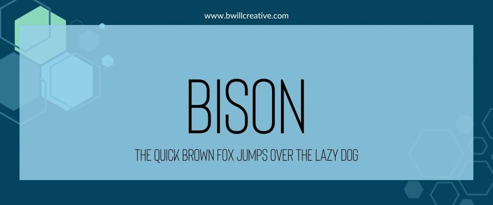
Bison is a versatile and adaptable font that stays legible, even in smaller sizes. Bison is a basic sans-serif font, but if you want the logo for your business to get straight to business with your message, then this font will do the trick.
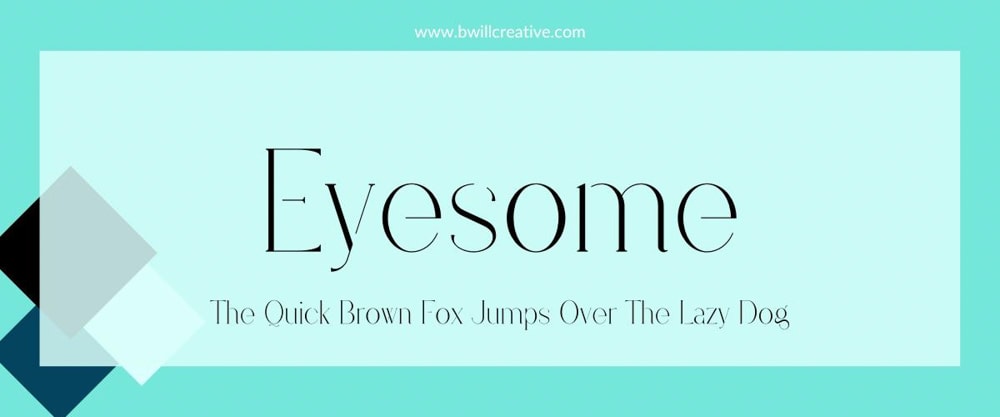
Eyesome is an elegant and sophisticated font that feels modern and contemporary, mixing normal-width lines and razor-thin lines. Some lines are so thin that they don’t attach to the rest of the letter, which is a nice artistic touch. This font is great for any business in beauty and cosmetics, fashion, or wedding and event planning.
3. Black Bones
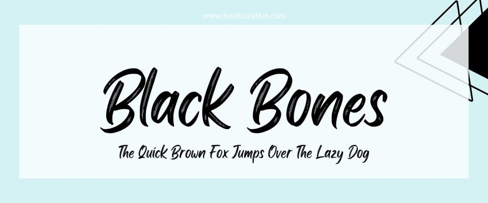
Black Bones is a modern and trendy font that can make your logo memorable to your customers. The unique streaky brushstrokes make this font perfect for any business in fashion and apparel, music and entertainment, and creative design.
4. Beauty Salon Sans
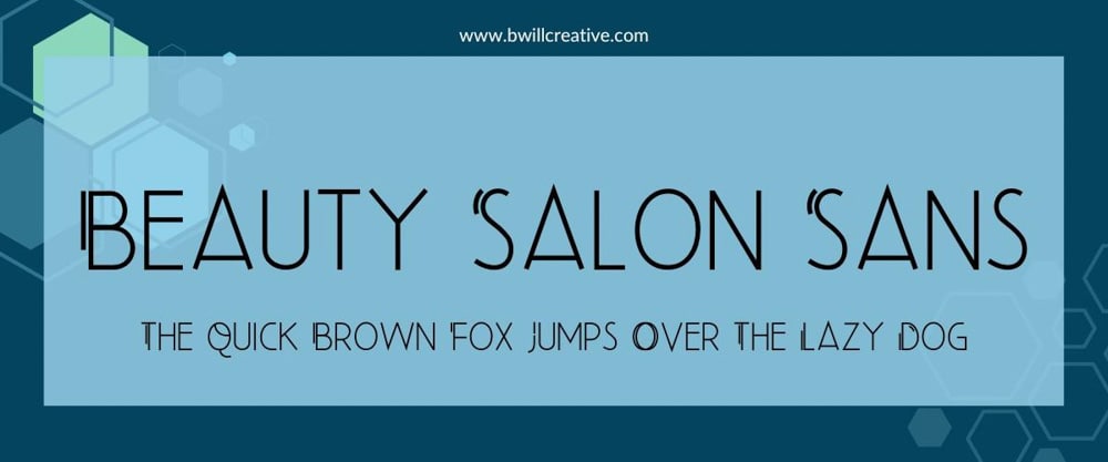
Beauty Salon Sans is a modern font that feels like a timeless classic. This font stands out because of the stylized accents on many of the uppercase letters. This font is perfect for luxury hair salons, nail salons, spas, and wellness centers.
Beauty Salon Sans is only available for Canva Pro users.
5. TT Norms
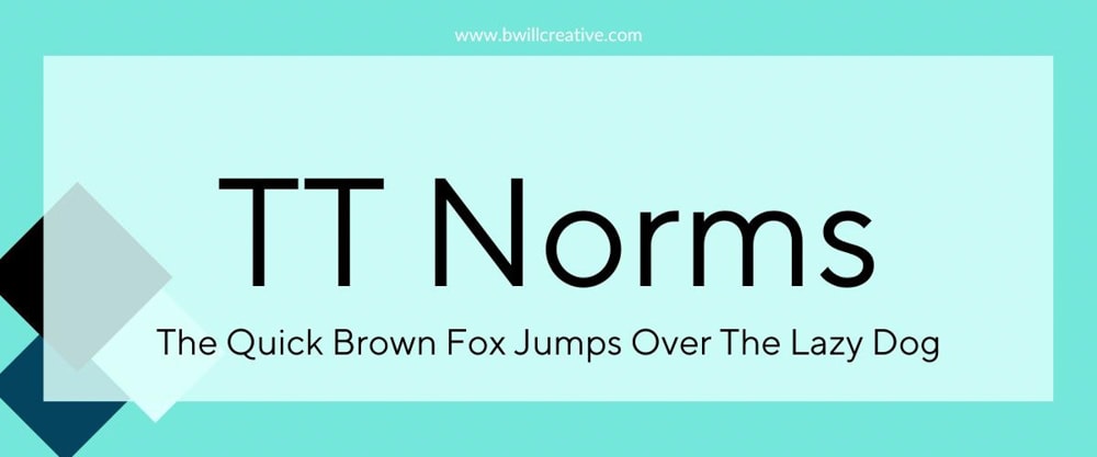
TT Norms is a go-to font when you need something with a modern aesthetic that’s clear and legible. This ensures that your logo will remain clear for both digital and print media. TT Norms works well for any business that needs to look as professional as possible.
6. Yellowtail
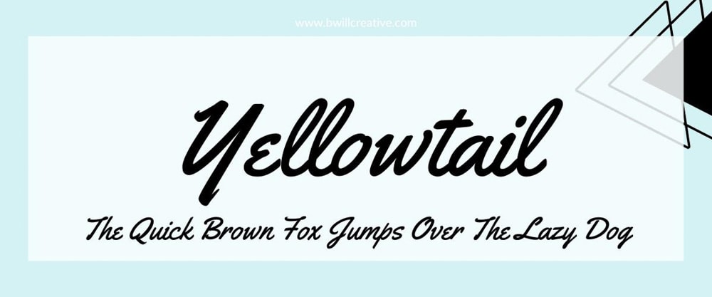
Yellowtail is an expressive and fun font with exaggerated curves and vintage charm. Yellowtail has a distinct style that sets it apart from the more generic options, allowing your logo to stand out and create a strong visual identity. Yellowtail’s playful style makes it a great choice for a logo for a restaurant, food truck, clothing boutiques, and craft-based businesses.
7. Intro Pro
Intro Pro is a bold and modern typeface that manages to leave an impact with its simplicity. Intro Pro is a versatile font that can work for just about any professional company logo. Intro Pro is a good choice if you have a consulting service or tech start-up.
8. Lemon Tuesday
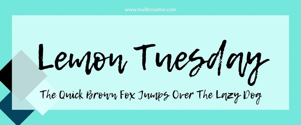
Lemon Tuesday is a unique display font that looks and feels like someone scribbled down their signature with a marker. What this font loses in legibility, it gains in style and likelihood of grabbing your customer’s attention. Lemon Tuesday is a font perfect for a smoothie shop, juice bar, farmers market, or event planning services logo.
9. Beauty Salon Script
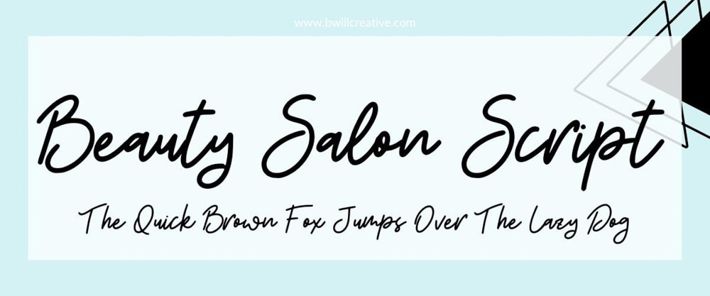
Beauty Salon Script is an alternative version of Beauty Salon Sans with a more handwritten feel. Beauty Salon Script produces a feminine logo that feels elegant and personalized. Much like its sister font, Beauty Salon Script is a perfect logo font for hair salons, nail salons, makeup brands, and other beauty services.
10. Bodoni FLF
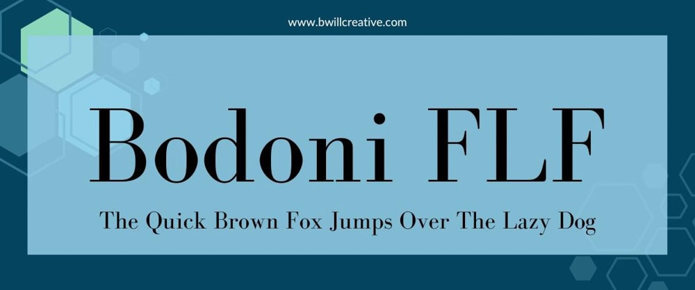
Bodoni FLF is an elegant, timeless, and highly legible typeface. Using this font for your logo will work well for a flyer and the sign on top of your business. This type of font is excellent for the logo of a fine dining restaurant, high-end clothing brands, and art galleries and museums.
11. Hitchcut
Hitchcut is a very bold and unique font that has an almost cutout feel to it. This font is purposely unbalanced as each letter is a different size and width, making this display font feel creative and playful. Hitchcut can work for everything from a logo for an art studio to a children’s toy company to a music and art festival logo.
Chango is a large round font designed to grab your customers’ attention. Each letter is slightly exaggerated in size and remains very versatile, allowing legible use for a logo on your sign, a flyer, or even on the cover of your menu. This makes Chango perfect for your restaurant’s logo, your sports brand logo, and even automotive logos.
13. High Cruiser
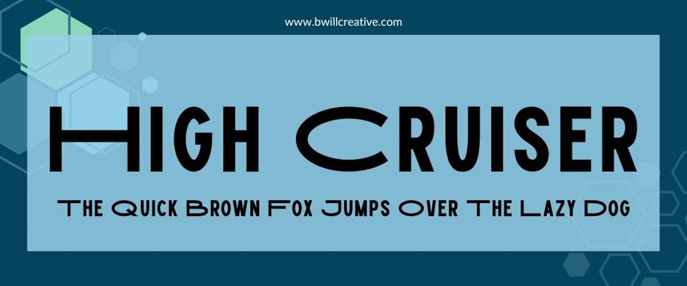
High Cruiser is a uniquely designed all-caps font. Instead of capitalized letters being longer height-wise than the rest of the sentence, capitalizing letters with High Cruiser will make the letter longer width-wise. This font is great for car companies, fitness centers, and sports brands.
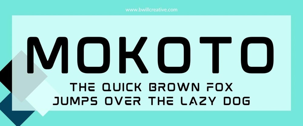
Mokoto is a futuristic typeface with a digital style that works best in digital formats if you want to make a logo for a cellphone accessory company, a gaming brand, or a high-tech business.
15. Yeseva One
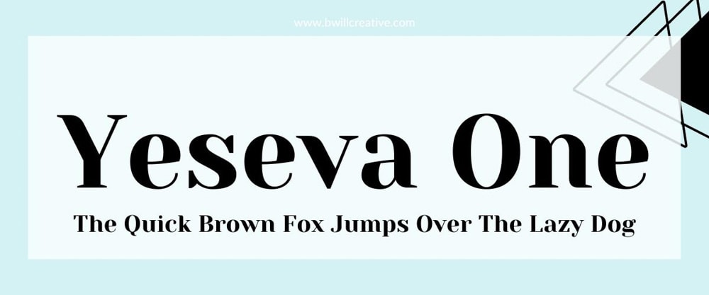
One of the standout features of Yeseva One is its overall balance and proportions. Many letters have a distinct curve/flourish, giving your logo a consistent feel. This type of logo font works for places that serve gourmet cuisine, wedding planners, and home decor companies.
16. Merriweather
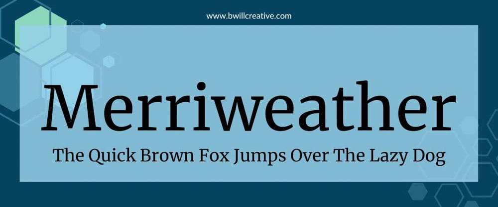
Merriweather’s well-defined letterforms ensure your brand’s name or tagline is easily readable. Merriweather has a classic aesthetic with a traditional yet contemporary charm. Some of the classic types of logos that work best with Merriweather are book publishers, newspapers, law firms, and consulting agencies.
17. Shrikhand
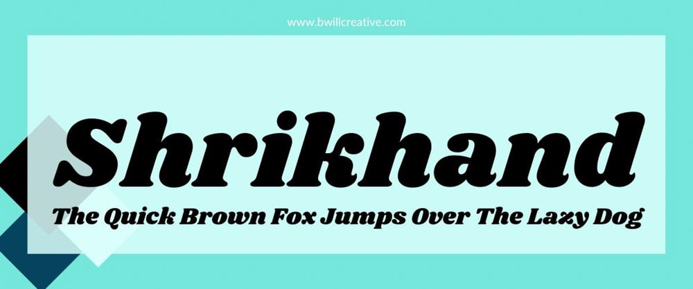
Shrikhand is a bold font that’s unapologetic in how much attention it can grab. This type of font is guaranteed to stick in your audience’s mind when they think about your logo. The versatility of this font makes it work for everything from a motorcycle brand to a technology company.
18. Alta Light
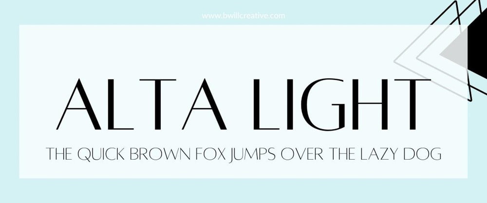
Alta Light is a minimalist font with good letter spacing that’s sophisticated enough to work for luxury brands, upscale businesses, and industries that value elegance. Some logos that work best with Alta Light are fashion and apparel, beauty and cosmetics, and the wedding industry.
19. Text Me One
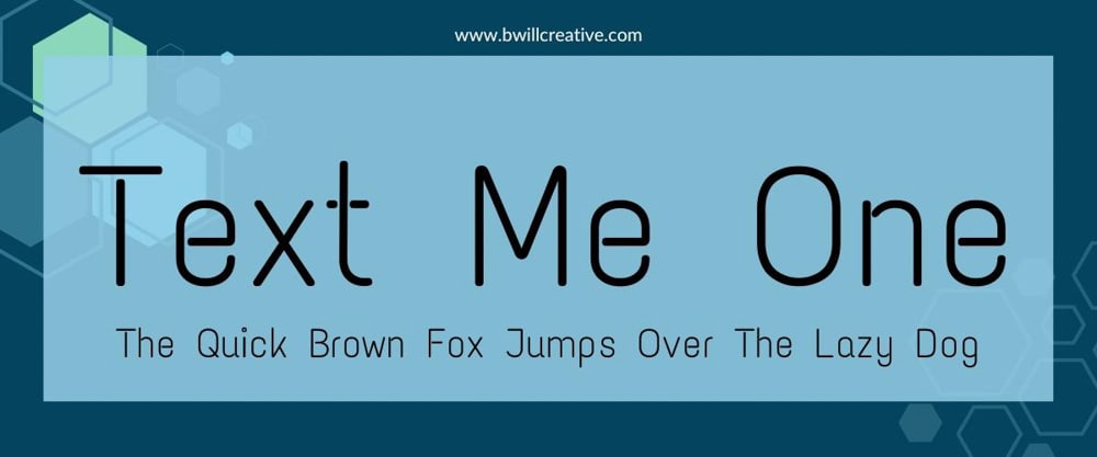
Text Me One is a modern font that can bring a digital flair to your logo. Due to its relatively thin frame with each letter, Text Me One is best used for online purposes. This font works exceptionally well for a logo in the technology field.
20. Nunito Sans
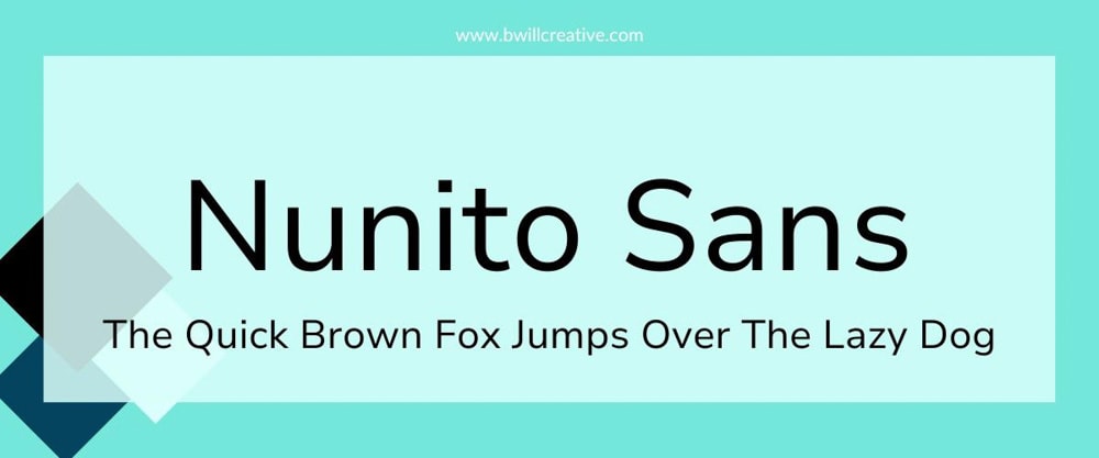
Nunito Sans is a clean and modern font with high legibility and versatility. Nunito Sans comes in a wide range of weights and styles you can also use for your logo. This font can be used with everything from technology startups to tutoring services and e-learning platforms.
21. HK Modular
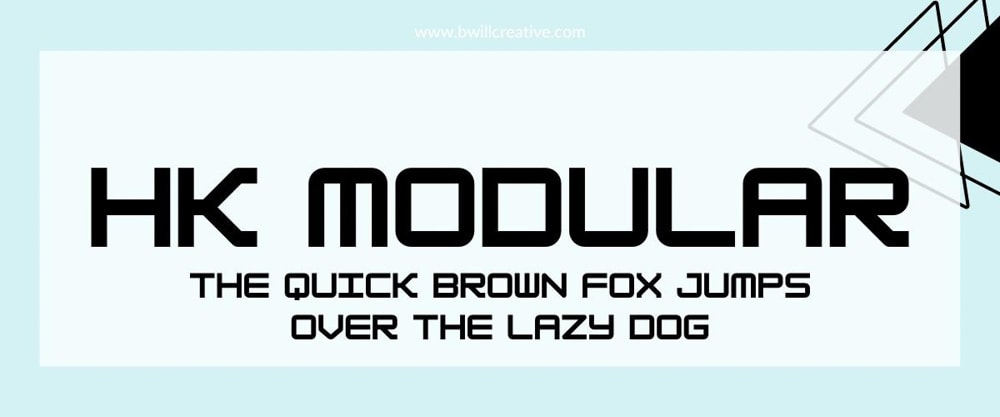
HK Modular is a display font that features a mechanical structure to it. The font has enough weight to be legible for a large sign or a business card . If you have a business in the tech field, this font should be highly considered.
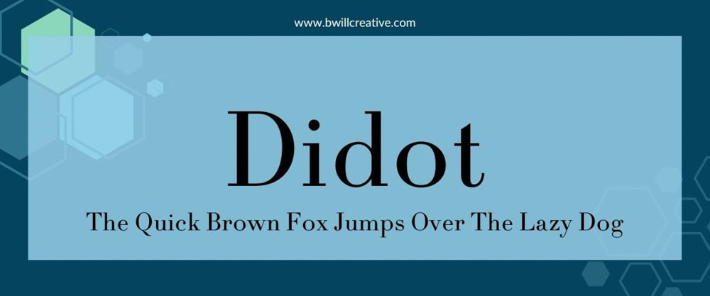
Didot is an elegant and sophisticated font with thin, delicate letterforms with high contrast between thick and thin strokes. This contrast gives Didot a refined and luxurious feel, making it a perfect logo font for high-end fashion brands, jewelry brands, and watchmakers.
Didot is only available for Canva Pro users.
23. Inndam Extended
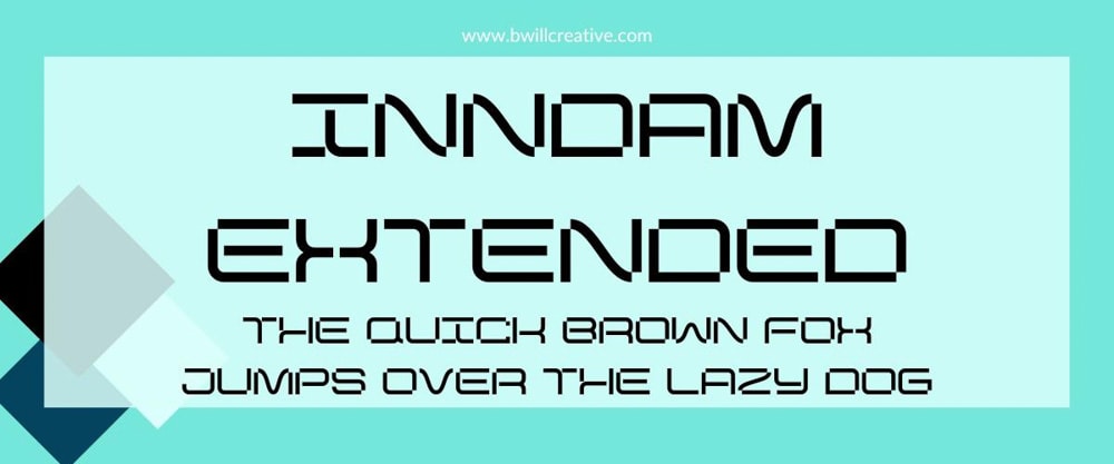
Inndam Extended is a font that feels right at home in the world of sci-fi and robots. It’s best used online; remember that the smaller the logo is, the less legible the font will be. Inndam Extended is great for any business in the tech field.
24. Abril Fatface
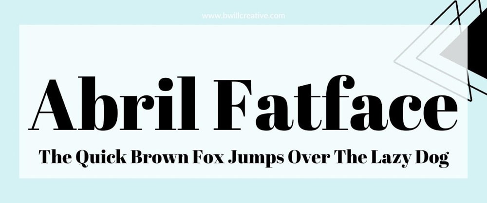
Abril Fatface is a bold and eye-catching font with a lot of personality. There’s a slight retro vibe to this font that can help bring a distinct visual style to your brand. The feel of this font works for classic and vintage-themed businesses such as retro clothing stores, antique shops, and vintage-inspired cafes.
25. Racing Sans One
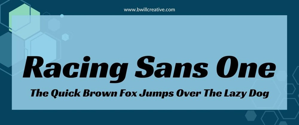
Racing Sans One is a bold, slightly slanted font that gives your logo a sense of speed. The font itself is very legible, and it’s bold enough to grab attention. This font is best used for delivery and automotive services.
26. Josefin Sans
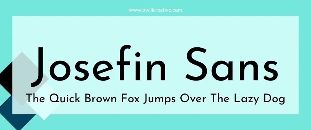
Josefin Sans is a sleek and minimalistic font that’s highly legible. The font has a geometric elegance, making it suitable for brands that value simplicity and sophistication. A logo made with this font would work well for fashion brands, technology startups, or even artisanal and handcrafted products.
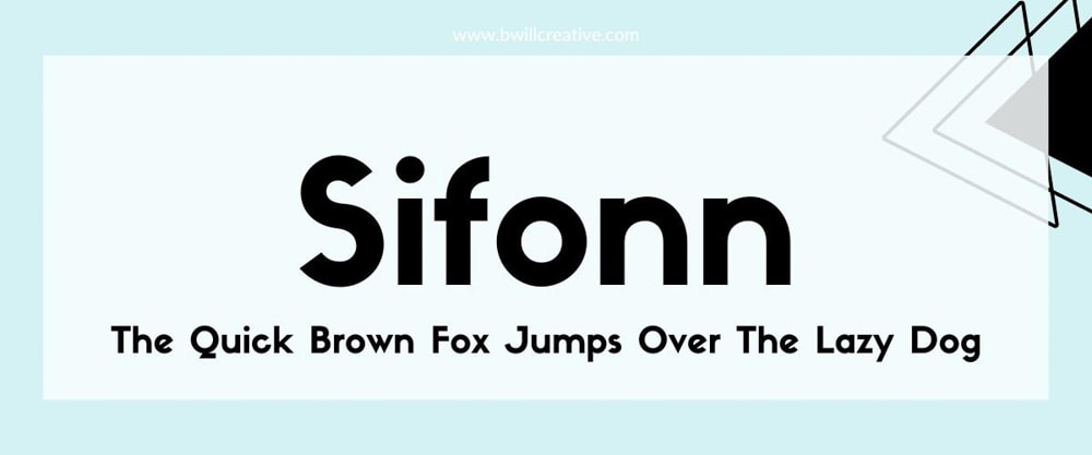
Sifonn is a bold font that feels like a fusion of modern and retro aesthetics. Sifonn is reminiscent of old-school Art Deco typography and works for a logo in beauty and cosmetics, jewelry and accessories, and hospitality and luxury services.
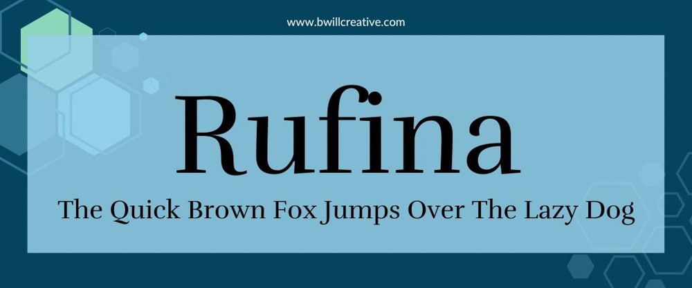
Rufina is a legible font that promises quality for your company’s logo. The one downside of this font is the spacing issue that pops up when certain letters are next to each other (like the lowercase “f” and “i”). If that doesn’t bother you, Rufina will work well as a logo for restaurants, resorts, art showcases, and wedding services.
29. Limelight
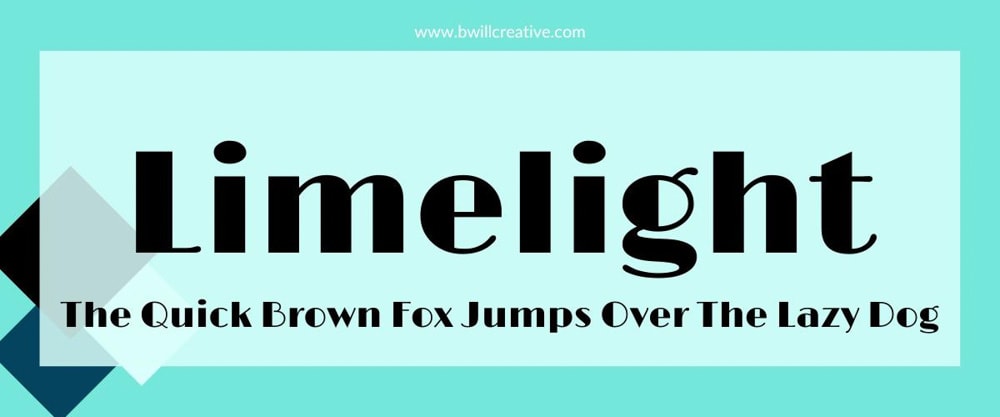
Limelight is a bold typeface inspired by 1920s Hollywood that will bring glamor to your logo. This font works well for printed and online purposes and is perfect for any business where you make your customers feel like superstars.
30. Kollektif

Kollektif is a clean and minimalistic font that can work with many different types of brand aesthetics. Kollektif is very legible and can be used to make a logo for everything from a gym or fitness studio to marketing agencies or almost any online retailer.
31. Vast Shadow
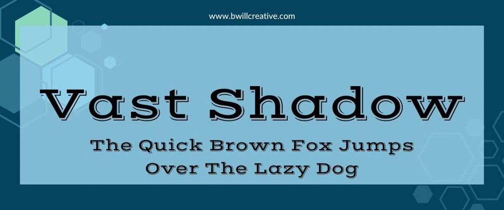
Vast Shadow is a display font with a built-in shadow that surrounds it. Remember that you won’t be able to adjust or remove the built-in shadow if you choose this font for your logo. You can use this font if you’re uncomfortable adding your own shadow to a Canva font.
32. Playfair Display
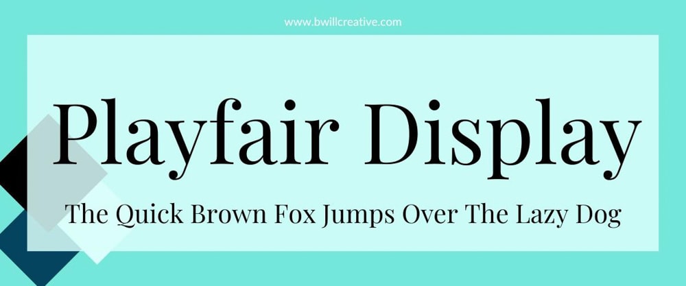
Playfair Display has a classic and sophisticated appearance with its delicate serifs and graceful curves. Choose this font to evoke a sense of heritage, craftsmanship, or premium quality—a perfect fit for cosmetics and beauty, fine dining, high-end retail, and luxury brands.
33. Fredoka One
Fredoka One is a playful and fun font that gives your logo a warm and inviting feel. Fredoka One works especially well for digital logos for websites, social media profiles, and mobile apps. This font is also perfect if your company involves a children’s brand, such as a kids’ clothing store, children’s books, or daycare centers.
34. Pacifico
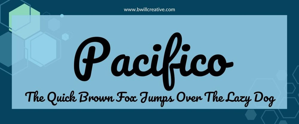
Pacifico is a casual and relaxing font with handwritten appeal. This font was made for creative endeavors in the beach and tropical theme variety. This makes Pacifico a perfect font for a logo with beachwear brands, travel companies, wellness centers, yoga brands, and cafes.
35. Odibee Sans
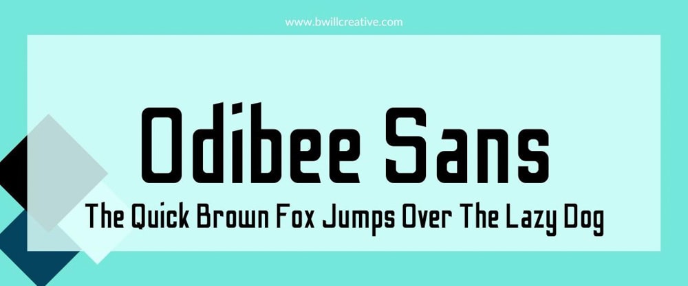
Odibee Sans is a uniquely shaped font with slightly slanted letters. This is the type of font you want to check out if you need something that feels traditional yet has a bit of jazz to it. This font works well for a logo based in the music industry, the clothing industry, and the entertainment industry in general.
36. Bakerie Thin
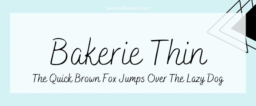
Bakerie Thin is a thin font that gives the impression of delicacy and precision. This font is ideal for minimalist branding strategies when it comes to your logo, as it may not grab a lot of attention. However, when you need a subtle font for a logo, Bakerie Thin will work well for an artisanal food company, a handmade crafts brand, a boutique retail store, or a bakery.
If none of these fonts work for your logo, you can add a font to Canva to use in your projects. But either way, you hopefully now have a few great logo font ideas for your new logo!

Continue Reading:
How To Create Adjustment Presets In Photoshop
How To Use The Marquee Tool In Photoshop
How To Crop A Layer In Photoshop (3 Simple Methods)
How To Use Generative Remove In Lightroom – Complete Guide
What Are Embedded Previews In Lightroom + How To Use Them
Adobe Lightroom System Requirements For Mac & PC
How To Outline An Image In Canva
How To Add A Border In Canva (To Images, Shapes & Text!)
How To Make A Background Transparent In Canva

As an Amazon Affiliate, I earn from qualifying purchases. Brendan Williams Creative also participates in affiliate programs with Impact, Clickbank, CJ, ShareASale, and other sites.
Student Login
329 Howe Street #1413 Vancouver, BC V6C 3N2 Canada
[email protected]
Mon to Friday 9:00 am to 5:00 pm
Privacy Policy
Terms & Conditions
Refund Policy
Cookie Policy
Home Blog Design 8 Best Canva Alternatives for Presentations in 2024
8 Best Canva Alternatives for Presentations in 2024

Canva is credited with being the go-to platform for creating graphic design projects. We can make banners, infographics , social media posts, business cards, and, why not, presentations. The main problem users tend to find is that due to Canva’s extensive reach worldwide, creating presentations in Canva becomes repetitive—almost as if the same person built all slide decks.
Pricing and tool capabilities are also important, especially when comparing Canva to a dedicated presentation software such as PowerPoint. In this article, you will find what, in our experience, are the best Canva alternatives—not just websites like Canva—to create professionally designed slide decks for your presentations. Some of these tools will be standalone applications, others third-party add-ins for existing software. Without further ado, let’s get started.
Table of Contents
What is the Best Alternative for Canva?
7 extra alternatives to canva, what platform is better than canva, could i use canva for business purposes, is there a more professional version of canva, final words.
As presenters, we require specific features or functionalities to craft different kinds of slides. SlideModel stands out as the number one Canva alternative, especially if you want to create polished, data-rich presentations.
SlideModel’s library contains over 50,000 PowerPoint and Google Slides templates, including diagrams , charts , timelines , infographic templates , icons , and so much more. They cater to business professionals, educators, hobbyist presenters, and anyone who needs to communicate a message in a visual format. All this while retaining full control of the graphic and text assets so users can work with pre-designed slide layouts that can be customized in the blink of an eye.
Saving Time and Effort with Pre-Designed Slide Layouts
Imagine you need to deliver a presentation about the results of your company’s expansion strategy in an emerging market. Rather than populating your slides with hard-to-read text walls, you can use infographic slides, maps, and diagrams to express the data you gathered in an easy-to-understand format.

This kind of visual communication technique aims for maximum efficiency when delivering information to an audience, not assuming their potential knowledge level on the topic. Complex data can be transformed into a series of customizable graphics, which can even be repurposed for updates on the same topic or to present to a different audience.
Don’t Work from Scratch – Mix and Match PPT Templates
One of the main advantages of using professional PowerPoint templates is that you are in charge of which graphics you want to integrate into your slide deck. For instance, you can find a powerful diagram that’s exactly what you need, but it doesn’t bear the same aesthetic as your previous slides. Presentation software like PowerPoint easily allows us to copy/paste slides and apply a common presentation theme to reach a cohesive design.

This degree of customization offered by SlideModel takes the burden off of designing slides from scratch. It’s a mere question of finding the graphics you need to tell your story and merging them into a common PPT theme. In this way, countless hours of designing your layouts get reduced to minutes, allowing users to focus on the content and the presentation speech.
Compatibility Across Multiple Platforms
If you were concerned that your presentation software isn’t PowerPoint, then put that worry to rest, as SlideModel products are compatible with Google Slides and Keynote. Each and every product available at SlideModel.com gives accurate information about their compatibility, with over 80% of its catalog being fully compatible with other presentation software (only complex shadow effects, complex shape placeholders, and some animation effects may not be available in other software, hence the reason why it won’t display the compatibility).

SlideModel’s designers know presenters’ needs, especially when securing compatibility for a presentation delivered on a different device than your personal computer. That’s why you won’t find hard-to-come-by font families, premium images to buy, and any other restrictions platforms like Canva throw on users. Any element of the slide deck is entirely editable, giving users a smooth experience regardless of the computer, operating system, or presentation software of their choice.
AI Tools for Presenters
If all the perks we’ve mentioned weren’t enough, SlideModel recently launched its Gen-AI presentation software, SlideModel AI , targeting users who strive to populate their slides with content. This project is driven by users’ feedback, especially those who must create presentations in a hurry and may feel blocked when it comes to picking a design, making their presentations shorter, or just needing guidance to start their work.

SlideModel AI is an intuitive tool that integrates LLM technologies and AI image generation. Users simply select the number of slides, give the tool a detailed prompt to generate the presentation’s outline, select the design to apply, and that’s it. A presentation is crafted in a matter of a couple of minutes – which is also fully customizable and can be further edited in presentation software like PowerPoint or Google Slides.
A Free Canva Alternative
If you don’t want to commit to a subscription or you’re looking for Canva alternatives free, SlideModel also offers a library of free PowerPoint templates covering a wide range of topics. These products were made for presenters by seasoned presenters, so you won’t feel held back by not having a premium subscription. This is ideal when you’re on a tight budget and need to bring a project to life with a powerful presentation.

If all this isn’t enough, you can learn about the most common questions asked by presenters in fully detailed guide formats through the SlideModel blog . PowerPoint and Google Slides how-to articles, detailed case studies with slides, how to prepare and present specific kinds of talks, and so much more.
Get to know seven different apps like Canva that can do wonders for your presentations. Some of these tools are intended for graphic designers, but with the proper learning time, you can master these tools and go beyond the limits of your imagination when creating new slides.
When we need to deliver a presentation in a non-sequential format, Prezi is the tool to use. It allows users to create zoomable presentations that allow for a more dynamic storytelling experience.
Prezi’s interface is built around the concept of a large canvas on which you can place all your presentation content. Instead of moving from slide to slide linearly, Prezi allows the presenter to zoom in and out of specific canvas sections. This feature is handy for presentations where flexibility in content delivery is key, as it allows users to explore ideas more organic and non-sequentially.
- Visual Engagement: Zooming in and out of different areas of the canvas helps highlight key points and can leave a lasting impression, making it ideal for presentations where engagement is a priority.
- Cloud-Based: Like Canva, Prezi is cloud-based, which means users can create, edit, and present their materials from anywhere with internet access. This offers convenience, especially for users who travel frequently or work remotely.
- Collaboration: Prezi allows for real-time collaboration, meaning multiple team members can work on the same presentation simultaneously, similar to Canva’s team collaboration feature.
- Limited Design Capabilities: Prezi primarily focuses on presentation design, which means it lacks the broader design features offered by Canva or other presentation software.
- Subscription Costs: Prezi offers a free version, but its more advanced features, such as offline access, branding options, and analytics, are only available with paid subscriptions. While Canva also offers paid plans, its free tier is more feature-rich, making Canva a better choice for users who want more flexibility without upgrading to a paid plan.
- Overwhelming Effects: While Prezi’s zooming feature is visually appealing, it can be overused, causing dizziness or distraction for some audiences.
Adobe Express
This application, formerly known as Adobe Spark, is a direct competitor to Canva in terms of tools and usage. As part of the Adobe family, it integrates well with other Adobe products, so it’s ideal for creative professionals who need to create graphics for different channels, such as social media and presentations.
Like Canva, Adobe Express provides users with an easy-to-use interface, a library of templates, and customization options for creating social media graphics, flyers, presentations, and more. However, Adobe Express distinguishes itself with some unique features and integration within the Adobe Creative Cloud suite, giving it an edge for certain users, especially those needing advanced photo editing, typography control, and branding options.
- Integration with Adobe Creative Cloud: One of the standout advantages of Adobe Express is its seamless integration with other Adobe tools like Photoshop, Illustrator, and Lightroom. This integration allows users to easily transfer assets between platforms, making it a great choice for those who may want to tweak images in Photoshop or create vector elements in Illustrator and then import them into Adobe Express for simpler, quick design tasks.
- Advanced Photo Editing Features: While Canva offers basic photo editing tools, Adobe Express provides more advanced features for editing images. Users can adjust brightness, contrast, saturation, and more with greater precision. Adobe Express offers a simplified solution for those requiring more detailed photo adjustments but don’t want to switch between multiple platforms.
- Custom Branding: Adobe Express allows users to create custom branding kits, including logos, fonts, and color palettes, which can be applied consistently across all designs. This is especially beneficial for businesses that need to maintain a cohesive brand image across multiple types of content, from presentations to social media graphics.
- Subscription Model: While Adobe Express offers a free plan with basic features, many more advanced features, such as additional templates, branding kits, and premium fonts, are only available through the paid subscription plan.
- Learning Curve for Adobe Tools: While Adobe Express is designed to be user-friendly, the broader Adobe ecosystem may have a steeper learning curve for those unfamiliar with Adobe’s software. Users accustomed to the simplicity of Canva might find Adobe Express slightly more complex due to its Adobe Creative Cloud connections and more advanced features.
- Limited Offline Access: Like Canva, Adobe Express is a cloud-based platform, meaning an internet connection is required to use the service. For users who need to work offline or in areas with limited connectivity, this can be a drawback.
CorelDRAW is an industry-standard vector graphics editor that serves as an excellent Canva alternative for users who need more advanced graphic design capabilities. While Canva is great for basic design needs and offers an intuitive, template-driven approach, CorelDRAW gives users far more control over every aspect of their design, making it particularly useful for professionals and businesses looking for custom presentation designs.
- Custom Design Flexibility: Unlike Canva’s template-driven approach, CorelDRAW offers total creative freedom. Users can start with a blank canvas and design every detail from scratch. This flexibility is ideal for professional designers and businesses that need unique, custom visuals not bound by pre-set templates. You have more control over every element, from shapes and colors to typography and layout, providing greater creativity.
- Multi-Page Layout Capabilities: CorelDRAW is also equipped with tools for creating multi-page documents like brochures, magazines, and catalogs. Canva, while user-friendly, does not offer the same level of functionality when it comes to handling complex layouts, making CorelDRAW a better choice for businesses that need detailed printed materials with multiple pages.
- Professional Photo Editing: CorelDRAW includes Corel PHOTO-PAINT, a powerful photo-editing software. This allows users to perform detailed image retouching and manipulation within the same suite. Canva offers basic photo-editing features, but they pale in comparison to the professional tools available in CorelDRAW. If you need to combine high-quality photo editing with graphic design, CorelDRAW is a better option.
- Instability: CorelDRAW is famous across the graphic design community for its erratic behavior, particularly when working with heavy-sized files containing numerous layers. This can cause Corel Draw to crash randomly when trying to save a file or because it triggers a RAM overload.
- Overkill for Simple Projects: For users who only need to create basic designs like social media posts, posters, or presentations, CorelDRAW may be overkill. Its robust feature set is unnecessary for simple, template-based designs that Canva handles quickly and easily. Canva’s drag-and-drop interface and vast template library make it better suited for users with minimal design needs or tight deadlines.
- System Requirements: Current versions of CorelDRAW may be taxing on RAM, video graphics card, and processor requirements, which can limit its usability on older computers.
Affinity Designer
Affinity Designer is another strong Canva alternative, particularly for users seeking professional vector design tools without the cost of a monthly subscription. Unlike Canva, which is based on templates and offers limited control over design elements, Affinity Designer allows users to create custom graphics and presentation elements from scratch.
It is ideal for professional designers, marketers, and businesses needing complete control over visual elements. It’s perfect for users who must create custom illustrations, icons, or other graphics for presentations without relying on pre-made templates. Its affordability and advanced tools make it one of the best alternatives to Canva for those needing more flexibility.
- Cross-Platform Compatibility: Affinity Designer works on macOS and Windows and even offers a mobile version for iPads. This cross-platform functionality provides flexibility for designers working on their projects from different devices. Canva, though cloud-based and accessible from any device, doesn’t offer the same level of offline editing capabilities that Affinity Designer provides through its desktop and iPad apps.
- Precision and Performance: Affinity Designer is designed for professional-level precision, offering advanced features like gradient controls, Boolean operations for shapes, and precise alignment tools. These features enable designers to create intricate and polished designs with ease. Additionally, Affinity Designer is known for its smooth performance, even with large files or complex projects, something Canva struggles with when handling high-resolution or intricate graphics.
- No Subscription Model: One of the biggest advantages of Affinity Designer over Canva (and Adobe Illustrator) is its pricing structure. Affinity Designer offers a one-time purchase model, providing users with a full suite of design tools without needing a monthly or annual subscription. This can be a significant benefit for users seeking a powerful design tool on a budget compared to Canva’s subscription-based pricing for premium features.
- Not Cloud-Based: Affinity Designer is a desktop application, meaning it does not offer the cloud-based functionality that Canva does. Canva allows users to access and edit their designs from any device with an internet connection. At the same time, Affinity Designer requires the software to be installed on each device, with no cloud-based collaboration features. This could be a drawback for teams or users who prefer real-time collaboration.
- Limited Collaboration Features: Canva offers robust collaboration tools that allow multiple users to work on the same design in real-time, making it great for teams or collaborative projects. Affinity Designer, while powerful for individual use, lacks this built-in collaborative functionality. For users who frequently collaborate with others, Canva’s team features may be more appealing.
Adobe Illustrator
Adobe Illustrator is another powerful Canva alternative for users who need high-quality, scalable vector graphics. While Canva is ideal for simple, quick designs, Illustrator provides industry-standard tools for creating custom, intricate designs, making it a favorite among professionals who need more flexibility and precision.
Adobe Illustrator offers detailed control over every design aspect, including vectors, shapes, typography, etc. This makes Illustrator the preferred tool for users who need to create logos, icons, and custom illustrations inside their slides.
- Advanced Vector Editing: One of Illustrator’s main advantages over Canva is its ability to create and edit vector graphics. Vector images are scalable, meaning they can be resized without losing quality, which is essential for projects like logos, icons, and print materials. Canva primarily works with raster-based images, which can become pixelated when resized. Illustrator’s vector editing tools offer complete flexibility and precision, making it ideal for professional design work.
- Custom Typography: Illustrator provides advanced typography tools that allow designers to precisely create and manipulate text. Users can customize fonts, add effects, and control spacing, kerning, and alignment in ways that Canva’s text tools cannot match. This is essential for branding projects where typography plays a key role in conveying the brand’s identity.
- Steep Learning Curve: Adobe Illustrator is a professional-grade tool with a much steeper learning curve than Canva. Due to its vast array of tools and features, users with no prior design experience may find Illustrator overwhelming. Canva, on the other hand, is much easier to use and is designed for users of all skill levels.
- No Ready-Made Templates: Illustrator doesn’t provide ready-made templates, unlike Canva, which offers thousands of templates for quick designs. Everything is created from scratch, which can be time-consuming for users who need to produce designs quickly.
For users who want to create presentations focusing on data and storytelling, Piktochart is another fantastic option among Canva alternatives. Piktochart specializes in infographics and visual storytelling, making it one of the top design sites like Canva, but with more emphasis on data visualization.
- Ease of Use: Piktochart’s intuitive interface is very similar to Canva, making it easy to pick up for users who are familiar with design platforms. You don’t need to have graphic design skills to create polished visuals.
- Flexible Templates: Like Canva, Piktochart offers a variety of templates that you can easily modify to fit your needs. However, its library focuses more on infographics and data-driven visuals, making it a better choice if that’s your primary focus.
- Fixed Layouts: While Piktochart offers pre-built templates for ease of use, the layouts are often rigid, making it harder to fully adapt designs to specific needs without distorting the overall aesthetic.
- Limited Animation Options: Piktochart lacks robust animation features, making it unsuitable for users looking to create animated presentations or highly interactive designs.
Movavi Video Editor
While Movavi Video Editor and Canva are both tools aimed at creators, their core functionalities differ. Canva focuses on graphic design, allowing users to create images, social media posts, presentations, and various visual content, while Movavi is specifically designed for video editing. If you’re looking to create video content rather than still images, Movavi Video Editor serves as a strong alternative to Canva when your focus shifts from static designs to dynamic, engaging video content.
Movavi Video Editor is a beginner-friendly yet feature-rich tool for video creation and editing. It’s perfect for individuals and businesses that need to create professional-looking videos without diving into overly complex software. With Movavi, users can create polished video presentations , promotional clips, tutorials, and other visual content quickly and easily.
- User-Friendly Interface: Like Canva, Movavi Video Editor is designed for ease of use. Its intuitive drag-and-drop interface makes it easy for beginners to get started, even if they have no prior experience with video editing. The platform’s simplicity is comparable to Canva’s ease of use for graphic design, making it accessible to a wide range of users.
- Comprehensive Video Editing Tools: Movavi offers a vast selection of video editing features, including trimming, cutting, joining clips, adding transitions, and applying filters. While Canva allows users to add basic animations and create simple videos, Movavi provides more control over the timeline and more advanced video editing capabilities, such as working with audio tracks, adjusting video speed, and adding special effects.
- No Cloud-Based Collaboration: Unlike Canva, which operates as a cloud-based platform, Movavi is a desktop application. This means users cannot easily collaborate in real-time or access their projects from multiple devices unless the software is installed on each one. Canva’s cloud-based approach is more convenient for team collaboration and remote access.
- Watermark in Free Version: The free version of Movavi Video Editor comes with a watermark on exported videos, which can be a drawback for businesses or individuals looking to create professional content without branding limitations. Users would need to upgrade to the paid version to remove the watermark, which is similar to Canva’s limitations in its free plan.
The answer to this question entirely depends on the niche in which you work. If you are a creative professional, some of the tools mentioned in this article, like Adobe Illustrator, Corel Draw, and Affinity Designer, are by far more proficient tools to create jaw-dropping graphics. On the other hand, if you lack a graphics design education and just need software to make your presentations, we highly recommend you work with either PowerPoint or Google Slides paired with SlideModel templates for static graphics or Movavi Video Editor for video presentations.
Yes, Canva is an excellent tool for business purposes, especially for small businesses, marketers, and professionals who need quick, visually appealing designs without advanced design skills.
Canva’s user-friendly interface, assets library, and versatility make it an ideal platform for creating various business assets such as presentations, social media graphics, marketing materials, and business cards. Still, users need to consider that some of Canva’s features are restricted to Canva Pro, such as resizing designs to other outputs, images, typefaces, templates, and more.
While Canva Pro offers several features aimed at businesses and advanced users, more professional design platforms are available that provide greater control and more advanced capabilities. Adobe InDesign, for instance, is a more professional tool than Canva, specifically designed for creating layouts, print designs, and publication-quality documents. For users who need precision in their designs and work in industries like publishing, marketing, or graphic design, InDesign offers far more versatility and control than Canva.
Adobe InDesign is widely regarded as the industry standard for desktop publishing. It’s particularly powerful for creating multi-page documents, such as brochures, magazines, and annual reports, where layout consistency and precision are critical. InDesign offers many advanced tools, including paragraph styles, master pages, and advanced typography options, making it ideal for users who need professional-quality layouts. Unlike Canva, which is template-based and geared toward simplicity, InDesign gives users complete freedom to design from scratch, offering fine-tuned control over every element.
For businesses or professionals working in content creation, advertising, or publishing, InDesign is a more professional choice than Canva. It integrates seamlessly with other Adobe Creative Cloud applications, allowing a smooth workflow between tools like Photoshop and Illustrator. This makes it easier for designers to incorporate complex graphics, retouched images, or custom illustrations into layouts. InDesign also supports high-resolution output, making it ideal for creating print-ready documents.
Another option for professionals seeking a more advanced tool than Canva is Affinity Designer or Affinity Publisher. Both provide high-quality design tools at a more affordable price point. Affinity Publisher is an excellent alternative to InDesign, offering professional-grade publishing tools with a one-time purchase model, making it an affordable yet powerful option for businesses.
As we can see, there are multiple options for creating a powerful workflow for presentation design. Most of these applications will be strictly tied to your graphic design skill levels, but all of them can be approached if you give them enough time to learn their basic functionality.
Additionally, you can learn more about how to use Canva and PowerPoint for presentations and how to convert Canva to Google Slides . The linked article is a comprehensive guide on our experience and how to maximize compatibility within both platforms in terms of graphic assets.
Like this article? Please share
Design, Presentation Approaches Filed under Design
Related Articles

Filed under PowerPoint Tutorials • September 9th, 2024
How to Convert Illustrator to PowerPoint
Extract powerful graphics and integrate them into your presentation slides. Learn how to convert Illustrator to PowerPoint with this guide.

How to Convert InDesign to PowerPoint
Repurpose your indd files as presentations by learning how to convert InDesign to PowerPoint. Step-by-step guide for Windows and Mac users.

Filed under Google Slides Tutorials • September 3rd, 2024
How to Download an Image from Google Slides
Extract high-quality graphics from presentations by learning how to download an image from Google Slides. Step-by-step instructions.
Leave a Reply
The best fonts for thumbnails
21 classic typefaces certain to make your thumbnails stand out.

Thumbnails demand a lot from design; accurately depicting a sometimes complicated message through a tiny rectangle and only a few large words can be challenging. A thumbnail may feel like a limiting design brief, but the fonts we’ve put together at Creative Bloq widen the possibilities of a thumbnail and make that tiny rectangle suddenly feel like a limitless opportunity. The text is often the most prominent aspect of a thumbnail that stands out the most, and the font choice can define the entire tone, which means it’s crucial to find just the right choice of typeface to effectively depict your message.
Whether you’re designing a thumbnail for a YouTube video, an Instagram Reel, a blog post or even an article, these 21 fonts offer a way to make only a few small words make a big impact. Our guide to free web fonts also has you covered for the rest of your online design font choices, and if you need even more free fonts, make sure to check out our ultimate list of free fonts , which compiles all the free typefaces you might need.
1. Bebas Neue
Why you can trust Creative Bloq Our expert reviewers spend hours testing and comparing products and services so you can choose the best for you. Find out more about how we test .

• Cost: Free
• Download from DaFonts
A clean and sleek typeface, Bebas is a font certain to help any project look put-together and professionally designed. It’s even used often for graphics in television, as its thick strokes are decisive and impactful, making it perfect for a concisely designed thumbnail intended to make a clear statement.

• Download from Font Download
If you’re looking for a font that effectively delivers your message with briefer words and large text, Impact delivers exactly what its name promises. Originally created in 1965, it’s now owned by Monotype – an infamous fonts company whose ownership proves the ubiquity and effectiveness of Impact.
3. Avenir (black oblique)

• Cost: £42.99
• Buy from My Fonts
Avenir is possibly one of the largest font families out there, with six different weights all available in their regular styles as well as in 'oblique'. This means it’s used in popular graphics far more often than you might notice at a glance. Avenir in 'black oblique' is often used for text designed to reflect old-fashioned film subtitles, and it also features heavily in the thumbnails of lifestyle vloggers and short film creators as it’s a font that reads clearly at all sizes as well as delivers effortless style and a beauty that mixes the old fashioned with the clear and modern.
4. Obelix Pro

• Download from Font Meme
You’ll recognise this font from its use on the thumbnails of mainstream YouTubers targeted at teen audiences. Channels that use this font in their thumbnails usually make content that performs extremely highly in the algorithm, so if you’re making a video you want to pick up a few views, the familiarity of this font and its associations with easy-to-watch content has a good chance of helping you go viral.
5. Futura PT

• Cost: Free (with Adobe subscription)
• Download from Adobe Fonts
Futura is a font that’s featured in the logos of many household brands, and has even got itself a place on a sign on the moon. Future PT is a slight reworking of Futura that ensures a touch more consistency across every letter. Futura’s strokes aren’t too thick but cut a definite line with a slight curve that creates incredibly readable and friendly text, with endless options for using it to make your own piece of distinctive typography, given its use across so many companies. Its international success and usage make it a safe and excellent font choice for a small thumbnail that relies on the text.

• Download from DaFont
If sans serif fonts had been around in the 1920s, Agency would have taken over the decade. Its slimmer but striking strokes boast large x-heights and low y-heights to go with the large curves this typeface consists of. It’s perfect to use for a noticeable piece of text in a thumbnail that you want to inject a bit more style into. This one would work especially well at a smaller size in the context of landscape-based backdrops.
7. Coolvetica

Another striking sans serif font, Coolvetica is a bold set of lettering that would function well at all sizes, especially medium and small. Its letters are made up of thick strokes that again, are incredibly curved, but are significantly more compressed than those of Agency. Some of its lines are especially distinctive, noticeably the ‘t’, the ‘q’ – the ‘q’ especially with the contrast of its straight strokes with its over-expressed curves.
8. Lovecraft

Lovecraft’s masterful style is already a finished piece of typography before you’ve even got to work on it! This decorative, all-caps font is made up nothing but large, chunky serifs, and would work perfectly for a feminine and more casual, personal touch to a thumbnail.
9. Phosphate

• Cost: £46.98
Phosphate presents as a sans serif version of Lovecraft. Its all caps letters are just as thick and intense, but creates something more to-the-point and sans frills as it looks as though its letters have been designed geometrically.
10. Paparazzi

Paparazzi is equipped for the essentials with an all-caps typeface including only a few key punctuation marks, making it ideal for an eye-catching short, snappy title on a thumbnail. With the use of some bold RGB colours, it would work well at a large size, as its squared-off strokes are designed to make a colourful statement.
11. Open Sans (condensed bold)

Open Sans is a large font family consisting of numerous different weights and variations, but its ‘condensed bold’ variation is ideal for thumbnails. It’s another sans serif typeface that’s built on rounded letters rather than geometric, and its condensed nature means it features excellent legibility and makes it perfect for fitting more text into a smaller space.
12. Reflex Pro

The example image of Reflex Pro on Adobe fonts shows the truly endless potential and flexibility of the typeface and its wide scope to be turned into a truly unique and recognisable piece of typography. It can be used as an ideal large text mask for a photograph or colour-based design, to make it stand out in a text-focussed thumbnail.
13. Campus MN

A geometric take on an American university-style design, Campus MN is a decorative font made entirely out of strokes outlining its letters – allowing a different colour or design to shine underneath your text. This adds the potential of extra layering to your design that will help to make it stand out.
14. Shantell Sans

Shantell Sans is a decorative font perfect for thumbnails titling education or learning-based content. It’s the sort of typeface we all need once in a while. It also fits the bill for more casual, personal projects, or projects aimed at younger audiences. Shantell Sans is ideal for a casual tone that still emulates professionally created, deliberate content.
15. ITC Franklin Gothic

Another excellent sans serif choice, ITC Franklin Gothic is a condensed font with lighter, far less intense lines than that of a choice like Paparazzi, but its condensed nature combined with unusually high x-heights make it a font that stands out and is safely clear from a distance and at smaller sizes.
16. Trade Gothic Next

Trade Gothic Next is not quite so condensed as ITC Franklin Gothic and features similarly lighter lines and large x-heights, but its rounded lines are wider than most and its x-heights are even higher than that of ITC Franklin Gothic, creating extremely rounded letters. The ‘o’, ‘d’ and ‘b’ make a particular impact with this feature, ensuring a thumbnail designed with clean lines that the brain responds well to.
17. Fabiola

This inventive font family on Adobe fonts includes the most decorative option, as well as an additional more demure version with far less pronounced serifs and fewer flourishes. The two fonts are designed to use their contrasts to work together to aid your design as a whole. Fabiola equips you with a more decorative option to fulfil your need for a legible but highly stylised font for your thumbnail, as well as with a clearer, far subtler accompaniment to use either for design purposes as a contrast to the first option, or even to serve as a second, more readable font, allowing you to not have to compromise on design for the sake of legibility.
18. HVD Poster Clean

A bit more out-there, this font holds connotations of marker pens and posters created using screen printing. This makes HVD Poster Clean an ideal match for a project on urban topics. This font would look especially great when styled with a few extra colour tweaks in Photoshop , over the top of a photograph relating to your project. This would be sure to make anyone notice a video, blog post or article in the urban genre.
MVB Diazo Condensed

MVB Diazo Condensed almost presents as a version of Paparazzi made up of lighter strokes. The rounded ends of its strokes connote tiny balloons or the titling of a felt tip pen, meaning that executed well, on the right thumbnail, this font could go far.
20. Adaptive Mono

A serif font designed to imitate the fonts that computer systems use, this is often used as the go-to font when designers need to create typography that imitates computer coding numbers. The ‘0’ and the ‘1’ especially imitate that infamous style. So if your thumbnail is titling anything about the digital, tech, computing or coding communities or industries, the exact imitation of Adaptive Mono's typeface will ensure your thumbnail catches eyes and is certified as excellent design work.
21. Droid Sans Mono

The text of Droid Mono is most effective for creating the effect the numbers have in the Adaptive Mono typeface. While the text of Adaptive Mono is made up of serif letters, its numbers create an infamous ‘coding’ look that no other font can imitate quite as effectively. However its letters are not quite as in-line with the look, which is where Droid Sans Mono comes in, and equips you with a full set of sans serif letters certain to match the numbers of Adaptive Mono.
Thank you for reading 5 articles this month* Join now for unlimited access
Enjoy your first month for just £1 / $1 / €1
*Read 5 free articles per month without a subscription
Join now for unlimited access
Try first month for just £1 / $1 / €1
Get the Creative Bloq Newsletter
Daily design news, reviews, how-tos and more, as picked by the editors.
Mabel is a freelance writer, artist and filmmaker. When she's not writing about the arts industry, books or culture, she's working on writing and illustrating her stories or developing experimental filmmaking projects. Working in journalism, poetry, documentary-filmmaking, illustration and fiction, storytelling is at the heart of what she does. She started writing articles in online magazines when she was seventeen. After training at the BFI Academy and then studying at UAL, she is now continuing to write articles while she works on creating and launching her first books and films.
Related articles

- 2 AceFast Z4 218W desktop power station review: a stylish solution for those juggling multiple power-hungry devices
- 3 6 ways AI can supercharge your small business branding
- 4 What's the best AI laptop for students?
- 5 Adobe Firefly AI video model looks genuinely useful
IMAGES
VIDEO
COMMENTS
Go To Canva ». 5. Oregano. Free or paid: Free. About: Oregano is a whimsical script font with playful curves, perfect for casual designs like greeting cards, cafe menus, or any project needing a retro touch. Go To Canva ». 6. The Seasons. Free or paid: Free.
1. Aileron With Canva Sans. Aileron is a sleek and modern sans-serif font that exudes professionalism and clarity, making it ideal for the body text in your presentation. Its clean lines ensure excellent readability. Pairing it with Canva Sans, which is known for its friendly and approachable character, creates a perfect balance.
02. Noto Serif. Canva plan: Free. Noto Serif is a popular font widely available for use in online settings, including in Canva's free plan. It's a serif font that's easy on the eyes and comes equipped in regular and bold on Canva's software. 03. Bebas Neue. Canva plan: Free.
Best Fonts in Canva for Presentations. 1. Bentham. Bentham is inspired by the lettering of nineteenth-century maps, gravestones, and the maker's plates of cast-iron machinery. It is characterized by expressive, flowing, and bulging curves, mannered awkwardness, and the bobbles on the terminals of its characters. 2.
1. Merriweather. Image Credit: Canva. Merriweather currently holds a prominent position as one of the top fonts on Canva. This professionally crafted serif font is incredibly versatile, making it an excellent choice for a wide range of design projects and creative purposes.
12. Playfair Display. Why it is a must-have Professional font: Playfair Display is an elegant serif font known for its high contrast and classic look. Its sophisticated design makes it suitable for presentations that require a touch of luxury and refinement, such as fashion, beauty, and lifestyle topics.
3. Margin + Marline. Free or paid: Free. About: The Margin and Marline font pairing combines a strong, contemporary sans-serif with a flowing script, perfect for modern professional designs that require a touch of elegance. Go To Canva ». 4. San Diego + Abstracted Dream. Free or paid: Free.
Bree Serif is a bold serif font that commands attention. The combination of robust strokes and assertive curves makes for an eye-catching aesthetic, perfect for any project that requires a powerful impression. This font's readability is also excellent, even in small sizes. 5. Espoir Serif.
Canva is a free-to-use online graphic design tool, and it's full of handy features that make designing things incredibly easy. Here, we've compiled ten of the best Text-based Canva fonts you should try, plus some hidden fonts in Photos and Elements you may not know about. 1. BD Sans Thin
Best Canva Fonts. 1. Verona. Feminine, elegant, and classy, this sans serif from epdesigns is ideal for logos, invitations, packaging, fashion, editorials, social media, and branding. Pair it with any sans or script to realize your vision. The lowercase features over 50 beautiful ligatures to ensure your works are unique and eye-catching.
With all that out of the way, let's look at the best fonts in Canva. 1. Alata. Alata is the first place we'll start in this list of the best fonts on Canva. The font is pretty standard, and it features a sleek design. This is an excellent starting point if you're looking for something that isn't fussy.
6. Aileron. Aileron is a classic typeface with powerful arches and curves that may be used to distinguish your headings, subheadings, and body material. The text should be placed in geometric, contrasting areas of your backdrop image for this Canva font to look perfect on design. 7.
Presentation Font #26: Dela Gothic One. Dela Gothic One is a thick and chunky font with a strong feel. It's ideal for headings on posters, packaging and in titles on presentations. This font has a lot of power and is best paired with a simple sans serif font or even a classic serif like Garamond for body copy.
Poppins is a clear, legible font, even in smaller sizes. This font ensures that your text will be easily readable for students and other teachers, whether used in a presentation, handout, or other classroom materials. 15. Norwester. Norwester is a strong, bold display font bound to catch your students' attention.
10 Best Masculine Fonts on Canva; Share Article: Tags: Best Fonts Canva Canva Fonts fonts. Chris Bryant. Hey, I'm Chris, a freelance UI/UX designer with 5 years of experience and the person behind Graphicpie. I enjoy sharing great fonts I've found and creating easy-to-follow tutorials for design tools like Canva, Krita, Figma, and more.
Best Canva Professional Fonts. 1. Georgia. Georgia is a web-safe serif font that combines readability with a touch of elegance. It's frequently used in web design and online content. 2. Avenir. Avenir is a versatile sans-serif font with a contemporary design. It's commonly used for both print and digital media.
Didot is only available for Canva Pro users. 23. Inndam Extended. Inndam Extended is a font that feels right at home in the world of sci-fi and robots. It's best used online; remember that the smaller the logo is, the less legible the font will be. Inndam Extended is great for any business in the tech field.
Canva is credited with being the go-to platform for creating graphic design projects. We can make banners, infographics, social media posts, business cards, and, why not, presentations.The main problem users tend to find is that due to Canva's extensive reach worldwide, creating presentations in Canva becomes repetitive—almost as if the same person built all slide decks.
The Drunken Hour font is one of the best Harry Potter fonts on Canva. It is characterized by highly irregular, wobbly, and strange strokes and letters. It gives off a haunted, magical feeling. Some of the letters have blotches on it to add an even spookier feeling. The tilted letters make it seem off balance.
A bit more out-there, this font holds connotations of marker pens and posters created using screen printing. This makes HVD Poster Clean an ideal match for a project on urban topics. This font would look especially great when styled with a few extra colour tweaks in Photoshop, over the top of a photograph relating to your project. This would be ...