Improve your practice.
Enhance your soft skills with a range of award-winning courses.

How to Structure your Presentation, with Examples
August 3, 2018 - Dom Barnard
For many people the thought of delivering a presentation is a daunting task and brings about a great deal of nerves . However, if you take some time to understand how effective presentations are structured and then apply this structure to your own presentation, you’ll appear much more confident and relaxed.
Here is our complete guide for structuring your presentation, with examples at the end of the article to demonstrate these points.
Why is structuring a presentation so important?
If you’ve ever sat through a great presentation, you’ll have left feeling either inspired or informed on a given topic. This isn’t because the speaker was the most knowledgeable or motivating person in the world. Instead, it’s because they know how to structure presentations – they have crafted their message in a logical and simple way that has allowed the audience can keep up with them and take away key messages.
Research has supported this, with studies showing that audiences retain structured information 40% more accurately than unstructured information.
In fact, not only is structuring a presentation important for the benefit of the audience’s understanding, it’s also important for you as the speaker. A good structure helps you remain calm, stay on topic, and avoid any awkward silences.
What will affect your presentation structure?
Generally speaking, there is a natural flow that any decent presentation will follow which we will go into shortly. However, you should be aware that all presentation structures will be different in their own unique way and this will be due to a number of factors, including:
- Whether you need to deliver any demonstrations
- How knowledgeable the audience already is on the given subject
- How much interaction you want from the audience
- Any time constraints there are for your talk
- What setting you are in
- Your ability to use any kinds of visual assistance
Before choosing the presentation’s structure answer these questions first:
- What is your presentation’s aim?
- Who are the audience?
- What are the main points your audience should remember afterwards?
When reading the points below, think critically about what things may cause your presentation structure to be slightly different. You can add in certain elements and add more focus to certain moments if that works better for your speech.

What is the typical presentation structure?
This is the usual flow of a presentation, which covers all the vital sections and is a good starting point for yours. It allows your audience to easily follow along and sets out a solid structure you can add your content to.
1. Greet the audience and introduce yourself
Before you start delivering your talk, introduce yourself to the audience and clarify who you are and your relevant expertise. This does not need to be long or incredibly detailed, but will help build an immediate relationship between you and the audience. It gives you the chance to briefly clarify your expertise and why you are worth listening to. This will help establish your ethos so the audience will trust you more and think you’re credible.
Read our tips on How to Start a Presentation Effectively
2. Introduction
In the introduction you need to explain the subject and purpose of your presentation whilst gaining the audience’s interest and confidence. It’s sometimes helpful to think of your introduction as funnel-shaped to help filter down your topic:
- Introduce your general topic
- Explain your topic area
- State the issues/challenges in this area you will be exploring
- State your presentation’s purpose – this is the basis of your presentation so ensure that you provide a statement explaining how the topic will be treated, for example, “I will argue that…” or maybe you will “compare”, “analyse”, “evaluate”, “describe” etc.
- Provide a statement of what you’re hoping the outcome of the presentation will be, for example, “I’m hoping this will be provide you with…”
- Show a preview of the organisation of your presentation
In this section also explain:
- The length of the talk.
- Signal whether you want audience interaction – some presenters prefer the audience to ask questions throughout whereas others allocate a specific section for this.
- If it applies, inform the audience whether to take notes or whether you will be providing handouts.
The way you structure your introduction can depend on the amount of time you have been given to present: a sales pitch may consist of a quick presentation so you may begin with your conclusion and then provide the evidence. Conversely, a speaker presenting their idea for change in the world would be better suited to start with the evidence and then conclude what this means for the audience.
Keep in mind that the main aim of the introduction is to grab the audience’s attention and connect with them.
3. The main body of your talk
The main body of your talk needs to meet the promises you made in the introduction. Depending on the nature of your presentation, clearly segment the different topics you will be discussing, and then work your way through them one at a time – it’s important for everything to be organised logically for the audience to fully understand. There are many different ways to organise your main points, such as, by priority, theme, chronologically etc.
- Main points should be addressed one by one with supporting evidence and examples.
- Before moving on to the next point you should provide a mini-summary.
- Links should be clearly stated between ideas and you must make it clear when you’re moving onto the next point.
- Allow time for people to take relevant notes and stick to the topics you have prepared beforehand rather than straying too far off topic.
When planning your presentation write a list of main points you want to make and ask yourself “What I am telling the audience? What should they understand from this?” refining your answers this way will help you produce clear messages.
4. Conclusion
In presentations the conclusion is frequently underdeveloped and lacks purpose which is a shame as it’s the best place to reinforce your messages. Typically, your presentation has a specific goal – that could be to convert a number of the audience members into customers, lead to a certain number of enquiries to make people knowledgeable on specific key points, or to motivate them towards a shared goal.
Regardless of what that goal is, be sure to summarise your main points and their implications. This clarifies the overall purpose of your talk and reinforces your reason for being there.
Follow these steps:
- Signal that it’s nearly the end of your presentation, for example, “As we wrap up/as we wind down the talk…”
- Restate the topic and purpose of your presentation – “In this speech I wanted to compare…”
- Summarise the main points, including their implications and conclusions
- Indicate what is next/a call to action/a thought-provoking takeaway
- Move on to the last section
5. Thank the audience and invite questions
Conclude your talk by thanking the audience for their time and invite them to ask any questions they may have. As mentioned earlier, personal circumstances will affect the structure of your presentation.
Many presenters prefer to make the Q&A session the key part of their talk and try to speed through the main body of the presentation. This is totally fine, but it is still best to focus on delivering some sort of initial presentation to set the tone and topics for discussion in the Q&A.

Other common presentation structures
The above was a description of a basic presentation, here are some more specific presentation layouts:
Demonstration
Use the demonstration structure when you have something useful to show. This is usually used when you want to show how a product works. Steve Jobs frequently used this technique in his presentations.
- Explain why the product is valuable.
- Describe why the product is necessary.
- Explain what problems it can solve for the audience.
- Demonstrate the product to support what you’ve been saying.
- Make suggestions of other things it can do to make the audience curious.
Problem-solution
This structure is particularly useful in persuading the audience.
- Briefly frame the issue.
- Go into the issue in detail showing why it ‘s such a problem. Use logos and pathos for this – the logical and emotional appeals.
- Provide the solution and explain why this would also help the audience.
- Call to action – something you want the audience to do which is straightforward and pertinent to the solution.
Storytelling
As well as incorporating stories in your presentation , you can organise your whole presentation as a story. There are lots of different type of story structures you can use – a popular choice is the monomyth – the hero’s journey. In a monomyth, a hero goes on a difficult journey or takes on a challenge – they move from the familiar into the unknown. After facing obstacles and ultimately succeeding the hero returns home, transformed and with newfound wisdom.
Storytelling for Business Success webinar , where well-know storyteller Javier Bernad shares strategies for crafting compelling narratives.
Another popular choice for using a story to structure your presentation is in media ras (in the middle of thing). In this type of story you launch right into the action by providing a snippet/teaser of what’s happening and then you start explaining the events that led to that event. This is engaging because you’re starting your story at the most exciting part which will make the audience curious – they’ll want to know how you got there.
- Great storytelling: Examples from Alibaba Founder, Jack Ma
Remaining method
The remaining method structure is good for situations where you’re presenting your perspective on a controversial topic which has split people’s opinions.
- Go into the issue in detail showing why it’s such a problem – use logos and pathos.
- Rebut your opponents’ solutions – explain why their solutions could be useful because the audience will see this as fair and will therefore think you’re trustworthy, and then explain why you think these solutions are not valid.
- After you’ve presented all the alternatives provide your solution, the remaining solution. This is very persuasive because it looks like the winning idea, especially with the audience believing that you’re fair and trustworthy.
Transitions
When delivering presentations it’s important for your words and ideas to flow so your audience can understand how everything links together and why it’s all relevant. This can be done using speech transitions which are words and phrases that allow you to smoothly move from one point to another so that your speech flows and your presentation is unified.
Transitions can be one word, a phrase or a full sentence – there are many different forms, here are some examples:
Moving from the introduction to the first point
Signify to the audience that you will now begin discussing the first main point:
- Now that you’re aware of the overview, let’s begin with…
- First, let’s begin with…
- I will first cover…
- My first point covers…
- To get started, let’s look at…
Shifting between similar points
Move from one point to a similar one:
- In the same way…
- Likewise…
- Equally…
- This is similar to…
- Similarly…
Internal summaries
Internal summarising consists of summarising before moving on to the next point. You must inform the audience:
- What part of the presentation you covered – “In the first part of this speech we’ve covered…”
- What the key points were – “Precisely how…”
- How this links in with the overall presentation – “So that’s the context…”
- What you’re moving on to – “Now I’d like to move on to the second part of presentation which looks at…”
Physical movement
You can move your body and your standing location when you transition to another point. The audience find it easier to follow your presentation and movement will increase their interest.
A common technique for incorporating movement into your presentation is to:
- Start your introduction by standing in the centre of the stage.
- For your first point you stand on the left side of the stage.
- You discuss your second point from the centre again.
- You stand on the right side of the stage for your third point.
- The conclusion occurs in the centre.
Key slides for your presentation
Slides are a useful tool for most presentations: they can greatly assist in the delivery of your message and help the audience follow along with what you are saying. Key slides include:
- An intro slide outlining your ideas
- A summary slide with core points to remember
- High quality image slides to supplement what you are saying
There are some presenters who choose not to use slides at all, though this is more of a rarity. Slides can be a powerful tool if used properly, but the problem is that many fail to do just that. Here are some golden rules to follow when using slides in a presentation:
- Don’t over fill them – your slides are there to assist your speech, rather than be the focal point. They should have as little information as possible, to avoid distracting people from your talk.
- A picture says a thousand words – instead of filling a slide with text, instead, focus on one or two images or diagrams to help support and explain the point you are discussing at that time.
- Make them readable – depending on the size of your audience, some may not be able to see small text or images, so make everything large enough to fill the space.
- Don’t rush through slides – give the audience enough time to digest each slide.
Guy Kawasaki, an entrepreneur and author, suggests that slideshows should follow a 10-20-30 rule :
- There should be a maximum of 10 slides – people rarely remember more than one concept afterwards so there’s no point overwhelming them with unnecessary information.
- The presentation should last no longer than 20 minutes as this will leave time for questions and discussion.
- The font size should be a minimum of 30pt because the audience reads faster than you talk so less information on the slides means that there is less chance of the audience being distracted.
Here are some additional resources for slide design:
- 7 design tips for effective, beautiful PowerPoint presentations
- 11 design tips for beautiful presentations
- 10 tips on how to make slides that communicate your idea
Group Presentations
Group presentations are structured in the same way as presentations with one speaker but usually require more rehearsal and practices. Clean transitioning between speakers is very important in producing a presentation that flows well. One way of doing this consists of:
- Briefly recap on what you covered in your section: “So that was a brief introduction on what health anxiety is and how it can affect somebody”
- Introduce the next speaker in the team and explain what they will discuss: “Now Elnaz will talk about the prevalence of health anxiety.”
- Then end by looking at the next speaker, gesturing towards them and saying their name: “Elnaz”.
- The next speaker should acknowledge this with a quick: “Thank you Joe.”
From this example you can see how the different sections of the presentations link which makes it easier for the audience to follow and remain engaged.
Example of great presentation structure and delivery
Having examples of great presentations will help inspire your own structures, here are a few such examples, each unique and inspiring in their own way.
How Google Works – by Eric Schmidt
This presentation by ex-Google CEO Eric Schmidt demonstrates some of the most important lessons he and his team have learnt with regards to working with some of the most talented individuals they hired. The simplistic yet cohesive style of all of the slides is something to be appreciated. They are relatively straightforward, yet add power and clarity to the narrative of the presentation.
Start with why – by Simon Sinek
Since being released in 2009, this presentation has been viewed almost four million times all around the world. The message itself is very powerful, however, it’s not an idea that hasn’t been heard before. What makes this presentation so powerful is the simple message he is getting across, and the straightforward and understandable manner in which he delivers it. Also note that he doesn’t use any slides, just a whiteboard where he creates a simple diagram of his opinion.
The Wisdom of a Third Grade Dropout – by Rick Rigsby
Here’s an example of a presentation given by a relatively unknown individual looking to inspire the next generation of graduates. Rick’s presentation is unique in many ways compared to the two above. Notably, he uses no visual prompts and includes a great deal of humour.
However, what is similar is the structure he uses. He first introduces his message that the wisest man he knew was a third-grade dropout. He then proceeds to deliver his main body of argument, and in the end, concludes with his message. This powerful speech keeps the viewer engaged throughout, through a mixture of heart-warming sentiment, powerful life advice and engaging humour.
As you can see from the examples above, and as it has been expressed throughout, a great presentation structure means analysing the core message of your presentation. Decide on a key message you want to impart the audience with, and then craft an engaging way of delivering it.
By preparing a solid structure, and practising your talk beforehand, you can walk into the presentation with confidence and deliver a meaningful message to an interested audience.
It’s important for a presentation to be well-structured so it can have the most impact on your audience. An unstructured presentation can be difficult to follow and even frustrating to listen to. The heart of your speech are your main points supported by evidence and your transitions should assist the movement between points and clarify how everything is linked.
Research suggests that the audience remember the first and last things you say so your introduction and conclusion are vital for reinforcing your points. Essentially, ensure you spend the time structuring your presentation and addressing all of the sections.
We use essential cookies to make Venngage work. By clicking “Accept All Cookies”, you agree to the storing of cookies on your device to enhance site navigation, analyze site usage, and assist in our marketing efforts.
Manage Cookies
Cookies and similar technologies collect certain information about how you’re using our website. Some of them are essential, and without them you wouldn’t be able to use Venngage. But others are optional, and you get to choose whether we use them or not.
Strictly Necessary Cookies
These cookies are always on, as they’re essential for making Venngage work, and making it safe. Without these cookies, services you’ve asked for can’t be provided.
Show cookie providers
- Google Login
Functionality Cookies
These cookies help us provide enhanced functionality and personalisation, and remember your settings. They may be set by us or by third party providers.
Performance Cookies
These cookies help us analyze how many people are using Venngage, where they come from and how they're using it. If you opt out of these cookies, we can’t get feedback to make Venngage better for you and all our users.
- Google Analytics
Targeting Cookies
These cookies are set by our advertising partners to track your activity and show you relevant Venngage ads on other sites as you browse the internet.
- Google Tag Manager
- Infographics
- Daily Infographics
- Popular Templates
- Accessibility
- Graphic Design
- Graphs and Charts
- Data Visualization
- Human Resources
- Beginner Guides
Blog Beginner Guides How To Make a Good Presentation [A Complete Guide]
How To Make a Good Presentation [A Complete Guide]
Written by: Krystle Wong Jul 20, 2023

A top-notch presentation possesses the power to drive action. From winning stakeholders over and conveying a powerful message to securing funding — your secret weapon lies within the realm of creating an effective presentation .
Being an excellent presenter isn’t confined to the boardroom. Whether you’re delivering a presentation at work, pursuing an academic career, involved in a non-profit organization or even a student, nailing the presentation game is a game-changer.
In this article, I’ll cover the top qualities of compelling presentations and walk you through a step-by-step guide on how to give a good presentation. Here’s a little tip to kick things off: for a headstart, check out Venngage’s collection of free presentation templates . They are fully customizable, and the best part is you don’t need professional design skills to make them shine!
These valuable presentation tips cater to individuals from diverse professional backgrounds, encompassing business professionals, sales and marketing teams, educators, trainers, students, researchers, non-profit organizations, public speakers and presenters.
No matter your field or role, these tips for presenting will equip you with the skills to deliver effective presentations that leave a lasting impression on any audience.
Click to jump ahead:
What are the 10 qualities of a good presentation?
Step-by-step guide on how to prepare an effective presentation, 9 effective techniques to deliver a memorable presentation, faqs on making a good presentation, how to create a presentation with venngage in 5 steps.
When it comes to giving an engaging presentation that leaves a lasting impression, it’s not just about the content — it’s also about how you deliver it. Wondering what makes a good presentation? Well, the best presentations I’ve seen consistently exhibit these 10 qualities:
1. Clear structure
No one likes to get lost in a maze of information. Organize your thoughts into a logical flow, complete with an introduction, main points and a solid conclusion. A structured presentation helps your audience follow along effortlessly, leaving them with a sense of satisfaction at the end.
Regardless of your presentation style , a quality presentation starts with a clear roadmap. Browse through Venngage’s template library and select a presentation template that aligns with your content and presentation goals. Here’s a good presentation example template with a logical layout that includes sections for the introduction, main points, supporting information and a conclusion:

2. Engaging opening
Hook your audience right from the start with an attention-grabbing statement, a fascinating question or maybe even a captivating anecdote. Set the stage for a killer presentation!
The opening moments of your presentation hold immense power – check out these 15 ways to start a presentation to set the stage and captivate your audience.
3. Relevant content
Make sure your content aligns with their interests and needs. Your audience is there for a reason, and that’s to get valuable insights. Avoid fluff and get straight to the point, your audience will be genuinely excited.
4. Effective visual aids
Picture this: a slide with walls of text and tiny charts, yawn! Visual aids should be just that—aiding your presentation. Opt for clear and visually appealing slides, engaging images and informative charts that add value and help reinforce your message.
With Venngage, visualizing data takes no effort at all. You can import data from CSV or Google Sheets seamlessly and create stunning charts, graphs and icon stories effortlessly to showcase your data in a captivating and impactful way.

5. Clear and concise communication
Keep your language simple, and avoid jargon or complicated terms. Communicate your ideas clearly, so your audience can easily grasp and retain the information being conveyed. This can prevent confusion and enhance the overall effectiveness of the message.
6. Engaging delivery
Spice up your presentation with a sprinkle of enthusiasm! Maintain eye contact, use expressive gestures and vary your tone of voice to keep your audience glued to the edge of their seats. A touch of charisma goes a long way!
7. Interaction and audience engagement
Turn your presentation into an interactive experience — encourage questions, foster discussions and maybe even throw in a fun activity. Engaged audiences are more likely to remember and embrace your message.
Transform your slides into an interactive presentation with Venngage’s dynamic features like pop-ups, clickable icons and animated elements. Engage your audience with interactive content that lets them explore and interact with your presentation for a truly immersive experience.

8. Effective storytelling
Who doesn’t love a good story? Weaving relevant anecdotes, case studies or even a personal story into your presentation can captivate your audience and create a lasting impact. Stories build connections and make your message memorable.
A great presentation background is also essential as it sets the tone, creates visual interest and reinforces your message. Enhance the overall aesthetics of your presentation with these 15 presentation background examples and captivate your audience’s attention.
9. Well-timed pacing
Pace your presentation thoughtfully with well-designed presentation slides, neither rushing through nor dragging it out. Respect your audience’s time and ensure you cover all the essential points without losing their interest.
10. Strong conclusion
Last impressions linger! Summarize your main points and leave your audience with a clear takeaway. End your presentation with a bang , a call to action or an inspiring thought that resonates long after the conclusion.
In-person presentations aside, acing a virtual presentation is of paramount importance in today’s digital world. Check out this guide to learn how you can adapt your in-person presentations into virtual presentations .

Preparing an effective presentation starts with laying a strong foundation that goes beyond just creating slides and notes. One of the quickest and best ways to make a presentation would be with the help of a good presentation software .
Otherwise, let me walk you to how to prepare for a presentation step by step and unlock the secrets of crafting a professional presentation that sets you apart.
1. Understand the audience and their needs
Before you dive into preparing your masterpiece, take a moment to get to know your target audience. Tailor your presentation to meet their needs and expectations , and you’ll have them hooked from the start!
2. Conduct thorough research on the topic
Time to hit the books (or the internet)! Don’t skimp on the research with your presentation materials — dive deep into the subject matter and gather valuable insights . The more you know, the more confident you’ll feel in delivering your presentation.
3. Organize the content with a clear structure
No one wants to stumble through a chaotic mess of information. Outline your presentation with a clear and logical flow. Start with a captivating introduction, follow up with main points that build on each other and wrap it up with a powerful conclusion that leaves a lasting impression.
Delivering an effective business presentation hinges on captivating your audience, and Venngage’s professionally designed business presentation templates are tailor-made for this purpose. With thoughtfully structured layouts, these templates enhance your message’s clarity and coherence, ensuring a memorable and engaging experience for your audience members.
Don’t want to build your presentation layout from scratch? pick from these 5 foolproof presentation layout ideas that won’t go wrong.

4. Develop visually appealing and supportive visual aids
Spice up your presentation with eye-catching visuals! Create slides that complement your message, not overshadow it. Remember, a picture is worth a thousand words, but that doesn’t mean you need to overload your slides with text.
Well-chosen designs create a cohesive and professional look, capturing your audience’s attention and enhancing the overall effectiveness of your message. Here’s a list of carefully curated PowerPoint presentation templates and great background graphics that will significantly influence the visual appeal and engagement of your presentation.
5. Practice, practice and practice
Practice makes perfect — rehearse your presentation and arrive early to your presentation to help overcome stage fright. Familiarity with your material will boost your presentation skills and help you handle curveballs with ease.
6. Seek feedback and make necessary adjustments
Don’t be afraid to ask for help and seek feedback from friends and colleagues. Constructive criticism can help you identify blind spots and fine-tune your presentation to perfection.
With Venngage’s real-time collaboration feature , receiving feedback and editing your presentation is a seamless process. Group members can access and work on the presentation simultaneously and edit content side by side in real-time. Changes will be reflected immediately to the entire team, promoting seamless teamwork.

7. Prepare for potential technical or logistical issues
Prepare for the unexpected by checking your equipment, internet connection and any other potential hiccups. If you’re worried that you’ll miss out on any important points, you could always have note cards prepared. Remember to remain focused and rehearse potential answers to anticipated questions.
8. Fine-tune and polish your presentation
As the big day approaches, give your presentation one last shine. Review your talking points, practice how to present a presentation and make any final tweaks. Deep breaths — you’re on the brink of delivering a successful presentation!
In competitive environments, persuasive presentations set individuals and organizations apart. To brush up on your presentation skills, read these guides on how to make a persuasive presentation and tips to presenting effectively .

Whether you’re an experienced presenter or a novice, the right techniques will let your presentation skills soar to new heights!
From public speaking hacks to interactive elements and storytelling prowess, these 9 effective presentation techniques will empower you to leave a lasting impression on your audience and make your presentations unforgettable.
1. Confidence and positive body language
Positive body language instantly captivates your audience, making them believe in your message as much as you do. Strengthen your stage presence and own that stage like it’s your second home! Stand tall, shoulders back and exude confidence.
2. Eye contact with the audience
Break down that invisible barrier and connect with your audience through their eyes. Maintaining eye contact when giving a presentation builds trust and shows that you’re present and engaged with them.
3. Effective use of hand gestures and movement
A little movement goes a long way! Emphasize key points with purposeful gestures and don’t be afraid to walk around the stage. Your energy will be contagious!
4. Utilize storytelling techniques
Weave the magic of storytelling into your presentation. Share relatable anecdotes, inspiring success stories or even personal experiences that tug at the heartstrings of your audience. Adjust your pitch, pace and volume to match the emotions and intensity of the story. Varying your speaking voice adds depth and enhances your stage presence.

5. Incorporate multimedia elements
Spice up your presentation with a dash of visual pizzazz! Use slides, images and video clips to add depth and clarity to your message. Just remember, less is more—don’t overwhelm them with information overload.
Turn your presentations into an interactive party! Involve your audience with questions, polls or group activities. When they actively participate, they become invested in your presentation’s success. Bring your design to life with animated elements. Venngage allows you to apply animations to icons, images and text to create dynamic and engaging visual content.
6. Utilize humor strategically
Laughter is the best medicine—and a fantastic presentation enhancer! A well-placed joke or lighthearted moment can break the ice and create a warm atmosphere , making your audience more receptive to your message.
7. Practice active listening and respond to feedback
Be attentive to your audience’s reactions and feedback. If they have questions or concerns, address them with genuine interest and respect. Your responsiveness builds rapport and shows that you genuinely care about their experience.

8. Apply the 10-20-30 rule
Apply the 10-20-30 presentation rule and keep it short, sweet and impactful! Stick to ten slides, deliver your presentation within 20 minutes and use a 30-point font to ensure clarity and focus. Less is more, and your audience will thank you for it!
9. Implement the 5-5-5 rule
Simplicity is key. Limit each slide to five bullet points, with only five words per bullet point and allow each slide to remain visible for about five seconds. This rule keeps your presentation concise and prevents information overload.
Simple presentations are more engaging because they are easier to follow. Summarize your presentations and keep them simple with Venngage’s gallery of simple presentation templates and ensure that your message is delivered effectively across your audience.

1. How to start a presentation?
To kick off your presentation effectively, begin with an attention-grabbing statement or a powerful quote. Introduce yourself, establish credibility and clearly state the purpose and relevance of your presentation.
2. How to end a presentation?
For a strong conclusion, summarize your talking points and key takeaways. End with a compelling call to action or a thought-provoking question and remember to thank your audience and invite any final questions or interactions.
3. How to make a presentation interactive?
To make your presentation interactive, encourage questions and discussion throughout your talk. Utilize multimedia elements like videos or images and consider including polls, quizzes or group activities to actively involve your audience.
In need of inspiration for your next presentation? I’ve got your back! Pick from these 120+ presentation ideas, topics and examples to get started.
Creating a stunning presentation with Venngage is a breeze with our user-friendly drag-and-drop editor and professionally designed templates for all your communication needs.
Here’s how to make a presentation in just 5 simple steps with the help of Venngage:
Step 1: Sign up for Venngage for free using your email, Gmail or Facebook account or simply log in to access your account.
Step 2: Pick a design from our selection of free presentation templates (they’re all created by our expert in-house designers).
Step 3: Make the template your own by customizing it to fit your content and branding. With Venngage’s intuitive drag-and-drop editor, you can easily modify text, change colors and adjust the layout to create a unique and eye-catching design.
Step 4: Elevate your presentation by incorporating captivating visuals. You can upload your images or choose from Venngage’s vast library of high-quality photos, icons and illustrations.
Step 5: Upgrade to a premium or business account to export your presentation in PDF and print it for in-person presentations or share it digitally for free!
By following these five simple steps, you’ll have a professionally designed and visually engaging presentation ready in no time. With Venngage’s user-friendly platform, your presentation is sure to make a lasting impression. So, let your creativity flow and get ready to shine in your next presentation!
Discover popular designs

Infographic maker

Brochure maker

White paper online

Newsletter creator

Flyer maker

Timeline maker

Letterhead maker

Mind map maker

Ebook maker
You’re using an older browser version. Update to the latest version of Google Chrome , Safari , Mozilla Firefox , or Microsoft Edge for the best site experience.
- Corporate Training
- Course Selling
- Academic Learning
- Learning Basics
- Instructional Design
- Online Training Tools
- Manufacturing
- Products iSpring Suite iSpring Learn
- Use Cases Training organizations Onboarding Compliance Training Induction Training Product Training Channel Partner Training Sales Training Microlearning Mobile Learning
- Company About Us Case Studies Customers Partnership Course Development Contact Us
- Knowledge Hub Knowledge Hub Academy Webinars Articles Guides Experts on iSpring
- Language EN English Français Deutsch Español Italiano Nederlands Português Polski 中文 日本語 العربية Indonesia
- Shopping Cart
How to Structure a PowerPoint Presentation

content creator
Helen Colman See full bio →

Think of a movie that has breathtaking special effects but no storyline. Does it have any chances of becoming a blockbuster? Of course not. The same is true with a PowerPoint presentation. No matter how beautiful the visuals of your slide deck are, it will never be a success if it doesn’t follow a logically sound structure.
In this post, we’ll cover the typical presentation structure in PowerPoint – what sections it should include – and provide some practical tips on how to arrange the slides and implement these ideas technically. Use these practical guidelines to organize your slides in a clear and simple way and save time on their development. But first, let’s see why your PPT deck needs to be guided by a structure.
Why Is Structuring a PowerPoint Presentation Important?
A sound deck structure is crucial for audience understanding. When the information is presented logically, it’s much easier for a viewer to get the message. The research supports this idea – it shows that people are 40% more likely to retain structured information than unstructured information.
If you’re going to accompany your slideshow with an oral presentation, a good structure is also important for you as a speaker. It will help you feel confident, stay on topic, and avoid any awkward silences, so you’re more likely to win your audience over.
What Is the Typical PowerPoint Presentation Structure?
A good PowerPoint presentation always has a story to tell and, like any narration, it consists of three basic parts: introduction, body, and conclusion. Let’s look at each part in greater detail with some examples.
Introduction
The introduction sets the tone for the entire presentation and explains what the audience will come away with after viewing it. Here are the multiple slides you may need to add in the intro:

This is the main part of your presentation, which should keep the promises you made in the introduction. This is where you explain your topic and present all your information.
Depending on the nature of your presentation, divide it into segments/points. Arrange your points in a logical order and then provide information to support each of them. There are many different ways to organize your key points, for example:
- Number your points according to their priority (1, 2, 3, …)
- Place the points in a time frame (past, present, future)
- Use narration (tell a story from beginning to end)
- Present the points with a problem-solution dynamic (state a problem, describe its impact, offer ways to solve the issue)
A good conclusion summarizes the key points you made or highlights what the audience should have learned. It clarifies the general purpose of your presentation and reinforces the reason for viewing it. Here are the slides you may want to include:
- Summary. List what goals your audience have achieved, what knowledge they got, and how this information can help them in the future.
- Conclusion. Here you can thank your audience for viewing the presentation.
Tips for Structuring a Presentation in PowerPoint
Now that you know which parts a typical presentation should consist of, let’s see how to structure it in PowerPoint.
1. Combine slides into sections
When working with a large PowerPoint presentation (PPT), you can create sections that can be collapsed and expanded. This will help you keep presentation slides organized and facilitate navigation in editing mode. To do that, follow these steps:

- To shift a section, right-click on its name and use the Move Section Up and Move Section Down options.
- To collapse or expand a certain section, click on the collapse icon to the left of the section name. You can also minimize and maximize all sections at once by right-clicking on the section name and choosing Collapse All or Expand All .
As well, you can access these settings by choosing Slide Sorter under the VIEW tab.

This kind of segmentation is a great way to overview the logical flow of your slides all at once and see if there are any changes required. For example, you may decide to break one slide into two or three, or the other way around.
2. Use the Outline View
One other way to structure a PowerPoint presentation in the editing mode is to use Outline View . You can choose it from the VIEW tab.

This view doesn’t display sections, but it shows the title and main text of each slide, which can give you a quick overview of the presentation contents. Here you can go through the entire text and edit it instantly. You can also work with text (on the left) and slides (on the right) simultaneously, as the latter is shown on the right side of your screen.
Note that, to be displayed in an outline, text needs to be typed in a text placeholder, not a text box . A text placeholder is a box with the words “Click to add text” or “Click to add title”, and it appears when you choose a standard layout.
You can also use Outline View to promote bullet text to titles and the other way around. To do that, right-click on a relevant title or text and select the Promote or Demote options.

Be attentive about demoting a title, as this will delete the original slide and move its title and text to the adjacent slide.
PowerPoint only allows users to promote and demote text, not entire slides. Therefore, there’s no possibility to change the hierarchical order of slides.
3. Create a table of contents
All the aforementioned tips help you organize a presentation when formatting it. However, it’s crucial that your viewers can easily navigate through entire presentation too. One sure way to provide them with this opportunity is to create an interactive and structured table of contents.
Though there’s no native automatic outline in PowerPoint, it can be created manually:

- Press Ctrl+A to select all the names, and Ctrl+C to copy them.
- Then Press Ctrl+V to paste the copied titles on the desired slide. In case there are too many titles and they don’t fit onto a single page, you can divide the table of contents into two columns or place it on two slides.

You’ll need to repeat this procedure to link all the chapters to corresponding slides. For more information, read this step-by-step guide on how to add a hyperlink in PowerPoint .
Now all the chapters can be accessed from a single table of contents, which is very convenient. However, you will also need to link them back to that unifying page. You can do this by inserting an Action Button on every slide of your presentation in Slide Master mode:

Now there is a single page from which all the other pages can be easily accessed. As well, it’s possible to go back to the table of contents at any time with the intuitive Home button.
Depending on the size of your presentation, the time it takes to create an interactive outline may vary, as you will need to add hyperlinks to every chapter manually. Be aware that if you rename a slide or simply delete it, these changes will not be automatically registered in the table of contents. For example, if you delete a slide, its title will still be displayed in the table of contents, but clicking on it won’t lead the viewer to another point in the presentation.
This is what our sample presentation looks like:

A Better Way to Structure a PowerPoint Presentation
Creating a table of contents manually might be fine for a small presentation, but if you have 122 slides, it would require too much time and energy to do so. That’s why, instead of manually creating a table of contents, we took advantage of iSpring Suite and simply enabled the automatic outline.
iSpring Suite
Fully-stocked eLearning authoring toolkit for PowerPoint. No training required to start!

Note: iSpring Suite turns slides into HTML5 format, so your audience can view them online, right in their browsers.

As you can see, the new presentation has a pop-up outline and a navigation panel, which make it possible to move to any slide at any time without leaving the slide show mode.
How to set up navigation
To create navigation in your presentation, follow these simple steps:
- Get a free trial of iSpring Suite.

- When you’ve configured the Slide Properties settings, click on Save & Close in the upper-left corner.
How to configure an outline
Whereas PowerPoint requires the outline to be designed manually, iSpring Suite has already prepared it for you. At the same time, you don’t have to stick with the standard outline template, as you can easily customize the player’s final look and feel:

We recommend leaving Enable Search marked, as this will allow viewers to search for any content at any time, including the texts on the slides. This is especially useful for large presentations with a lot of text.
If you have previously arranged slides into multiple levels in the Slide Properties, then leave Multilevel outline marked. That way, the outline will display the nesting structure of the presentation, facilitating navigation. You can learn more about the other outline options here .

- When you have finished configuring the player, click on Apply & Close in the upper-left corner.
- Now you can publish your enhanced presentation either to HTML5, to make it easily accessible via browser on any device, or MP4 video format. If you’re going to upload your presentation to an LMS, you can publish it to any eLearning format: SCORM, AICC, Tin Can, or cmi5.
While a standard PowerPoint slideshow is straightforward and limited, iSpring Suite saves viewers from having to follow a strict slide order. An interactive and searchable outline allows non-linear navigation, where any information can be accessed at any time at a glance.
Also read : → How to Convert PowerPoint to MP4 Video
Also read : → How To Record Presentations With Audio
Another perk
iSpring Suite comes with Content Library , which provides a great collection of presentation templates and allows you to create professional-looking presentations in a matter of minutes. Each template includes basic course elements: a title slide, a table of contents, chapters, a timeline, and info slides. Organize them in the order you prefer, populate them with your texts and images, and your presentation is ready to go.

We hope this article will help you develop an ideal structure for your PowerPoint presentation and do this quickly and easily. Captivate your audience with a powerful and persuasive presentation!
Do you have any other insights on how to simplify PowerPoint slides design? Please share them in the comment section. We’d like to hear from you.
Table of Contents
Create online courses and assessments in record time.

Content creator
Helen Colman
She enjoys combining in-depth research with expert knowledge of the industry. If you have eLearning insights that you’d like to share, please get in touch .

How to Compress a PowerPoint Presentation
22 PowerPoint Add-ins and Plug-ins – Free & Paid for 2024
The Best Interactive Presentation Software and Tools in 2024

We use cookies to collect info about site visits and personalize your experience. See our Cookie Policy for more details.
Manage your cookies
Essential cookies are always on. You can turn off other cookies if you wish.
Essential cookies
Analytics cookies
Social media cookies
- Presentations
- Most Recent
- Infographics
- Data Visualizations
- Forms and Surveys
- Video & Animation
- Case Studies
- Design for Business
- Digital Marketing
- Design Inspiration
- Visual Thinking
- Product Updates
- Visme Webinars
- Artificial Intelligence
7 Ways to Structure Your Presentation to Keep Your Audience Wanting More

Written by: Orana Velarde
The most successful and memorable presentations have one thing in common.
They all tell a story.
No matter how many facts or charts need to be presented, incorporating stories into a presentation will keep your audience focused and intrigued.
Using stories to support data is a well-known technique in all aspects of public speaking, from motivational talks to in-company sales pitches.
Here’s a short selection of 8 easy-to-edit modern presentation templates you can edit, share and download with Visme. View more templates below:

In this guide, we will look at 7 ways to structure your presentations using storytelling techniques to keep your audience engaged until the very end.
Look closely at each one to see which fits your presentation’s purpose best!
Planning Your Presentation Structure: Like Building a Lego Model

Is it easier to separate the correct pieces before you start building? Or is it better to search in a big bucket with mixed parts for every new piece you need?
We’re pretty sure you will pick the first option. In the beginning, it might seem like this option would take longer, but the opposite is true.
The first step to a successful presentation structure is to brainstorm your ideas and combine them into a rough draft. But first, consider the message you want to relay to your audience.
RELATED: A Non-Designer's Guide to Creating Memorable Visual Presentations
The Message
What is the message you want to convey with your presentation?
A good starting point is to decide if it will be informative, entertaining, inspiring or persuasive.
In a business setting, you might want your presentation to do two of these things: inform and persuade. If you are a mindset coach for companies, then you might want to entertain and inspire.
The main message should be easy to grasp from the title on your first slide. Think of an appropriate way to word what you want to give your audience in one or two sentences. This can of course be changed later, but having a preliminary title will help get your ideas in order for what comes next.
RELATED: 150+ Presentation Topic Ideas for Students [Plus Templates]
Once you know which direction your presentation will take, it’s time to jot all your ideas down on paper to create a presentation outline and rough draft of all the points you will cover.

7 Ways to Structure Your Presentation
Now that the brainstorming and rough draft are out of the way, it’s time to start structuring your presentation. This is when we introduce the storytelling aspect into the equation.
All the information you have gathered and organized in your rough draft now needs some attitude to really get your message across.
We are going to look at 7 different styles of storytelling structures that work great for presentations. They all have a different style of delivery and cadence. Choosing one for your presentation will depend on your message and who your audience is.

Embed on your site: <script src="//my.visme.co/visme.js"></script><div class="visme_d" data-url="6xo6gwg6-7-ways-to-structure-your-presentation-to-keep-your-audience-wanting-more" data-w="800" data-h="4325" data-domain="my"></div><p style="width: 220px; font-family: Arial; border-radius:3px; padding: 3px; background-color: rgba(0, 0, 0, 0.1); font-size: 10px; color: #333333" >Speak Visually. Create an infographic with <a href="https://www.visme.co/make-infographics?utm_source=CTA&utm_medium=Embed" target="_blank" style="color: #30a0ea"><strong>Visme</strong></a></p>
Fact and Story
The first structure we will look at is Fact and Story . The premise is that the presentation moves back and forth between facts and stories.
Presentation guru Nancy Duarte wrote about this presentation structure in her book " Resonate ." She suggests that mixing storytelling with the relay of facts can help your audience stay interested until the end of your presentation.

According to Duarte, this type of structure should start off with an initial setting of the present reality: the “what is.” From there, an invitation to adventure is presented and the first instance of “what could be” is told as a story to illustrate how the initials facts can be improved.
This comparison of presenting the facts as what they are at the present moment with stories that show how things could be improved is what keeps your audience interested and waiting for more.
The conclusion should end at a high point, considerably higher than where it began. The audience should feel like they learned something and, at the same time, inspired to change.
This structure maintains a level of suspense and excitement, perfect for presentations that need to inspire AND inform.
This TED talk by David McCandless about the The Beauty of Data Visualization is a perfect example of the Fact and Story structure. He presents a collection of data visualizations which he created himself, along with a story of why he chose each particular set of data.
The topics he chose were extremely relevant to our present day and the audience related to all of them. The personal stories added to the intrigue and the audience left feeling like data visualizations are not only beautiful but also quite important.
Create a stunning presentation in less time
- Hundreds of premade slides available
- Add animation and interactivity to your slides
- Choose from various presentation options
Sign up. It’s free.

The Explanation
According to Gavin McMahon, co-founder of fassforward Consulting Group , the presentation structured labeled as The Explanation is meant to teach new insights and abilities.
Its main purpose is to inform about a process or plan to either fix a problem or learn something new. A good way to incorporate storytelling into the structure is to show the progression of the facts along with the progression of a story.

The presentation progresses in an upward motion following these steps:
- The Lay of the Land shows how things stand right now, what the destination is and how you plan to get there. The point is to get the audience excited and on board as quickly as possible by showing them the entire process straight up. Tell a story that relates directly to the introduction. Better yet, start with a story.
- The Roadmap is a visual map of how you will get to the final destination and reach the resolution. Set the audience on the right track.
- The First Step begins the adventure to get where you want to go.
- T he Next Steps is the middle section of the presentation, where all the steps are laid out one by one.
- Almost there is the catharsis where you look back at how much has changed and progressed since the first step.
- The Arrival is the celebration of the end of the journey. The audience should feel like they have learned something new and gained new knowledge.
The Explanation structure can be used for presentations by consultants that want to teach new ways of doing things inside a company or department. It could also perfectly fit in a sales meeting where a presenter can explain their process of a masterful sales plan.
This TED talk by Amy Cuddy about how your body language shapes who you are is a great example of an Explanation structure. She tells us about her experiment on power poses and how they can affect the outcome of a difficult situation.
The presentation starts off with a discussion on the natural animal and human condition of power and ends with a personal invitation to change your life with a 2-minute practice of power posing.
If you are a lover of the show "Grey’s Anatomy," this is the idea behind the power pose that the neurosurgeons do before a big procedure.
As you know, a pitch in the business sense is when a presenter uses the power of a presentation or speech to convince the audience of something he/she believes will improve a system or solve a problem, according to Gavin McMahon, co-founder of fassforward Consulting Group .
The Pitch presentation structure is like a climb uphill that takes you over a hurdle and on to a positive resolution.
It shows how the presenter’s idea can really improve a situation. By using a real and relatable story, the pitch makes more sense and feels more important.

- The Wind Up is a quick summary of what’s going on right now to presents the facts in a way that is easy to grasp and relatable to the audience.
- The Hurdle presents the problem that needs to be solved . Relay the problem with a story so that the emphasis is doubled.
- The Vision presents a glimpse into the main idea on how the problem can be solved.
- The Options is the moment when two different options are laid out as possibilities to solve the initial problem. The idea is to give an average option first, followed by a great option second. If there have already been tests and experiments to prove these facts, then these are the story.
- The Close is the point where the ideal option is presented as the best and only option.
- The Fine Print tells the audience exactly how the problem will be solved, the steps that need to be taken and the tasks to be resolved.
- The Hook is the uplifting conclusion to the presentation which relays an added bonus to the solution of the problem.
Use The Pitch presentation structure when you want to convince someone that your idea is the best for their problem. This structure also works when a new startup is looking for new funding or sponsorship opportunities.
This TED talk by Enric Sala about how to turn the high seas into the world’s largest natural reserve is a great example of a Pitch structure. He starts off with a story of how a group of fishermen revived an area of the ocean by stopping all the fishing there and turning it into a natural reserve.
Ten years later, that piece of ocean makes more money from scuba diving tourism than it ever did from fishing. He continues to talk about the same problem at a larger scale, the diminishing supply of fish and the destruction of the oceans.
His pitch to solve the impending problem is to turn the high seas into a natural reserve. He finishes by telling the audience that the plan is being pitched to the UN and that every individual can help their country abide by the new agreement if it goes through.
There is a well-known structure in literature called “The Hero’s Journey” which follows the plight of a main character from the beginning of a story to the end and leaves the reader feeling like they've learned a lesson they will never forget.
This type of presentation structure, The Drama , has a strong storytelling aspect. This is often used to tell the story of an influential company from founding days, through trials and tribulations, and then finishes with an inspiring show of success.

Another perfect presentation for The Drama structure is an inspiring personal story.
These are the steps of a Drama style presentation structure:
- One Fine Day . The introduction sets the stage with a situation where things are not perfect but just average. Imagine as if it were the first page of a book, where the setting is laid out and the audience gets an idea of a time and place.
- The Challenge. Suddenly a problem appears that can’t be ignored. The things that need to be solved are presented as a challenge.
- Descending Crisis . At this point, the problem is attacked head on but things gets worse until it hits rock bottom.
- Rock Bottom. When all seems lost and everything is at its worst, the story arrives at a standstill. As an added bonus, the presenter can pause for effect.
- The Discovery . This is the moment when a glimmer of light shows up and there is a discovery, a new way of resolving the problem.
- The Rise . By discovering new abilities, the problem can be tackled in a positive way.
- The Return . Not only are the problem and challenge resolved, the character and the audience break through and reach an unexpected happiness threshold, opening the world to a whole new range of possibilities.
- The Lesson . The conclusion is reached with an unforgettable lesson and resolution. The audience will feel inspired, informed and entertained.
This TED talk by Adam Driver about his journey from Marine to actor is the perfect example of The Drama structure.
He begins the story by telling the audience about what his life was like before he joined the Marines and what drove him to do it.
He tells how the Marines became his family, and closest friends. Then, right before deploying to Iraq or Afghanistan, he had an accident that separated him from the Marines for good.
He continues to explain how he went on to become an actor, followed by the creation of his project to unify theater with military service.
His talk ends with an example of the theater pieces he coordinates to be presented at military camps. Listeners are left with their hearts full of a newfound hope for humanity.
RELATED: This Classic Storytelling Model Will Help You Give a Mesmerizing Presentation
Situation - Complication - Resolution
According to Gavin McMahon , co-founder of fassforward Consulting Group, most presentations in the realm of B2B sales and business consultancy follow the Situation - Complication - Resolution structure. It is a three-element storyline linked by the words but and therefore .

The starting point is The Situation , where current conditions are shown in an unbiased and transparent way. The situation connects to the next step through the word but .
A simple example: Our home decor company is selling pretty well this month, but…
This is when The Complication is presented.
In the above example, it could look something like this:
Our home decor company is selling pretty well this month, but … we have been spending too much on international shipping.
When presenting The Complication , use facts to prove it. Present it as the challenge that needs to be overcome. The Complication is a low point, but from a low point we can only go up.
The final destination is The Resolution , which is connected to The Complication with the word, therefore .
Our home decor company is selling pretty well this month, but we have been spending too much on international shipping. Therefore, we need to start using a new company that has a better price range and great service.
Back up all of your information with real facts and proof.
Situation - Opportunity - Resolution
A similar structure to the one above, the Situation - Opportunity - Resolution replaces Complication with Opportunity . This three-part structure is also joined by the words but and therefore .
The difference is that instead of the movement going down and then up, it goes slightly up and then levels out.

This structure is perfect when you need to show that something is not that hard to fix; that the problem might not be so big after all and that the solution is easy to grasp.
A presentation that follows this structure could turn out to be quite short, if only the facts are presented, but that would leave the audience feeling like “is that it?” Adding an interesting story to help the audience relate makes the overall presentation more effective.
This TED talk by Adam Galinsky about how to speak up for yourself is a perfect example of the Situation - Opportunity - Resolution presentation structure. He starts off by saying: “Speaking up is hard,” and instantly everyone in the audience can relate.
He gives a few personal stories about times when he should have spoken up and others when he shouldn’t. He gives contextual proof and explanations about how sometimes we feel powerless, other times powerful, and how this affects if we speak up or not.
His solution to the problem is not a huge effort but rather a personal mindset change. The presentation ends with an inspiring quote by the speaker’s father which leaves the audience feeling like they will know exactly when it’s the perfect time to speak up, or not.
Hook, Meat and Payoff
This presentation structure, like The Drama, is deeply founded in the art of storytelling. While the Hero’s Journey is more of a literary technique, Hook, Meat and Payoff is more like a spoken-word progression.

The idea is that with the Hook , the presenter gives the audience a sense of place and time, plus a situation that will put them at the edge of their seats, wanting more.
The Meat is the middle section and usually the longest part of the presentation where the story progresses and all the information is relayed in an interesting and inviting way.
The Payoff is the inspiring conclusion that circles back to the beginning and leaves the audience feeling inspired.
It's like when you come out of the movie theater: You feel better about yourself and the world around you, as if you've learned something important that will make your life a little better.
This TED talk by Jill Bolte Taylor about her stroke of insight is a perfect example of a Hook, Meat and Payoff presentation structure.
One of the most famous TED talks of all time, this presentation starts with her personal story of the time she suffered a brain hemorrhage and stroke.
She is a neuroanatomist; she studies brains for a living. Her experience of having a stroke is one of the deepest stories you'll ever hear about the union between science and spirituality.
Her presentation hook, a real human brain which she shows to the audience, very much grabs your attention. The meat of the talk is also entertaining and interesting; she has the audience laughing and crying right along with her.
In the end, she recounts the moment when she felt her body die and then woke up feeling like she was a different person. She had lost all capacities with the stroke, and it took her eight years to learn to talk and walk again.
The Payoff is her invitation to everyone to feel like they have Nirvana at their fingertips, that being conscious of the world around us is not an impossible task.
RELATED: 7 Storytelling Techniques Used by the Most Inspiring TED Presenters
Make a Storyboard
Now that we've looked at the seven different ways that you can structure your presentation with storytelling techniques, it’s time to make a storyboard.
A storyboard is what film makers use to set up the structure of their movie before filming it. It is created with the help of the screenplay, following the flow of the story. Each rectangle in the storyboard is a scene in the film.
Presenters use this process of storyboarding to set up their presentations because it really helps with productivity. A storyboard is essentially a visual draft of your presentation.
(A note for the “un-artistic”: Don’t worry about things looking amazing right now! Uneven squiggles and weird shapes work the same way as perfect squares. The designed and finished look will come later when you set it all up in the Visme editor.)
As you add the story aspect to your presentation, make sure you don’t get too wordy and try using visuals instead of too much text. Use one or two sentences at most for each slide.
The best way to make a storyboard is with index cards, using each card as a slide. You can add things or easily take them away before you even start to design the final draft.
If it makes things easier, you can take a look at some presentation templates in Visme to see how we've created different slides. This might visually inspire the cards in your storyboard.
Image Source
Build it with Visme
You are now ready to move on to the final step: building your presentation with Visme. Okay, you can create it with whichever presentation software you like, but we think you'll conclude Visme is one of the best choices out there.
Promotions aside, it’s time to bring it all to life.
First, open a new presentation canvas, then choose a template or start from scratch. When you start from a blank canvas in Visme, you can add pre-built slides one by one from the slide library.
Create your slides by following the storyboard. For an added bonus, you can use animations, videos and audio to make your presentation unique.
Record your own audio and voiceovers within Visme
If your presentation is meant to be seen on its own, online or sent as a scrollable PDF, there might need to be more text than on a visual presentation which accompanies a speech. You can try animating the text so it's not just a big block of words.
Using audio also helps, but if the viewer has their computer on mute, they might miss it. Make sure your first slide gives the instruction to turn up the volume.
If your visual presentation is going to be used as a backdrop for a speech, you can forgo some of the text and make it more visual.
Remember to rehearse your speech along with the slides so it all flows seamlessly. TED speakers suggest you rehearse a spoken presentation at least 10 times until it flows naturally.
If you need more help with your presentation design, don't forget to grab our free e-book below.

Create beautiful presentations faster with Visme.

Trusted by leading brands
Recommended content for you:

Create Stunning Content!
Design visual brand experiences for your business whether you are a seasoned designer or a total novice.
About the Author
Orana is a multi-faceted creative. She is a content writer, artist, and designer. She travels the world with her family and is currently in Istanbul. Find out more about her work at oranavelarde.com
A step-by-step guide to captivating PowerPoint presentation design
november 20, 2023
by Corporate PowerPoint Girl
Do you often find yourself stuck with a lackluster PowerPoint presentation, desperately seeking ways to make it more engaging and visually appealing? If your boss has ever told you to "please fix" a presentation and you didn't know where to start, you're not alone. In this article, we'll walk you through a straightforward method to transform your PowerPoint slides into a visually captivating masterpiece.
Let's dive right in!
Clean up your slides
The first step in this journey to presentation excellence is all about decluttering your slides and elevating their impact. Say goodbye to those uninspiring bullet points that often dominate presentations. Instead, focus on what truly matters – the key call-out numbers. By increasing the font size of these numbers, you ensure they take center stage, immediately drawing your audience's attention.
To make those numbers pop, consider breaking the text after the numbers into the next line and adding a touch of color. The contrast created by pairing a dark color with a lighter shade, like dark teal and light teal or burnt orange with peach, can work wonders. This simple adjustment makes your data more engaging , enhancing the overall impact of your presentation.
Add dimension with boxes
Now, let's introduce an element of depth and organization to your slides. By adding boxes, you'll create a visually pleasing structure that guides your audience through the content. In the "Insert" menu, select "Table" and opt for a one-by-one table. Change the table color to a light gray shade, elongate it, and position it neatly to the left of your text.
To improve readability and aesthetics, increase the spacing between text phrases. A small adjustment in the before spacing setting (setting it to 48) significantly enhances the visual appeal of your slides.
Insert circles
To further enhance the visual appeal and engagement of your slides, let's introduce circles. In the Insert menu, navigate to Shapes and choose the circle. Adjust the circle's height and width to 1.2, ensuring it complements your content seamlessly. Match the circle's shape fill color with the corresponding text color for a harmonious look.
Avoid using colored outlines for the circles, as they may distract from the overall aesthetic. This simple addition of circles adds an element of visual interest to your presentation, making it more captivating.
Choose icons
Now, it's time for a touch of creativity. Selecting icons to complement your text can elevate the clarity and appeal of your slides. In the "Insert" menu, you can search for relevant keywords to find the perfect icon from PowerPoint's extensive library .
For instance, if your text discusses investment portfolio yield, search for "growth" and choose an upward arrow growth icon. These icons add an extra layer of visual appeal and clarity to your content, making it more engaging and informative.
Final touches
To wrap up the transformation process, we come to the final touches that give your presentation a polished, professional finish. Align your icons with their corresponding circles and change the shape fill color to white. This simple adjustment creates a crisp, cohesive look that ties everything together seamlessly.
In conclusion, by following these steps, you've embarked on a journey to enhance your PowerPoint presentation . These initial steps are just the beginning of your exploration into the world of design elements and styles that can cater to your specific presentation needs. The key to a stunning PowerPoint presentation lies in the details. By following these steps, you can turn a lackluster set of slides into a visually engaging and dynamic presentation that will captivate your audience. So, the next time your boss says, "Please fix," you'll know exactly where to start. Happy presenting!
Related topics
This website uses cookies. Learn more
How to structure a PowerPoint presentation: A detailed guide
· Create Courses
How do you structure a PowerPoint presentation?
Introduction , what is the 555 rule in powerpoint, what is the 10 20 30 rule in powerpoint, the conclusion , powerpoint presentation examples , graphy, the all-in-one course creation platform.
In this blog, you’ll understand the step-by-step guide on how you can structure a PowerPoint presentation effectively.
You might be a great presenter but suck at creating a structured presentation. The idea of outlining, selecting the right templates, and adding transitions is way out of your league.
However, creating a structured presentation is as important as the narration.
When information is presented logically, the retention rate automatically goes up. It becomes easier for a viewer to understand the meaning behind the words and create a flow of information.
Monetize your skills and extertise GOT YOUR CONTENT READY? GRAPHY IS ALL YOU NEED TO GET STARTED!
A report published by Standard Business says that people retain 40% more information when presented structurally.
So, here we are to help you understand how you should structure your PowerPoint presentation to make it likable and easy to digest.
Table of Contents
You can follow this standard structure while creating your PowerPoint presentations. A good presentation is always one that has a good storyline and narration. Let’s dive into detail on how to create a solid PowerPoint structure.
An introduction is the most crucial part of a presentation. It sets the tone for your audience and makes them comfortable. Before you start with your presentation, make sure to
- Introduce yourself
- Explain the purpose of this presentation
- And, what outcomes can your audience expect at the end of it?
This doesn’t have to be super-detailed, but it should build a connection with the person. You can include storytelling to gather attention and further move on to introducing the topic.
Here are some slides that you must include in your introduction:
- The title: Introduce the topic of the presentation and add a brief description
- Challenges/ objectives: Explain the goals or challenges you will target in the presentation. For example, I’ll “compare,” “evaluate,” and “analyze” this topic.
- Outcome: Your audience must know the results they can expect at the end of the presentation. For instance, at the end of this presentation, I hope to provide you with a….
- Table of Content: You can include a table of contents for your audience to know the topic of discussion in the presentation.
In the introduction, you can also tell the length of the talk or whether you want audience participation. Clarifying such small things can make presentations smoother and less awkward.
The body
This is the part where you take your introduction forward and briefly discuss the key topics. You must organize these points to transition smoothly from one topic to another. The body of your presentation needs to be spot-on for your audience to understand the information given.
Here are some tips to consider when creating the body of your presentation:
- The length and structure of your slides are crucial to the body of your presentation. You can use the 5-5-5 and 10-20-30 rules to structure a PowerPoint presentation.
The 555 rule says, to use at least
- 5 words on a single line.
- 5 lines of text on every slide
- 5 slides that use the mentioned rules in a row
The purpose of this 555 rule is to create a flow in presenting your information. This rule helps if you have to make a big presentation that requires heavy content and various slides. It will help you structure a presentation well and not overwhelm your audience with the information.
The 10 / 20 / 30 rule in PowerPoint is fairly simple. It says that no PowerPoint presentation should have over 10 slides, be longer than 20 minutes, and have fonts smaller than 30 points.
Each of the rules helps the presenter form a balance between design and explanation. This helps to structure a PowerPoint presentation and create easy-to-digest slides.
- Use images more than words. The human brain processes visual stimuli 60 times faster than text. So, instead of writing lengthy paraphs, add photos or videos. If you think a concept is explainable through a photo, use it.
- Your presentation should be short and crisp. You don’t have to write everything about the topic in your slides. Include a few short-crisp sentences and use narration to explain the topic in depth.
- Try to organize your topics well. List points in order of numbers or alphabets put them in a time frame, or use transition words like next, then, and another for easy understanding. No matter how well you explain concepts, if your presentation lacks the translation to move from one topic to another, then it might not work.
In your conclusion, you can summarise the main points you have made and do a recap of what your audience has learned. Lastly, mention how this new information meets your objective for the presentation.
In conclusion, you must state your sources of information, like books, articles, or interviews with people.
Include a Q&A part to ask questions. This way, there isn’t any open-ended conversation, and your audience is clear about the points you made. If you cannot answer any question because of a lack of time, note it down to provide the solution through mail or phone.
End your presentation by thanking your audience for their precious time and asking for their feedback.
See how simple it is to structure a PowerPoint presentation. Now, look at a few examples of PowerPoint structures for your reference.
Powerpoint presentations are mostly referred to as bland and boring, but that’s not the case. If you structure it well, your presentations will become more like a learning opportunity than an endurance test. Here are some PowerPoint presentation examples you can refer to:
- Teacher education
Look at this slide deck , created for teachers on how to use Google Slides. It’s not overloading with information nor holding it back; it’s simply perfect. Most of the slides are image-oriented with practical examples to help the audience understand the basics of creating presentations in Google Slides.
- Zuroa sales deck
To see how storytelling works in presentation, refer to Zuroa’s sales desk . These slides are a perfect example of how you can make your audience relate to your issues. Including metrics and messages from well-known CEOs makes the slides authoritative.
- Trackmaven research deck
Creating a data-heavy presentation is quite tricky. Your audience can quickly accelerate from engaging to boring. Trackmaven excellently presents its report on the best time to post on social media. The presentation has more graphs than numbers or text. If you are looking for a reference for creating such data extensive topic, then, indeed, check this out.
- Officevibe collaboration examples
This slide deck increases awareness of the problem faced because of a disengaged team. The presentation has bright colors and unique designs that draw attention. Plus, it’s filled with relevant data to ensure the authority and seriousness of the issue.
They are excellent examples of how you can structure a PowerPoint presentation. If you notice, none of them are text-heavy. Instead, they have used visuals or videos to convey most of their information. Thus, the information presented is easy to digest and keeps the audience hooked until the end.
If you are looking to create your online course and sell it with minimum effort and easy-to-use features, then Graphy is the best place for you. Graphy has thousands of active content creators who have created their own online courses and monetized their skills. You can also do the same, and the best thing is that you can start for free.
Graphy offers a load of features that will definitely add stars to your success, features like:
- Branded website and mobile app
- Advanced-level marketing and sales tools and features
- Multi-layer content security
- Rich multimedia
- 24*7 customer support
- Customizable landing/sales pages
- Personalized course completion certificates for your learners
- Integrated payment gateways and country-specific pricing
Isn’t it amazing?
So join Graphy , just like 40,000+ creators.
Course platform
create your online course
online course platform india
PowerPoint presentation
structure a PowerPoint presentation
Top creators use Graphy to sell courses and memberships
Join 150K+ creators who have launched their online knowledge business using Graphy
You may also want to read

A Step-by-Step Guide To Build Your Own Branded Mobile App in 2024
Create Courses

Can You Start a Podcast with No Audience? Here’s How to Do It

How to Start Your Online Classes in 5 Simple Steps!
Previous Post

How to Structure a PowerPoint Presentation
No matter how sleek or beautiful your slide decks appear, your presentation won’t be a success if it fails to adhere to a sound and proper structure, throughout. This is why it’s worth taking some time to learn how most effective presentations are structured.
And what could be a better way to understand the right way to design your presentations than learn it from a presentation company ? In this article, we share the standard structure of an effective PowerPoint presentation, in addition to some practical tips on how to implement this structure technically, using PowerPoint.
What Is the Standard Presentation Structure?
A decent presentation always has an important story to tell and, just like any other narration, it primarily consists of three basic sections: introduction, main body, and conclusion.
Introduction
The first section in your presentation should be an introduction. It should set the tone for your entire presentation and explain to the audience what they can expect from your presentation. Here are some of the slides you may want to add in the introduction section:
- The title of the presentation
- The objective(s) of the presentation
- A table of contents
As you can guess, this will be the main section of your presentation, where you explain your topic of concern. Break down your content into bite-sized points, arrange them in a logical order, and then present all the information you would like to share with your audience, in order to support each of your points.
This section is to summarise all the key points or highlights from your presentation. Share with your audience how this information will help them in the future. Finally, thank the audience for viewing your presentation.
Tips for Structuring a PowerPoint Presentation
Now that you know what sections a typical presentation consists of, let’s take a look at how to structure it effectively in Microsoft PowerPoint.
Create slides and edit them in Outline View
It’s always a good idea to structure a PowerPoint presentation while in the editing mode. To do this efficiently, go to the ‘View’ tab and select ‘Outline View’. It will show you the title and main text section for each slide, and let you edit the text, while also providing an overview of the presentation’s content.
TIP: You can also use the Outline View to select a section of bullet text and promote it to slide titles, and vice versa. To do this, right-click on a relevant piece of text or title and select ‘Promote’ or ‘Demote’.
Arrange slides into sections
If you are developing a large PowerPoint presentation, it’s best to organise it by clubbing multiple slides together into sections that can be easily collapsed and expanded, whenever required.
- To create a new section, go to the list of slides, and right-click on the slide from where you want a new section to begin.
From the drop-down menu, select ‘Add Section’ and assign a name to the section.
- To re-order the sections, right-click on the section name and click ‘Move Section Up’ or ‘Move Section Down’.
- To expand or collapse a section, click on the icons for the same on the left of the section name.
TIP: You can also access these settings by going to the under the ‘View’ tab and choosing Slide Sorter.
Create a well-organised table of contents
The aforementioned tips will help you organise a presentation’s content. However, it’s also crucial that your audience can navigate through your presentation with ease. This is why it’s always a good idea to create a structured and interactive table of contents, and place it near the beginning of the presentation.
To do this, follow these steps:
- Go to the title slide or a blank slide and insert the table of contents.
- Switch to ‘Outline View’, right-click on the outline pane, and click ‘Collapse’. Then, click ‘Collapse All’ to display only the titles.
- Select all the slide titles, copy them, and paste them on the desired slide.
- Select the title of the first slide and right-click on it. Then, click on ‘Link’.
- In the window that opens next, select ‘Place in This Document’ (from the left-hand menu), select the corresponding slide for the selected title, and click OK.
Repeat this procedure for the remaining titles and link them to the corresponding slides.
Wrapping Up
There you have it! There are many more tips to come, so, if you are interested to learn more about presentation design, don’t forget to check out our future blog posts.
Want to take your online presentation game to the next level? Contact us today!

Your Guide To Corporate Presentations From Real Presentation Expertsn
Mastering the art of pitch deck designn, how to avoid using filler words in your presentationn, a guide to slide count in presentationsn, 6 essential presentation skills for pitching successn, a guide to crafting powerful endings in presentationsn, what can our clients tell us about social media usen.
Your Guide To Corporate Presentations From Real Presentation Experts

Mastering the Art of Pitch Deck Design
How to Avoid Using Filler Words in Your Presentation

- Documentation

The Go-To Guide on How to Structure a PowerPoint Presentation
- Clarity for Your Audience
- Better Retention
- Confidence as a Presenter
- Introduction
- Create Slide Sections
- Use the Outline View
- Create a Table of Contents
- Common Pitfalls and How to Avoid Them
- Craft An Impactful PowerPoint Presentation
Think about a fancy building that looks incredible from the outside but lacks a strong foundation. It won’t last long or work well. Similarly, having beautiful slides is not enough in PowerPoint presentations if you don’t organize them properly.
In this article, we’ll talk about how to set up a PowerPoint presentation correctly. We’ll explain what important parts it should have and give you practical tips on arranging your slides to make them effective. These practical ideas will help you organize your slides better and make it easier to create them.
Let’s dive in and understand why a good PowerPoint structure is so important.
Why Structuring PowerPoint Presentations is Important?

1. Clarity for Your Audience
Imagine telling a story with all the words mixed up. It would not be very clear. That’s how it feels for your audience when your slides are not structured. When your presentation has a clear beginning, middle, and end, people can follow along much better. They know where you’re starting, what’s coming next, and what you’ve concluded.
2. Better Retention
Research tells us that structured information is 40% more likely to be remembered than information everywhere. So, if you want your audience to remember your key points, structuring your slides is essential. It’s like putting important items in labeled boxes – easier to find and remember.
3. Confidence as a Presenter
A structure also benefits you as the presenter. It’s like having a map that guides you through the presentation. You know what’s coming next, which helps reduce nervousness and keeps you from getting lost in your talk.
4. Engagement
A well-structured presentation is more engaging. People are more likely to pay attention and stay interested when they can follow a clear flow of information. It’s like a good movie – it keeps you hooked because it makes sense.
Therefore, structuring your PowerPoint presentation is like giving your audience a clear roadmap. It helps them understand your message, remember it, and keep you on track as the presenter. So, if you want your presentation to succeed, take the important step of structuring it properly.
Typical PowerPoint Presentation Structure

The introduction is like the opening act of a performance, and it’s super important because it tells your audience what they’ll learn from your presentation. Here are the different slides you need to include in the beginning:
- The Title: Start your presentation with a clear and captivating title. It sets the stage for what your audience can expect. You can add a brief description under the title.
- A Table of Contents / Main Menu: A table of contents or main menu slide is like the map of your presentation. It provides your audience with an overview of what topics you’ll cover. It is especially helpful for longer presentations. You can easily make your presentation more engaging by using hyperlinks. This means your viewers can pick which part they want to see next by clicking on it, just like choosing a chapter in a book.
- Objectives: Clearly state what you aim to achieve with your presentation. It’s like telling your audience what to expect and why it matters. For example, if you’re giving a presentation about a new project, your objective could be to gain approval and support from your team.
- Definitions (Optional): Consider including a definitions slide if your presentation involves specific terms or concepts your audience may not know.
Main Content : The body of your presentation is where the real meat of your topic resides. Here’s how you can structure it effectively:
- Introduction to Topics : Start by introducing the main topics or sections you’ll cover. Think of this as the roadmap within your presentation. For instance, if you’re discussing the benefits of a new product, you might have sections like “Product Features,” “Market Opportunities,” and “Customer Feedback.”
- Content Slides : Each main topic or section should have its series of content slides. These slides delve into the details, providing information, examples, and visuals.
- Numbering: You should number your points according to priority. (1,2,3..)
- Narration: Narrate each slide like a story from beginning to end.
- Time Frame: You should place the slides in the time frame (Past, Present, Future)
- Problem-Solving : Explain a problem, talk about how it affects things, and then offer solutions to fix it.
- Transitions : Use transitional slides to guide your audience smoothly between sections or topics.
- Visuals : Incorporate visuals like images, diagrams, and charts to enhance understanding and engagement.
A strong conclusion wraps up your presentation nicely. It recaps the important things you discussed and reminds your audience what they should take away. Here are some slides you might consider including:
- Summary and Takeaways: The conclusion is where you tie everything together. Summarize the key points you’ve discussed in the body of your presentation. Reinforce your main message and objectives.
- Call to Action (Optional) : Depending on the nature of your presentation, you should include a call to action slide. It could be an invitation for questions, a request for feedback, or a specific action you want your audience to take after the presentation.
- Closing Remarks: End your presentation with some closing remarks. Thank your audience for their attention and participation. It helps create a sense of closure and leaves a positive impression.
Remember, while this structure is typical, it can be adapted to suit your specific presentation and audience. Flexibility is key. Ensure your slides are visually appealing, easy to read, and not overcrowded with text. Keep your audience’s attention by using a clear structure, engaging visuals, and a well-planned delivery.
By following this structure and considering your audience’s needs, you’ll be well on your way to creating a successful PowerPoint presentation.
Technical Tips for Structuring in PowerPoint

1. Create Slide Sections
When dealing with a big PowerPoint presentation, organizing it into sections that you can easily collapse or expand is helpful. This makes it neater and easier to work on. Here’s how you can do it in simple steps:
Create a Section :
- Find the slide in your list where you want to start a new section.
- Right-click on that slide.
- From the menu that appears, choose “Add Section.” It will create a new section.
- You’ll see it’s named “Untitled Section.” To give it a proper name, right-click on it and select “Rename Section.” Then, type in the name you want.
- If you need more sections, you can repeat this process to create and name them.
Move Sections :
- Sometimes, you might want to change the order of your sections.
- To do this, right-click on the section name you want to move.
- You’ll see options to “Move Section Up” or “Move Section Down.” Choose the one that suits your needs to shift the section.
Collapse or Expand Section
- If you have a lot of sections and want to focus on one, you can collapse the others.
- To collapse a section, click on the little collapse icon (usually a small triangle or arrow) to the left of the section name.
- You can collapse or expand all the sections by right-clicking on any section name and selecting “Collapse All” or “Expand All.”
- You can access these settings by going to the “VIEW” tab and choosing “Slide Sorter.” It’s like putting different presentation parts into folders to keep things tidy and organized.
2. Use the Outline View
Another way to organize your PowerPoint presentation while editing it is by using “Outline View.” Here’s how you can use it in simple terms:
- You can find Outline View in the “VIEW” tab of PowerPoint.
- When you switch to Outline View, you won’t see the sections, but you will see each slide’s titles and main text. It gives you a quick look at what’s on each slide. You have the text on the left, and on the right, you see how your slides look.
- You can edit your presentation directly in this view. If you want to change the text, you can do it here without going to each slide.
- The text must be in a “text placeholder” to appear in the outline. A text placeholder is a box with text like “Click to add text” or “Click to add title.” These show up when you use a standard layout for your slides.
- You can also change the order of your text. For example, if you have a bullet point that you want to turn into a slide title or vice versa, you can do it. Just right-click on the title or text to see options like “Promote” and “Demote.” Promote moves text up, and Demote moves it down.
- One thing to be careful about is demoting a title. If you do this, it will delete the original slide and move the title and text to the slide next to it. So, make sure you want to do that.
- Unfortunately, you can’t change the order of your slides in Outline View. You can only promote or demote text within slides, not entire slides.
Think of Outline View as a way to quickly see and edit the text in your presentation without getting lost in all the slides. It’s like having a summary of your content that you can work with easily.
3. Create a Table of Contents
Creating a table of contents in a PowerPoint presentation can make it easy for your viewers to navigate through it. While PowerPoint doesn’t offer an automatic table of contents feature, you can create one manually with these steps:
- Insert a Table of Contents Slide : Start by inserting a table of contents slide on the title or a blank slide. Add a new slide by pressing “New Slide” on the ribbon. Once you’ve added the slide, select all its objects and delete them.
- Right-click anywhere in the outline pane.
- Choose “Collapse” and then “Collapse All.” It will show only the slide titles.
- Click Ctrl+A to select all the slide titles, then press Ctrl+C to copy them.
- Paste the Titles : Go to your table of contents slide and press Ctrl+V to paste the copied slide titles. If you have too many titles that don’t fit on one page, you can divide the table of contents into two columns or spread it across two slides.
- · Select the title of the first chapter on your table of contents slide.
- · Right-click and choose ” the link.”
- · Press “Place in This Document” on the left-hand menu in the open window.
- · Then, choose the slide corresponding to the first chapter and click “OK.”
- · You must repeat this procedure to link all the chapters to their respective slides.
Creating a manual table of contents ensures viewers can jump to different parts of your presentation by clicking on the linked titles. It’s a helpful way to enhance navigation in your PowerPoint presentation.
Common Pitfalls and How to Avoid Them

- Overloading Slides with Text : One big mistake is cramming too much text onto slides. Use concise bullet points, visuals, and speaker notes for additional details to avoid this.
- Ignoring Visual Design : Neglecting visual appeal can make your presentation dull. Use consistent fonts, colors, and graphics to make your slides visually engaging but not overwhelming.
- Complex Charts and Graphs : Overly complex charts must be clarified for the audience. Simplify visuals and use clear labels. Consider breaking complex data into multiple slides if needed.
- Too Many Animations : Excessive animations can distract from your message. Use animations sparingly and purposefully to emphasize key points.
- Lack of Rehearsal : Not rehearsing leads to stumbling during the actual presentation. Practice your delivery multiple times to ensure a smooth flow.
- Ignoring Your Audience : Failing to consider your audience’s needs and knowledge level can result in a presentation that doesn’t resonate. Tailor your content to your audience’s background and interests.
- Skipping a Clear Structure : Your presentation can feel disjointed without a logical structure. Follow the introduction, body, and conclusion structure, and use transitions to connect ideas.
- Technical Glitches : Technical issues like malfunctioning equipment or unreadable fonts can disrupt your presentation. Always have a backup plan and test your setup beforehand.
- Reading Slides Aloud : Reading slides word-for-word is boring. Use slides as visual aids, and speak naturally to engage your audience.
- Neglecting Q&A Preparation : Not preparing for questions can leave you confused. Anticipate possible questions and rehearse answers.
In conclusion, structuring a PowerPoint presentation is as vital as its content. A well-organized presentation helps your audience understand and retain information while keeping you, the presenter, on track.
Remember to create sections, utilize Outline View for efficient editing, and add a table of contents for easy navigation.
Avoid common pitfalls like information overload, design neglect, and technical glitches. Instead, focus on engaging visuals, practice, and audience-centered content.
By implementing these strategies and maintaining a clear structure, you can create compelling presentations that captivate your audience and effectively convey your message. Your next PowerPoint presentation can be a powerful tool that informs, persuades, and leaves a lasting impact.

Our blogs will land in your inbox & keep you updated about the latest tech developments in Education, Healthcare, and Recruitment.
| Thank you for Signing Up |

Sign up to download
Recent blogs.

Are you ready to revamp your recruitment strategy? Buckle up and dive into this blog post to discover the latest trends shaping the hiring future! The way we find and recruit top talent is undergoing a dramatic transformation. In today’s competitive job market, it’s no longer enough to simply post a job ad and wait… Read More » Top 17 Online Recruitment Trends Shaping the Future of Hiring

Recruiting can feel like a gamble. You invest time and money, hoping to land the perfect candidate. But all too often, the results are disappointing – a slow hiring process, underwhelming applicants, and ultimately, a bad fit. This is where ROI (Return on Investment) comes in. By optimizing your recruitment strategy, you can dramatically improve… Read More » Maximizing Recruitment ROI: Strategies for Optimal Results

In today’s tight job market, associations play a crucial role in connecting skilled professionals with employers in their industry. One powerful tool at your disposal is your association’s job board. But let’s face it, just having a job board isn’t enough anymore. To truly get the most out of this valuable resource, you need to… Read More » 4 Effective Tips to Boost Your Association’s Job Board ROI

Technology Blogs

Did you know around 50% of the world’s digital media and marketing software market is currently controlled by Adobe? However, there has been a significant change due to Adobe Flash Player’s discontinuation, leading to an increase in alternative multimedia solutions. This in-depth tutorial will review the dynamic options that have swept the web. Learn about… Read More » 14 Handy Flash Alternatives To Play Media Files In 2024

In case you were unaware, 90% of the brain’s information is visual. It can be challenging to make captivating video presentations, especially if you need to familiarize yourself with the necessary tools and methods. You run the danger of losing your audience’s interest and needing help to communicate your idea properly. To help you out,… Read More » Creating a Video Presentation in PowerPoint – A Complete Guide

Want to know about screen recording software but don’t know where to start? In this guide we’ll delve into the vast world of free and premium screen recording tools, uncovering their distinct features, benefits, and restrictions. We aim to give you the knowledge to make informed decisions and discover the best screen recording software for… Read More » 19 Best Screen Recording Software For Windows PC Users

Reach out to us!
Structuring a Slide Presentation
Defining your structure is charting the path that the audience will take through your presentation. A poor structure is disorienting and leaves the audience wondering how they will get to their destination (or what the destination even is). Invest time in defining your central message and present your results as the evidence to support it. Don’t forget to tailor how much context you provide in your introduction and conclusion to the audience you are presenting to.
| 1. 1.1. 1.2. 1.3. 2. 2.1. 2.2. 2.3. 2.4. 3. 4. |
1. Before you start
Put away PowerPoint, Google Slides, and any software you’re tempted to open up. The first step to an effective presentation is clarifying your objectives, your audience, and your central (takeaway) message.
1.1. Identify your purpose
What do you want your audience to do, think, or feel after hearing your talk? Goals such as “update my audience” are short-sighted, but can be developed further. For instance, it could become “update my audience so they can appreciate all the promising work I’ve done and they’ll want to renew our grant.” Helpful goals are audience-centric and can inform what to include in your presentation.

1.2 Understand your audience
Think about who will be in attendance and tailor your talk to them. Determine your audience’s
- reason for attending your talk
- prior knowledge about your field or your work
- interests and motivations.
Understanding your audience will help you gauge how much background and technical detail to include. It will also help you motivate your work.
1.3 Craft a central message
Effective talks leave the audience with a clear take-away message. Based on your goal for the talk and the interests of your audience, create a single-sentence message that you would deliver to your audience. If an audience member thinks back about your talk and remembers a single thing, what should that be?
Also, make sure you understand the format and constraints of your talk, including how much time you will have, how your slides will be shown (large projector vs. small TV screen), and how many people will attend and how they will participate (questions during vs. after).
Return to Contents
2. Developing your content
Your technical presentation should follow an hourglass-shaped narrative: start broadly with an issue that your audience cares about, lead into the specifics of your work, then open up again with what your results mean and how they link back to the bigger picture. When you structure your talk, however, start at the narrowest part of the hourglass—your results. Your central message will emerge from here.
2.1. Interpret your results
The most important part of your talk to the majority of your audience is not your results themselves, but the message they support. Start planning your talk by looking at your results and deciding what main points you can draw from them.
Carefully group your results , not by how you performed the experiments, but by the main points they support. Aim for 2-4 groupings that each lead to a single main point. These 2-4 main points should form the evidence for the main message of your talk.
Filter out less relevant results based on how well they support your main points. You often just can’t fit everything into one talk, so be selective about what you include to maximize your impact.
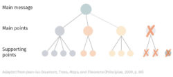
Evaluate your argument based on how well your results support your conclusions, and how well your conclusions support your main message. Look for logical holes in your argument, and address them or modify your main message to better fit your conclusions.
2.2 Explain your methods
Describe what you did to get to your results. Give your audience the information they need to understand your results (how you set up your experiment, simulation, etc.). Be selective about what information you include to keep focus on your central message.
2.3 Motivate your work
Explicitly tell your audience why they should invest time listening to your talk
Start with something your whole audience cares about. For expert audiences, this could be a specific problem, where for uninformed audiences it should be a more general goal for your field.
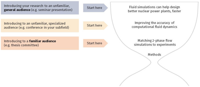
2.4 Describe the impact
How did your work address the needs from your motivation? Look forward to the future and describe the difference made by your work.
Start with the most direct impact of your work. What is at least one thing that your work directly accomplishes? What next steps does your work motivate?
Connect back to your motivation. Describe how you see your project evolving to have a larger impact. Explain how your (and your group’s/colleague’s/field’s) work is coming together to meet a larger goal. End by connecting back to the thing the whole audience cares about, not a “Questions?” “Thank you!” or “backups” slide.
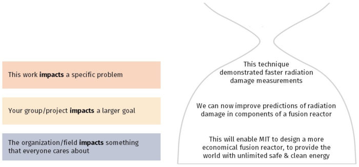
3. Putting it together
Build a slide list based on the information you gathered. Take your motivation, methods, results, and impact, and turn them into a series of sentences, each representing a single slide. These sentences will become your slide titles, and together they should form a coherent story.
Fill out your outline from your slide list. Plan out what evidence you’ll need to support each slide title.
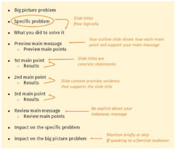
Now you can start creating slides !
4. Quick tips
- You can write, sketch, or storyboard your narrative to discover and develop your story. Just make sure that there is a clear logical flow leading from one point to the next.
- Do not focus on how many slides you should have. Especially in technical presentations, some of the content will be complex enough that animations will be needed, which will throw off your slide count. Instead, focus on constraints such as time limits and your audience’s capacity to understand your message.
- If you are recycling slides from a previous talk, take a moment to still go through the “ Before you start ” section. This will help ensure that you have a solid foundation for your new talk.
Additional resources
- Jean-luc Doumont, Trees, Maps, and Theorems (Principiae, 2009), specifically the “Designing the Presentation” chapter. You can borrow a copy from the NSE Communication Lab.
- Jean-luc Doumont’s one-page guide
To get started or receive feedback on your draft, make an appointment with us. We’d love to help!
- SUGGESTED TOPICS
- The Magazine
- Newsletters
- Managing Yourself
- Managing Teams
- Work-life Balance
- The Big Idea
- Data & Visuals
- Reading Lists
- Case Selections
- HBR Learning
- Topic Feeds
- Account Settings
- Email Preferences
Structure Your Presentation Like a Story
- Nancy Duarte

To win people over, create tension between the status quo and a better way.
After studying hundreds of speeches, I’ve found that the most effective presenters use the same techniques as great storytellers: By reminding people of the status quo and then revealing the path to a better way, they set up a conflict that needs to be resolved.
- ND Nancy Duarte is a best-selling author with thirty years of CEO-ing under her belt. She’s driven her firm, Duarte, Inc., to be the global leader behind some of the most influential messages and visuals in business and culture. Duarte, Inc., is the largest design firm in Silicon Valley, as well as one of the top woman-owned businesses in the area. Nancy has written six best-selling books, four have won awards, and her new book, DataStory: Explain Data and Inspire Action Through Story , is available now. Follow Duarte on Twitter: @nancyduarte or LinkedIn .
Partner Center
The Presenter's Guide to Nailing Your Next PowerPoint
Updated: July 27, 2022
Published: February 11, 2021
Have a presentation coming up that involves PowerPoint slides? Creating the content and design for a new presentation can be a daunting task.

Between outlining, deciding on a design, filling it out, and finalizing the details, it's not uncommon for a few questions to pop up.
Where's the best place to start? Are some steps better to take before others? How can you make sure you aren't missing anything? And how on earth do you master those essential -- yet slightly technical -- design tricks that can take a presentation from good to great?
![→ Free Download: 10 PowerPoint Presentation Templates [Access Now]](https://no-cache.hubspot.com/cta/default/53/2d0b5298-2daa-4812-b2d4-fa65cd354a8e.png "presentation structure slide")
We're here to make the process a little easier for you. We've talked to some of the best presenters at HubSpot and have included their tips throughout this blog.
With the following tips in your arsenal, you'll be able to navigate PowerPoint much more fluidly and give a standout presentation that'll leave your audience wanting more.
How to Structure a Powerpoint Presentation
1. decide on a working title and the main takeaways..
Beyond picking a topic, your first step should be coming up with a working title for your presentation. A working title is more specific than a topic: Think "How the Right Nutrition Can Strengthen Your Kids' Bones" instead of "Raising Healthy Kids." Keep in mind that a compelling presentation title is much like a compelling blog post title : short, accurate, and valuable.
Once you've got your working title, make a list of the main takeaways of your presentation to begin to give it some structure. This'll help you stay focused when writing your outline and elaborating on those sections.
Aja Frost, the Head of English SEO at HubSpot, says, "I try to structure my presentations around a story. Not only does this make the presentation more memorable and engaging, it's also easier to figure out which information is relevant."
To do this, Frost says to pick a protagonist. She adds, "It might be your team, your audience, your customer.... Then, identify the rising action, problem, climax, and falling action. It's just like grade school. This structure works whether you're talking about an accomplishment, a challenge, a big question—anything, really."
2. Create a short text outline with your audience in mind.
Once you have your main takeaways and your story in mind, it's time to begin outlining the content of your presentation in more detail, while keeping your specific audience in mind. A presentation on any topic should sound different if you're speaking to an audience of college students versus an audience of investors, for example. The tone, words, design, and delivery of your presentation should all cater to your specific audience for maximum impact.
Ask yourself: What do your audience members already know? What new information can you teach them? What are they expecting from your presentation? What's going to be interesting to them? What will keep them focused and engaged? Then, make choices during every stage of the presentation process accordingly.
Justin Champion, a content professor at HubSpot, says, "Before diving into a presentation, I create an outline of how it'll flow. I do this by creating an intro (what they're going to learn), the body (what they're learning), and finish with a conclusion (recap what they just learned) I use bullet point slide a lot for talking points I can expand on. Pro tip: use animations to guide the story. For example, instead of showing all the bullets at once, click through to each via animation."
3. Formulate your content as a narrative, if possible.
This may not apply for more formal presentation that have rigid structures (like performance reports), but for presentations that have more flexibility, presenting your content as a narrative can be much more compelling.
Stories appeal to people's emotional side in ways that information, facts, and figures can't. They help you relate to your audience -- and in turn, they'll make you and your message far more interesting to your audience. They also help make complicated concepts more easily understandable to your audience, who may not share the same experience level or work in the same industry.
Kyle Jepson, a senior professor at HubSpot, says, "Since I’m an educator, I always structure my presentations around the learning outcomes I want to achieve. If there are three things I want my listeners to understand at the end of the presentation, I’ll have three sections. Whenever possible, I put some sort of interactive element at the end of each section to assess their understanding. In a virtual event, this might be a poll or a question for people to respond to in the chat. In an in-person setting, workshop activities or small-group discussions work well."
4. Collect data and examples.
While sweeping statements can help you set the stage, supporting those statements with evidence will make your argument more interesting and credible. Data and examples give your argument content, and people will understand what you're saying much better.
But don't just slap random stats on your slides and expect to "wow" your audience. Be sure your data comes from a reputable source and that you're presenting it in a way that's easy to understand, like through accurate charts and graphs.
Finally, don't overwhelm your audience with too much data. According to psychologist George Miller , we can only remember approximately five to nine bits of information in our short-term memory at any given time. Keep that in mind as you collect your evidence.
5. Engage with your audience.
During a presentation, it's important to connect with your audience. But how can you do that when you're just talking at them?
Anni Kim, an INBOUND professor at HubSpot, says, "Staying engaged during a virtual presentation is tough, so provide plenty of opportunities for participation. You should add a slide at the beginning that points out how people can take advantage of the chat and ask questions throughout the presentation."
Once you've set the expectations, keep up on the chat and answer questions as they arise.
Now that you have a structure in mind, you'll start to write the content. Below, we'll give tips for how to start and end your presentation.
How to Start a Powerpoint Presentation
1. start with a story..
Not to be repetitive, but storytelling is one of the best ways to capture your audience's attention in general. Presentations are no different. Starting with a hook is a great way to get your audience invested in your content.
Champion says, "The best way to start a presentation is with an interesting story that connects to the content. A great way to keep you audience engaged is to make the content interesting."
2. Be yourself.
On the other hand, while you want to tell a story, you also want your audience to connect with you as the presenter.
Jepson says, "During the introduction, I think one of the most important things to do is to set expectations for your style as a presenter. You don't always need to start with a joke or a story. Start out by being you, and then keep being you for as long as you’re on stage."
3. Include surprising or unusual information at the beginning.
While you'll most likely use a standard approach with session title, presenter's bio, and an agenda, you don't want your audience to get bored.
Jepson adds "I think the standard approach (session title, presenter’s bio, agenda) is pretty effective except that it’s usually super boring. I try to include the standard information but sprinkle in things that are surprising or unusual."
Some examples include:
- Adding a photo of your family on the About Me slide. "A lot of presenters put a picture of themselves on their About Me slide. But I think that’s silly because I’m standing right there," Jepson says. "If people don’t know what I look like, they will by the end of the presentation! So I’ve started putting a picture of my wife and kids on that slide and saying something sweet or silly about that."
- Asking people to use their phones. "A lot of in-person presentations start with a request to silence cell phones," Jepson comments. "Sometimes I’ll do the opposite and say something like, 'Before we get started, I want you all to pull out your phones. You probably think I’m going to ask you to silence them. But I’m not. I’m here from HubSpot, and I’m here to help you however I can. So if there’s anyone from your team who might have questions or need help from a HubSpotter, I want you to send them a message and tell them to send their questions to you before we get to the Q&A section of presentation. To give you time to do this, I’m going to send a text to my wife to let her know I made it here safely.' And then I’ll literally pull out my phone and send a text message on stage."
Now that you've structured your post and have ironed out the details of your introduction, it's time to work on the end of the presentation.
How to End a Powerpoint Presentation
1. recap what the audience has learned..
First and foremost, the end of your presentation should tie everything together.
Champion adds, "Recap what they just learned, explain next steps based on learnings, and offer any associated resources to continue learning."
This will help people remember the content and give them resources to learn more or reach out if they have questions.
2. Q&A.
Another great way to end a presentation is with a Q&A.
Jepson remarks, "I always end with Q&A. The only tricky thing about that is knowing how to cut it off if you’re getting more questions than you have time to answer or if you aren’t getting any questions at all. In both of those situations, I do essentially the same: I cut it off and tell people to come talk to me individually."
For in-person meetings, Jepson will tell the audience to come find him after the presentation to ask more questions. However, for virtual meetings, he'll let people know how to reach him, whether that's via LinkedIn or email.
3. Call to action.
Calls to action are an important component of any piece of content and presentations are no different. What do you want your audience to do with this information?
In your recap, include actionable ways for your audience to incorporate your information into their day-to-day (if applicable). You can also let people know to reach out to you with questions so they know the next steps in case they want to discuss the presentation further.
Now that you have an idea of what you're going to be talking about and how you'll be laying it out, it's time to open up a new PowerPoint presentation and apply those basic design elements.
Outlining Your PowerPoint Design
1. pick a color scheme..
Before you begin translating your text outline into PowerPoint, you'll want to start by adding some very basic design elements to your PowerPoint slides. First, choose a color scheme -- one that has enough contrast between colors to make colors stand out. Whether you decide to use two, three, or four different colors in your presentation is up to you, but certain color combinations go together better than others. Read the sections on creating color schemes in this blog post to figure out a good color combination.

Image Source
2. Design your slide backgrounds.
In PowerPoint, less is more. You don’t ever want to let the design distract from your message. But at the same time, you want to get more creative than a plain, white background -- even if you're going for a very simple design.
The three main ways to add a background design to a PowerPoint presentation are: 1) to use a predesigned template from PowerPoint; 2) to create a custom background using a solid color; or 3) to create a custom background using an image. Here's how to do each of those things.
(We also have a few general PowerPoint templates available for download here , which come with a series of videos to teach you some basic PowerPoint creation tips.)
How to Browse Predesigned Templates in PowerPoint
PowerPoint comes with a series of predesigned templates to choose from.
To browse these templates on a Mac: Click on the slide or slides you want to add the background to. Then, click the "Themes" tab at the top of the screen.

You can either scroll through your options up there, or you can access the themes gallery in a bigger window by hovering your mouse over the theme previews and clicking the dropdown arrow that appears below them.
Right-click the background style that you want. To apply the background style to the selected slides, click "Apply to Selected Slides." To apply the background style to all of the slides in your presentation, click "Apply to All Slides."
To browse these templates on a PC: Click on the slide or slides you want to add the background to. Then, click the "Design" tab at the top of the screen. In the "Background" group, click the arrow next to "Background Styles" to open up the theme gallery.

Pro Tip: You can also apply any PowerPoint template you already have as a theme, even if it doesn't show up in the theme gallery. To do that, click the "Browse Themes" option you'll find at the bottom of the dropdown themes gallery, and navigate to wherever the given presentation, template, or theme is located on your computer. Then, click "Apply."
How to Create a Custom Background Using a Solid Color
Want your slide background to be a simple, solid color? The steps to do this are almost identical on a Mac and a PC.
Simply right-click the slide(s) you want to add a background color to, then click "Format Background." In the window that appears, click "Fill" and then "Solid." Notice you can also adjust the gradient or make the background a pattern. Click "Apply" at the bottom to apply the changes.

How to Create a Custom Background Using an Image
Sometimes, making the slide background a high-definition image can really make that slide pop. It also encourages you to cut down on text so that only a few keywords complement the image. PowerPoint makes it easy to create a custom background using an image you own.

First, choose your image. Size matters here: Be sure it's high resolution so that it can fill your slide without becoming blurry or distorted. Here are the 17 best free stock photo sites to help you find some large, great quality images.
To create a custom background using an image on a Mac: Click the slide that you want to add a background picture to. To select multiple slides, click a slide and then press and hold CTRL while you click the other slides.
Next, click the "Themes" tab at the top of your screen. In the "Theme Options" group, click "Background," then "Format Background."

In the window that appears, click "Fill," then "Picture or Texture." To insert a picture from a file, click "Choose Picture..." and then locate and double-click the picture you want to insert. If you want to use this picture as a background for just the slides you selected, click "Apply." If you want to use the picture as a background for all the slides in your presentation, click "Apply to All."
To create a custom background using an image on a PC: Click the slide that you want to add a background picture to. To select multiple slides, click a slide and then press and hold CTRL while you click the other slides.
Next, click the "Design" tab at the top of your screen. In the "Background" group, click "Background Styles," then "Format Background."
In the window that appears, click "Fill," then "Picture or texture fill." To insert a picture from a file, click "File" and then locate and double-click the picture you want to insert. If you want to use this picture as a background for just the slides you selected, click "Close." If you want to use the picture as a background for all the slides in your presentation, click "Apply to All."
Filling In the Content
1. fill in the text on your slides using concise language..
Your slides are there to support your speech, not replace it. If your slides contain too much information -- like full sentences or (gasp) paragraphs -- then your audience members won't be able to help but read the slides instead of listening to you. Plus ... that's boring. Instead, use slides to enhance keywords and show visuals while you stand up there and do the real work: telling a story and describing your data.
When it comes to your slide text, focus on the main phrases of a bullet point, and cover details verbally. We recommend using up to three bullet points per slide and making any text as simple and concise as possible. A good rule of thumb is this: If you're using more than two lines per slide or per idea, then you've used too much text. Depending on the type of presentation, two lines might even be a little text-heavy.
Are you planning on sending your slides to your audience afterward? If you're concerned about putting enough information on the slides for people to understand your presentation when they go back to it later, you can always add little details into the slide notes in PowerPoint. You can find the Notes pane at the bottom of your PowerPoint screen, right below your slides. Click and drag the edge of the pane to make it larger or smaller.

2. Brainstorm your final title with someone else.
Once all your content is there, you're ready to finalize your title. First, refine your working title as best you can on your own. Is it compelling and interesting enough to engage your audience from the very start? Does it accurately reflect your presentation?
Next -- and this is important -- connect with someone else to brainstorm the final title together. Read this blog post for a helpful walkthrough on writing a great title and title brainstorming with others.
Filling In Your PowerPoint Design
1. choose a font that's easy to read..
Choose either one font to use throughout your presentation, or two (one for your headers and one for your body text) that contrast each other well. Here's a list of 35 beautiful fonts you can download for free to get you started.
If you decide on two fonts, your header font should be bold and eye-catching, and your body text font should be simple and easy to read. (For more guidance on what fonts work best together, take a look at this visual guide .)
2. Embed your font files.
Fonts changing from one computer to another is one of the most common problems PowerPoint presenters have -- and it can really mess up your presentation and flow. What's actually happening in this case is not that the fonts are changing; it's that the presentation computer just doesn’t have the same font files installed .
If you’re using a PC and presenting on a PC, then there is a smooth workaround for this issue. When you involve Mac systems, the solution is a bit rougher.
On a PC: When you save your PowerPoint file, click "Save As" and then "Save Options." Then, select the "Embed TrueType fonts" check box and press "OK." Now, your presentation will keep the font file and your fonts will not change when you move computers (unless you give your presentation on a Mac).
On a Mac: In PowerPoint for Mac, there's no option to embed fonts within the presentation. So unless you use ubiquitous typefaces like Arial or Tahoma, your PowerPoint is likely going to encounter font changes on different computers. The best way to avoid this is to save the final version of your presentation slides as JPEGs, and then insert those JPEGs onto your PowerPoint slides. In other words, make each slide a JPEG picture of your slide. (Note that the file size of your PowerPoint will increase if your presentation includes a lot of JPEGs.)
Mac users can easily drag and drop the JPEGs into PowerPoint. If you don't use actions in your presentation, then this option works especially well.
If you want your presentation to appear "animated," then you'll need to do a little tinkering. All you need to do is save JPEGs of each "frame" of the animation. Then, in your final presentation, you'll just display those JPEGs in the order you'd like the animation to appear. While you'll technically have several new slides in place of one original one, your audience won't know the difference.
If you're a Mac user and want to use this option, then be sure to add this to your checklist as the final step.
3. Adjust the font sizes.
Once you've chosen your font, you can start playing around with font size. Carefully choose the font sizes for headers and text, and consistently use the same font face and sizes on all your slides to keep things clean and legible. Be sure your font is big enough so even the audience members in the way back of the room can read them.
4. Adjust line and character spacing.
The biggest PowerPoint no-no is using too much text on a slide. The most effective slides use text sparingly and present it in a way that's easy to read. One trick to make text more legible without changing the font size or layout is to increase or decrease the space between each line and each letter.
To adjust line spacing:
Select the text you'd like to adjust. On the "Home" tab, in the "Paragraph" group, click "Line Spacing" and choose "Line Spacing Options." In the Paragraph dialog box's "Spacing" section, click the "Line Spacing" dropdown list and choose "Exactly." In the "At" text box, adjust the value accordingly. Click "OK" to save your changes.

To adjust character spacing:
Select the text you want to change. Then, on the "Home" tab, find and click the "Font" button." Choose "Character Spacing Options" from the dropdown menu. Adjust spacing as needed.

5. Add images.
Great visual cues can have a huge impact on how well your audience understands your message. Using gorgeous images in a slide presentation is the perfect way to keep things interesting.
It's important, though, that you don't use images to decorate. This is a very common mistake. Remember: Images are meant to reinforce or complement your message, but they can be distracting. Focus on finding high resolution images so that they look good when expanded without becoming blurry or distorted.
If you don't have your own images to use, check out our roundup of the 17 best free stock photo sites .
Pro Tip: If you're finding that the background of an image is distracting, you can actually remove it before putting it into your presentation directly inside PowerPoint -- no Photoshop required. Read this blog post for instructions .

6. Use multimedia, but sparingly.
Using multimedia in your presentation, like video and audio, can be an effective way to capture your audience's attention and encourage retention of your message. In most cases, it's best to avoid using more than one or two video or audio clips so you don't detract from your talk or your message.
PowerPoint lets you either link to video/audio files externally, or embed the media directly in your presentation. You should embed these files if you can, but if you use a Mac, you cannot actually embed the video. We'll get to that in a second.
PC users: Here are two great reasons to embed your multimedia:
- Embedding allows you to play media directly in your presentation. It'll look much more professional than switching between windows.
- Embedding also means that the file stays within the PowerPoint presentation, so it should play normally without extra work (except on a Mac).
Mac users: You need to be extra careful about using multimedia files. You'll always need to bring the video and/or audio file with you in the same folder as the PowerPoint presentation. It’s best to only insert video or audio files once the presentation and the containing folder have been saved on a portable drive in their permanent folder. You can also record voiceovers for your presentation or hire a voice actor through Voice123 .
If your presentation is going to be played on a Windows computer, then Mac users need to make sure their multimedia files are in WMV format . That can get complicated, so if you want to use PowerPoint effectively, consider using the same operating system for designing and presenting no matter what (if that's something you can control).
7. Design your title slide.
The title of your presentation is often the first impression it gives off -- especially if it's going to be on display as people file in to your presentation -- so it's important to put some time and careful thought into its design.
Here are 20 layout ideas for PowerPoint title slides from Chris Lema :
8. Add any consistent elements, like your company logo.
There's a reason this is at the end. If you add things like your logo that you want to be in the same place on every slide, any adjustments you make to individual slides could slightly alter the alignment ... and you'll have to go back and adjust them all over again.
Preparing For the Presentation
1. review and edit your slides..
Spend some time on your own flipping through your slides while practicing your talk. Make sure you can check all of the following off the list:
- Your slides flow well and align with your talk.
- Your slides are free of all grammatical, formatting, or design errors.
- Your multimedia files work.
- You've double-checked any mathematical calculations you made yourself.
- You've properly attributed any statistics, data, quotes, ideas, etc. to the original source.
- You've double-checked you're actually allowed to use the photos/images you used . (Don't skip this step. Here's a cautionary tale about internet copyright law .)
- You're sure nothing in your presentation could potentially harm any of your partners, stakeholders, audience members, or your company.
- You've checked with a friend that nothing in your presentation might offend certain people in your audience -- or, if so, that it's worth it.
2. Know your slides inside out.
The best presenters don't read off your slides, so it's important to prepare and practice your presentation ahead of time. You never want to be the person finalizing your talk or presentation half an hour before an event ... that's just poor planning. Plus, what if the projector fails and you have to give your talk without slides? It can happen, and if does, you'll be incredibly happy you spent so much time preparing.
3. Practice using "presenter view."
Depending on the venue, you might have a presenter's screen available to you in addition to the main projected display that your audience can see. PowerPoint has a great tool called "Presenter View," which includes an area for notes, a timer/clock, a presentation display, and a preview of the next slide.
Make sure "Presenter View" is turned on by selecting it in the "Slide Show" tab of your PowerPoint.
To practice using "Presenter View," open the "Slide Show" tab within PowerPoint. In the "Presenter Tools" box, click "Presenter View."

4. Bring your own laptop and a backup copy of your presentation.
This isn't just a bonus step -- it's an essential one. Technology can mess up on you, and you need to be prepared. Between operating systems or even between different versions of Microsoft Office, PowerPoint can get a little wonky. One way to avoid problems is to ensure you have all the right hardware with you. Bring along your own laptop when you're presenting, just in case.
Even if you bring your laptop, but especially if you for some reason cannot, bring a backup copy of your PowerPoint file on a flash drive.
What other tips do you have for nailing PowerPoint presentations?
Editor's note: This post was originally published in October 2015 and has been updated for comprehensiveness.
![Blog - Beautiful PowerPoint Presentation Template [List-Based]](https://no-cache.hubspot.com/cta/default/53/013286c0-2cc2-45f8-a6db-c71dad0835b8.png "presentation structure slide")
Don't forget to share this post!
Related articles.
![20 Great Examples of PowerPoint Presentation Design [+ Templates]](https://www.hubspot.com/hubfs/powerpoint-presentation-examples.webp "presentation structure slide")
20 Great Examples of PowerPoint Presentation Design [+ Templates]
![How to Create the Best PowerPoint Presentations [Examples & Templates]](https://knowledge.hubspot.com/hubfs/powerpoint.webp "presentation structure slide")
How to Create the Best PowerPoint Presentations [Examples & Templates]
![17 PowerPoint Presentation Tips From Pro Presenters [+ Templates]](https://www.hubspot.com/hubfs/powerpoint-design-tricks_7.webp "presentation structure slide")
17 PowerPoint Presentation Tips From Pro Presenters [+ Templates]
![How to Write an Ecommerce Business Plan [Examples & Template]](https://www.hubspot.com/hubfs/ecommerce%20business%20plan.png "presentation structure slide")
How to Write an Ecommerce Business Plan [Examples & Template]
![How to Create an Infographic in Under an Hour — the 2024 Guide [+ Free Templates]](https://www.hubspot.com/hubfs/Make-infographic-hero%20%28598%20%C3%97%20398%20px%29.jpg "presentation structure slide")
How to Create an Infographic in Under an Hour — the 2024 Guide [+ Free Templates]

Get Buyers to Do What You Want: The Power of Temptation Bundling in Sales

How to Create an Engaging 5-Minute Presentation
![How to Start a Presentation [+ Examples]](https://www.hubspot.com/hubfs/how-to-start-presenting.webp "presentation structure slide")
How to Start a Presentation [+ Examples]

120 Presentation Topic Ideas Help You Hook Your Audience
![How to Create a Stunning Presentation Cover Page [+ Examples]](https://www.hubspot.com/hubfs/presentation-cover-page_3.webp "presentation structure slide")
How to Create a Stunning Presentation Cover Page [+ Examples]
Download ten free PowerPoint templates for a better presentation.
Marketing software that helps you drive revenue, save time and resources, and measure and optimize your investments — all on one easy-to-use platform
The Best Presentation Structure: Tips & Tricks!
The name PowerPoint says it all – a powerful tool for visualizing expressive content. With the right presentation structure, PowerPoint helps add weight to your ideas and statements through visual impact.
Are you looking for the perfect presentation structure that provides lots of opportunities to inspire your audience? Not exactly sure where to start? Keep reading for a detailed guide that will guarantee success.
As a rule, a presentation needs a topic and a specific reason for presenting it.
Here are some examples:
- A sales presentation to a customer to introduce products or services
- Presenting company figures to management
- An onboarding presentation to inform new colleagues about the most important company information
- A presentation for your company’s anniversary
- Presentations for school or university
- A presentation of research results for a science conference
Regardless of the topic or occasion, you need a clear and well-thought-out presentation structure. Without that, your audience will have a tough time following and your presentation will fall short of its goal, like attracting a new customer.
Give yourself enough time
Give yourself enough time to prepare your PowerPoint presentation. As soon as you know when you’re presenting, create a schedule. Spend 30 minutes a day preparing your upcoming presentation. Allow enough time to research the material, too. Use the rule of thirds as a guideline: If you have twelve days until the presentation, devote four days to researching and collecting information.
Take the time to thoroughly research your presentation topic. Take notes, collect ideas and thoughts. Use something you always have with you; a small notebook, a tablet or your smartphone is all you need. Keep your notes short – just enough information to get your creative juices flowing.
Organize your notes

Once you have enough material, it’s time to organize and structure it. Now is the time to form your basic presentation framework. Remember to allot enough time for this (think about the 3/3 rule).
Use your notes to develop your presentation. Ask yourself this: What’s the goal of my presentation? For example, do you want to impress investors with your startup or present an innovative marketing plan for the coming fiscal year? Answering this question will help you develop a core thesis.
Here’s something else to ask yourself: What do you want from your audience? Do you want to prompt an action (e.g., buy a product) or kick-start a discussion?
The go-to PowerPoint structure
Now that you’re prepared, it’s time to think about the right PowerPoint presentation structure . Here’s a general guide:
- Introduction
- Topic component 1
- Topic component 2
- Topic component 3
Remember to balance the various parts of your presentation. As a rule, the introduction shouldn’t be more than two slides. The topic slides form the body and should make up about 70% of your PowerPoint presentation. As simple as this may sound, it can be difficult to know which stylistic devices or elements to use to keep your audience’s attention. What should you focus on in each section of the presentation?
Take a look at this chart outlining a presentation:

So, what does this mean for each part of the presentation structure?
1. The introduction: Pique curiosity
An intro is an important part of any presentation structure. It has to awaken the audience’s interest and ideally, create a rapport. There are several ways to start the presentation.
- The soft intro
With this type of introduction, you meet the audience at their level and gradually get to the core content of your presentation. Your first slides should be simple and not introduce too much new content. The audience should be able to understand and agree with all points until you finally get to the main topic. The first step is to describe the current situation , the second step to describe the challenge and the third step to discuss how to respond to the challenge .
- The “element of surprise” intro

With this introduction, the element of surprise is on your side. Start the presentation with a statement that shocks or surprises your audience. Bold statements or results from studies are excellent ways to do this. With this kind of intro, you also describe the current situation and what has happened or could happen. You outline the potential consequences and ask how it should be handled. Make sure these statements are true and relevant to your audience. If they aren’t, you’ll come off as less credible.
2. The body of the presentation: The heart of the matter
The body should make up about 70% of your presentation structure. This is where you flesh out your presentation topic. Put yourself in your audience’s shoes; how you would like a presenter to address you? Are their arguments valid? This is a great time to actively involve your audience in a question-and-answer scenario. This is called a dialogue-oriented presentation. Involving your audience this way guarantees their full attention.
There are two ways to organize the main part of the presentation:

- As a pyramid
With this structure, the core message is introduced at the beginning of the presentation’s main section. Presenting the core message early will have your audience wanting to hear more. This is exactly the right time to start the question-and-answer scenario to hold their attention and get them involved.
- As a funnel
The funnel introduces the core message towards the end of the presentation . This structure does have a few drawbacks. It doesn’t lend itself well to a dialogue-oriented presentation and by waiting until the end to deliver your core message, your audience may not make the connection with earlier key statements. To avoid this, it always helps to revisit those earlier statements and reinforce the core message.
It’s also a more challenging presentation structure to pull off, especially if you don’t have that much experience with presenting. The funnel can be effective with controversial and/or highly emotional topics. Controversial core messages that are brought up at the very beginning of a presentation can lead to discussions that veer off and are hard to control. In these cases, the funnel structure is the better option.
3. The conclusion: crossing the finish line

The final part of your presentation structure may seem like the easiest. You’ve presented all your content, so the hard part is over, right? Never underestimate the importance of your conclusion . It gives you the perfect opportunity to reiterate your key points. Use it to summarize your insights, draw a conclusion and finally, discuss what needs to be done next.
It’s also a great opportunity to initiate an open discussion. If you want to open the floor to comments and questions at the end, give your audience a heads-up at the beginning of your presentation. That will give them a chance to take notes as you go along. You could also encourage the audience to ask questions during the presentation. Do this only if you know you won’t get thrown off track and you can quickly shift gears while presenting. You can find more helpful tips for a successful end of presentation here.
How to apply these tips now and create a presentation from scratch can be found in this tutorial .
The right presentation structure: It’s not just about content
Don’t forget that content alone is not enough to convince your audience. A well thought-out and rehearsed presentation is also counts as part of a presentation’s structure. The right delivery supports your slides and opens the door to communicating with your audience. You can find many helpful tips on giving a presentation in these articles:
- Why a good presentation intro is so important
- Tips for closing out a presentation
- Using the right body language while presenting
- Public speaking skills
- How to handle mistakes and slip-ups while presenting
- Using humor in presentations
Pro tip: Use notes
Is your presentation ready? Now it is time to prepare for your delivery. A short script may help . Just make sure you provide additional information and don’t simply read the slides aloud.
You can choose any note-taking tool you like. You can either use classic index cards with keywords or the Notes function in PowerPoint. You can read more about this here .
Most importantly, practice your presentation . Speaking freely and confidently is key to your presentation’s success. As great a tool as it is, PowerPoint can’t do it all for you; it can only visually support your key messages. So, take the time to make sure you are as well prepared as possible.
Impress your audience: Deliver a strong presentation with the perfect structure!
PowerPoint gives so many advantages to you and your presentation. PowerPoint is so easy to use, even beginners can master it in just a few simple steps.
Follow our tips on the right presentation structure – you’ll be amazed at how easy it is to create a professional and cohesive PowerPoint presentation!
If you need help developing the right presentation structure or building your presentation, let us put our expertise to work and help you create the perfect presentation. Feel free to contact us here for a no-obligation estimate or email us at: [email protected] .
Are you looking for professionally designed slide templates for your presentation? Then take a look at our shop . We have templates on a diverse selection of business topics and design themes for you to download. For example, these:

These articles might also interest you:
- Create a PowerPoint presentation
- How to create a PowerPoint table of contents
- Notes in PowerPoint
- A solid presentation conclusion
- Why the start of a presentation is so important
- The right body language while presenting
Share this post
- share
- save

Design Thinking: Problem Solving with a Difference

Why Corporate Mission Statements Are So Important

7 Tips & Learnings from the Apple Keynote

Microsoft 365 Life Hacks > Presentations > How to structure any presentation
How to structure any presentation
No matter what your topic’s about, there are effective ways to set up your presentation structure. A well-delivered presentation is memorable, logical, and will impart your knowledge and expertise to your audience. And research backs this up : audiences retain information that’s in a properly structured presentation 40% more accurately than without an order. Learn how to structure your presentation and get the most out of presentation software , while making the most impact.

Why follow a structure?
The most compelling presentations follow a logical narrative. You begin with establishing a foundation, introducing your thesis statement, and then diving into your points.

Tell your story with captivating presentations
Powerpoint empowers you to develop well-designed content across all your devices
If this structure seems familiar, that’s because it mimics the five-paragraph essay that uses the same narrative form, except in a written versus visual context.
Start with an accurate, concise title
In your opening slide, your title, subtitle, and any other descriptions will introduce your topic to your audience. Whether it’s humorous, academic, or a little of both, it’s best to keep your title concise and therefore memorable; your subtitle can expand on more details.
If you choose, you can include a summary of your presentation as a preview of what your audience can expect and the points you aim to cover. This can touch on how long the presentation will last, what the audience will learn, and what anticipated questions you may be expecting. You can easily place this information into a table of contents in PowerPoint.
Introduce yourself to your audience
The first slides of your presentation should explain to the audience why you’re here, and why you’re the most qualified to explain this topic. Perhaps you had previously written persuasive papers on the subject or you’re the project lead on this role. A brief biographical statement with highlights to your career or expertise, punctuated by bullet points, will go a long way into touching upon your qualifications.
Bring the topic into the fold
Next, you’ll be introducing your topic to your audience—which will be an overview of the angles you’ll explore in this presentation. Discuss your thesis statement in the form of your presentation’s purpose: do you aim to refute a common misperception, or persuade the audience towards a certain way of thinking? Discuss the potential challenges to your thesis statement, and know that later in the presentation, you’ll be addressing these issues head-on in order to make your argument airtight.
State your argument in the main body
The main body of your presentation will be the bulk of your presentation, and you can make this section as long as it needs to be in order to get your point across to your audience. No matter what approach your presentation takes, it will consist of bullet points, images, and multimedia. Visual aids go a long way to helping your audience retain information, and PowerPoint makes it easy to insert images and videos into your slides.
Begin with statements that are short, memorable, and impactful. Then, back these up with facts and evidence from your research: The key to successful sourcing applies to essay research as well as presentations. Be sure to place enough separation between distinct ideas into their own slides, as too much information in one slide can become overwhelming and therefore more easily forgotten.
Sum everything up in your conclusion
To help your audience retain what they’ve learned, make sure to sum up all the key points of your presentation. Your conclusion should be brief and to the point. Make sure you don’t bring up any new information in your conclusion.
Be sure to answer questions
At the end of most presentations, there is time for questions and answers. Here, you can dive into detail with specific concerns your audience might have, while using this time as a chance to reflect your own expertise.
Be sure to budget enough time (approximately 5 to 10 minutes) for this portion, depending on the subject and response. Your audience will likely appreciate this chance of interaction, and by addressing any questions they might have, you can reinforce the merits of your presentation on a personal level.
Presentations might be difficult, but developing a well-structured presentation can impart confidence—which will be helpful in reducing the anxiety that comes with public speaking. For more tips on how to deliver a winning presentation, check out Microsoft 365 .
Get started with Microsoft 365
It’s the Office you know, plus the tools to help you work better together, so you can get more done—anytime, anywhere.
Topics in this article
More articles like this one.

How to introduce yourself in a presentation
Gain your audience’s attention at the onset of a presentation. Craft an impressionable introduction to establish tone, presentation topic, and more.

How to add citations to your presentation
Conduct research and appropriately credit work for your presentation. Understand the importance of citing sources and how to add them to your presentation.

How to work on a group presentation
Group presentations can go smoothly with these essential tips on how to deliver a compelling one.

How to create a sales presentation
Engage your audience and get them interested in your product with this guide to creating a sales presentation.
Everything you need to achieve more in less time
Get powerful productivity and security apps with Microsoft 365

Explore Other Categories
Blog > English Presentation Structure (Introduction, Closing) & useful Phrases
English Presentation Structure (Introduction, Closing) & useful Phrases
02.21.20 • #powerpoint #presentation #english.
When giving a presentation in english, there are certain guidelines you should follow. Maybe you haven't got a lot of experience presenting - or you would simply like to refresh your already existing knowledge - we're here to teach you the basics about presenting and provide you with a free list of useful phrases and the basic structure you can in your presentation!

1. Structure
The general structure of a presentation is the following:
- Introduction
It is up to you to design these three parts. Using videos or everyday-examples can be a great way to introduce the audience to the topic. The important thing is that you capture the audience's attention from the beginning by making an interesting introduction. The main part is where you present your topic, ideally divided into sections. You can be creative with it - incorporate images, videos, stories or interactive polls . We generally recommend using different kinds of elements, as that makes the presentation more lively. Make sure your main part is well structured, so your audience can follow. In the conclusion, you should give a short summary of the points you made without adding any new information. You can also make an appeal to your audience in the end.
2. Useful Phrases
Here you'll find several phrases that you'll need in every presentation. Of course, you should adapt them and use them in a context that is suitable for your setting. The phrases are divided into subcategories so you can find what you're looking for more easily.

Starting your Presentation
In your introduction, you should:
Welcome your audience
Good morning/afternoon/evening everyone!
Ladies and gentlemen, I welcome you to my presentation about...
Introduce yourself
I am ... (from company ...) and today I would like to introduce you to the topic of ...
My name is ... and I am going to talk about ... today.
Icebreakers (for audience engagement)
Icebreaker polls are an amazing way to engage your audience instantly. They function as a fun and playful element at the beginning, giving you the perfect start you need to give a successful presentation. Click here to read our detailed post about icebreaker polls!
Mention the presentation topic and the reason for giving the presentation
I am grateful to be here today and tell you you about...
I would like to take this opportunity to talk about ...
I am here today to talk to you about ...
The reason why I am here today to talk about ... is ...
The purpose of this presentation is to ...
My goal today is to ...
Hopefully, by the end of the presentation, you will all know more about ...
Give a short overview of the content
To make it as understandable as possible, I divided my presentation into ... parts. In the first part, I will concentrate on ..., the second part will be about ..., ...
First of all, I will give you a short introduction, then we will move on to ...
... and finally, I will give you some insights to ...

Here are a few phrases that you could use during the whole presentation, but especially in the main part.
Engage your audience
In order to raise the audience's attention and improve their engagement, it is extremely important to make contact with them. A great way to do so is by adding interactive elements such as polls. If you would like to know more about this topic, read our article on How To Boost Audience Engagement . You can also use a software like SlideLizard , which allows you to conduct live polls, do Q&A sessions with your audience, share your resources and many more benefits that take your presentation to the next level.
Please raise your hand if you ...
Have you ever thought about ... ?
I would like to do a poll about ...
Please ask any questions as soon as they arrive.
On one hand, … on the other hand…
Comparing … with …, we can see that…
Clearly, … makes more sense than …
Whereas Option A is …, Option B is …
Making new points
Firstly,… Secondly,…
What also has to be mentioned is…
Next, I would like to bring up the topic of…
That being said, now we are going to take a look at…
Let's move on to the next topic.
On the next slide,…
The last thing I would like to mention is…

We made a whole blog post about how to pose questions in your presentation: The Right Way to do a Question Slide .
Talking about images or videos
In this image you can clearly see that ...
We are now going to take a look at a picture/video of ...
I'm going to show you a video by ... about ... now.
I've prepared a video about ...
Talking about statistics and charts
I am now addressing this graph that refers to the results of study XY.
In the graph on this slide, you can see that ...
The average is at ...
This graph clearly shows that the majority ...
According to this graph, the focus should be on ...
What that study tells us for practice is that we should ...
Emphasizing
I would like to emphasize the importance of ...
Moreover, it has to be said that ...
I want to stress the importance of ...
We always have to remember that ...
This is of high significance because ...
That part is especially important because ...
When something goes wrong
I am sorry, but it seems like the projector isn't working.
Could someone please help me with ...?
Is anybody here who knows how to ...?
Could someone give me a hand with ...
I would like to apologize for ...
I apologize for the technical problems, we are going to continue in a minute.
I am sorry for the inconvenience.
End of Presentation
In the conclusion, you should...
Sum up the main points
In conclusion I can say that…
To sum up the main points,…
With all mentioned aspects taken into consideration, I can say that…
Make an appeal
So please, in the future, try to be conscious about...
Please take a moment to think about...
I would like to encourage you to...
Thank your audience and say goodbye
It was a pleasure being here today.
Thank you for listening and goodbye.
Thank you for being such a great, engaged audience. Goodbye.
Thank you so much for listening, see you next time.
What is the structure of a presentation?
Your presentations should always have an Introduction, a Main part and a Conclusion.
What is a good way to begin a presentation?
You can start by introducing yourself, giving an overview of your topic, telling a little story or showing the audience an introductory video or image.
What are good phrases to use in English presentations?
There are many phrases that will make your presentation a lot more professional. Our blog post gives you a detailed overview.
Related articles
About the author.

Pia Lehner-Mittermaier
Pia works in Marketing as a graphic designer and writer at SlideLizard. She uses her vivid imagination and creativity to produce good content.

Get 1 Month for free!
Do you want to make your presentations more interactive.
With SlideLizard you can engage your audience with live polls, questions and feedback . Directly within your PowerPoint Presentation. Learn more
Top blog articles More posts

Elegant Architecture - Free PowerPoint Template

How to add a Countdown Timer in PowerPoint

Get started with Live Polls, Q&A and slides
for your PowerPoint Presentations
The big SlideLizard presentation glossary
Hybrid event.
When an event consist of both virtual and in-person parts, this is called a hybrid event. This type of event is popular as it combines the benefits of both online and live events.
Break-out-Room
In live online training, it is sometimes useful to divide the students into small groups for certain exercises, as it would be impossible to have conversations at the same time. Break-out-rooms are used so that people can talk to each other without disturbing the others. When the exercise is over, they are sent back to the main room.
Audience Demographics
Audience Demographics are the characteristics of listeners like age, gender, cultural backgrounds, group affiliations and educational level. The speaker has to consider all these characteristics when adapting to an audience.
Informative Presentations
An information presentation is created when no solution is currently available. Facts, data and figures or study results are presented and current processes are described.
Be the first to know!
The latest SlideLizard news, articles, and resources, sent straight to your inbox.
- or follow us on -
We use cookies to personalize content and analyze traffic to our website. You can choose to accept only cookies that are necessary for the website to function or to also allow tracking cookies. For more information, please see our privacy policy .
Cookie Settings
Necessary cookies are required for the proper functioning of the website. These cookies ensure basic functionalities and security features of the website.
Analytical cookies are used to understand how visitors interact with the website. These cookies help provide information about the number of visitors, etc.

3 Great Examples of Slide Structure from McKinsey, Bain, and BCG

By Paul Moss
Consulting firms all around the world consistently rely on the pyramid principle to build high-quality presentations with proper slide structure..
Consulting firms like McKinsey, Bain, and BCG rely on proper slide structure to communicate insights to their clients. In this post, I’ll show you exactly how they use the Pyramid Principle to structure their slides, and why it makes such a big difference in the clarity of their presentations.
If you’re new to this blog, make sure you check out our other consulting slide breakdowns . And when you’re ready, take a look at our advanced PowerPoint and presentation building courses where you can learn to create presentations like a top-tier consultant.

FREE Slide Design Course
Enroll in our free 5-day email course and learn how to design slides like a McKinsey consultant.
Complete hands-on exercises , review a realistic consulting case study , and get personalized feedback from your instructor!
Plus get a free copy of our Top 50 PowerPoint Shortcuts for Consultants cheat sheet.
Learn More ➔
Success! Please check your email.
We respect your privacy. Unsubscribe anytime.
Table of Contents
What is the Pyramid Principle?
Put simply, the Pyramid Principle is just a structured way of communicating your ideas where you start with your main point and then work your way through the supporting details of that main point. It is represented pretty well with a pyramid because you start right at the top of the Pyramid and then move down to the bottom with more supporting details and data.

Let’s say I am trying to communicate the idea that LeBron James is my favorite player. I would first start with the main point, and then provide my three key arguments for why he is my favorite player. Then below that, I could provide supporting details for each key argument.
In this visualization, each idea is meant to summarize all the ideas below it. For example, the idea that Lebron James scores a lot of points summarizes the two supporting details about his career average of 27 points per game, and him being the 3rd highest all-time scorer.

This style of top-down communication works really well in a variety of settings, including email, face-to-face communication, and of course, PowerPoint presentations — which is what I’m going to focus on here.
BCG Example
The first example on our list is BCG . The slide is an excellent example of the Pyramid Principle because it is well-structured and clear. The slide title says “Melbourne seen as a cultural and creative city”, which is the main point the slide creator is trying to communicate (which is why it sits at the top of the slide in bold green letters).
Then they’ve split the main point into two key arguments: “Melbourne perceived by Australians as the country’s leading cultural city” and, “International travelers also perceive Melbourne as a creative city”. Then below each subtitle, there are four supporting points that are meant to provide support.

“Melbourne as a Global Cultural Destination” BCG
In this example the Pyramid Principle is quite easy to see. The title of the slide is the main point, the subtitles of the slide represent the key arguments, and the bullet points below that make up the supporting details and data. Each aspect of the slide fits into one of these three layers, and everything on the slide has a purpose.

By structuring the information in this way, BCG makes it easy for the audience to process the contents of the slide quickly and easily. There’s no question about what they’re trying to say, or why they’re trying to say it.
With data-heavy slides like this, it can be easy for the audience to get lost — especially if they’re trying to listen to a live speaker, read the words on the slide, and think critically about the slide’s message. Even for a smart person, this can be cognitive overload. Organizing the slide into digestible bites significantly reduces the mental load on the audience.
McKinsey Example
The next slide from McKinsey is also reasonably straightforward. It’s from a deck about high-growth emerging economies, which they refer to as “outperforming economies”.
The title of the slide says “A pro growth agenda of productivity, income, and demand propelled the outperforming economies”, and the slide itself shows the three areas that have propelled the growth for these emerging economies: productivity, growth, and demand.

“Outperformers: High-growth emerging economies and the companies that propel them” McKinsey, October 2018
There’s a few data points on the slide and a nice visual in the middle to break down the three main categories, making it pretty easy to spot the different layers in the Pyramid. So obviously, just like in our last slide, the main point will be represented by the title. That is what they want us to understand and take away from the slide first.
Then next the key argument level is also pretty clear with “higher productivity”, “boosting demand”, and “strong and inclusive growth” shown in bold text within each bracket (and also mentioned in the title). Then lastly, the bottom layer of the pyramid is represented by the various bullet points within each bracket (below the key arguments).

Altogether, it makes for a well structured slide with a clear message and clear supporting points. Despite not be organized visually in the same way as the BCG slide, the slide is very well structured and easy to understand.
Bain Example
Then lastly, we have a slide from Bain , and this one is slightly more complicated than the first two. The title says “Greater than 60% of growth in 2011 continues to come from new customers. However, share from existing customers improved.” The slide is all about the luxury goods market in China, and more specifically, they’re trying to show where the growth in the market is coming from.

“China Luxury Market Study” Bain & Company, December 2011
The BCG slide was organized neatly into the left and right sections of the slide, and in the McKinsey slide they were bolded with bullet points underneath. What’s tricky about this slide however, is that the Pyramid Principle is not clearly visible at first glance.
The title of the slide still represents the main point, and the key arguments are not emphasized visually, but logically they’re still present. The first key argument is that growth is coming from new customers, and the second key argument is that growth is coming from existing customers. Then if you look through the body of the slide, you’ll notice that everything falls into one of these two categories.

In the waterfall chart for example, notice how it is split into these two categories: new customers (as represented by the red columns), and then existing customers (as represented by the dark grey columns). Then on the right hand side of the slide, each of the bullet points can fit into one of the two categories.
For example, the first bullet says “China market is still supply driven; new store openings create new demand.” This clearly fits into the key argument about growth coming (in part) from new customers. Combined with the key argument about growth coming from existing customers, these two provide solid logical support for the main point.
So despite not having an easy visual layout like the previous two examples, this slide is well organized logically, and provides a nice structure that helps the audience clearly understand the main message, as well as the support for that main message.
You can watch a video version of this article on YouTube .
- Print Friendly
7 Incredible Ways to Structure Your Presentation
As a speaker, you make every effort to make your presentation stand out – you add high-resolution images, well-researched content, animation, and whatnot, but despite this, sometimes your slideshow fails to hit the mark. Can you think of any reason? Poor design, lack of facial expression, and ineffective delivery of speech are the most probable reasons you will give for the presentation failure . Well, these are quite obvious reasons. Wait! Are you overlooking one important aspect that makes the presentation fall flat, i.e., the structure?
| According to research studies, the information/data presented in a structured manner is retained 40% more precisely by the audience than the unstructured information/data. |
Every decent presentation follows a natural flow with a clear beginning, middle, and end, and appropriate transitions and signposts, which gives a direction to the audience and keeps them on track. However, creating a well-structured presentation is a daunting task and takes a lot of nerve as you have to consider a lot of factors – the objective of your presentation, whether you need any visual assistance, settings where you will be delivering your talk, knowledge of the audience level, time constraints for your speech, etc.
If you are not sure how to organize your slides to create an impact on the audience, you have landed at the right place. In this blog post, we have provided some outstanding ways to structure your presentation. Let’s dive deeper!
1. Situation-Complication-Resolution
Image Source:
https://www.presentation-guru.com/wp-content/uploads/2016/05/Situation-Complication-Resolution.jpg
This structure is the best fit for presentations that aim to persuade the audience. It first describes the current scenario (more precisely, what’s going on at present) and then introduces the audience to the complication or problem (causes and impact). Then portray the solution of the problem (the steps, resources, and time required to solve it, the objections you may encounter, etc.). Finally, visualize the benefits after the resolution of the problem. You can make the presentation more intriguing by backing up your information with real-life examples, proof, and facts.
To sum up, the flow of information in this structure goes this way:
- Situation – The current scenario is represented with clarity.
- Complication – The challenge/problem that needs to be solved.
- Resolution – It depicts the solution to the problem.
Example : In his TED talk, Paul Greenberg beautifully presented how fishing salmon, tuna, and shrimp can ruin the oceans. He then suggested a few specific ways to overcome the problem that can benefit both nature and the people who earn their livelihoods through fishing.
2. Hook, Meat, and Payoff
Image Source:
https://www.presentation-guru.com/wp-content/uploads/2016/05/Hook-Meat-and-payoff.jpg
In this presentation structure, the presenter opens his talk with something (like surprising information, less known facts, provocative statements, rhetorical questions, etc.) that keeps the audience hooked and wanting more. Gradually, the story progresses in an interesting way and finally ends with a conclusion that relates to the beginning.
- Hook – It develops the interest of the audience and piques their curiosity, giving them a strong reason to stay intrigued and listen.
- Meat – The main part of the presentation that describes what people actually need to understand.
- Payoff – The benefit or reward the audience gets after gaining new knowledge or developing a new understanding.
Example : To learn more about how this structure works, watch this presentation by Simon Sinek on “How Great Leaders Inspire Action.”
3. Situation-Opportunity-Resolution
https://www.presentation-guru.com/wp-content/uploads/2016/05/Situation-Opportunity-Resolution.jpg
Every problem has an opportunity – this can be better represented by leveraging the Situation-Opportunity-Resolution structure. Instead of focusing more on the audience’s fear, it gives more attention to their aspirations.
- Opportunity – The opportunity that must be grabbed to address the problem.
- Resolution – It depicts the solution to the problem. You can provide evidence and proof to increase the credibility of the story.
Example : Watch this TED talk by Adam Galinsky on “How to Speak Up for Yourself” to get more insights into this structure.
4. The Drama
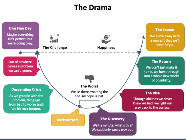
https://www.presentation-guru.com/wp-content/uploads/2016/05/The-Drama.jpg
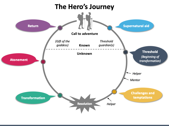
https://www.presentation-guru.com/on-structure-the-hidden-framework-that-hangs-your-story-together/
This structure is generally followed to present the success story of the business/individual. To be more precise, this structure depicts a Hero’s Journey – how he embarked on a voyage, what challenges/obstacles he encountered on the way, what unique things he discovered about himself, and what was the outcome of the entire voyage.
The entire story is narrated in the following 8 steps:
- One Fine Day – Depicts a stage situation that is not completely perfect, but just average.
- The Challenge – The challenge that comes suddenly and can’t be overlooked.
- Descending Crisis – How the challenge made things worse for the hero.
- Rock Bottom – Everything is at its worst, and the hero feels lost.
- The Discovery – A ray of hope (new abilities, skills, etc.) that makes the hero believe that the problem can be resolved.
- The Rise – How the problem can be resolved in a positive manner.
- The Return – How the hero overcomes the challenge and opens the way to a new range of possibilities for him.
- The Lesson – The key takeaway message that the hero gets from the entire journey.
Example : See how beautifully Adam Driver narrated his story of becoming an actor from Marines. This TED talk is the perfect example of this structure.
5. The Pitch
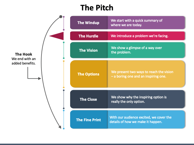
https://www.presentation-guru.com/wp-content/uploads/2016/05/The-pitch.jpg
The Pitch is perfect for sales presentations that aim to make the audience believe that the presenter’s idea can help them resolve their problem. The slideshow begins with the evaluation of the current situation and then proceeds towards the hurdles and the solution. You can include data, research, experiments, case studies, or use tests to support your ideas. Conclude your talk with the action that the audience is supposed to take next. Don’t forget to add a ‘hook’ (added benefit).
Here is a quick look at how this structure looks like:
- The Wind Up – A summary of the current scenario.
- The Hurdle – The problem/issue that needs to be resolved.
- The Vision – A quick glimpse into the main idea on how the problem/issue can be solved.
- The Options – Illustrates two different options to solve the problem.
- The Close – The best option is presented as the ideal solution to the problem.
- The Fine Print – Represents how exactly the problem will be resolved.
- The Hook – Showcases the ‘added benefit’ of the solution.
Example : Check out how Enric Sala pitched to solve the problem of turning the high seas into a natural reserve. He ended by making people aware of how people can contribute to their country.
6. The Explanation
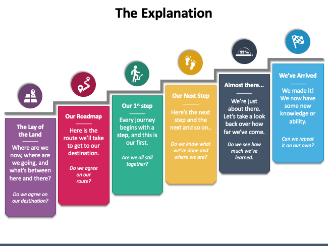
https://www.presentation-guru.com/wp-content/uploads/2016/05/the-explanation.jpg
This structure works best for crafting information-rich presentations that aim to educate the audience about a new regulation, initiative, insights, or process. The presentation progresses in an upward direction, depicting where we are now and where we need to reach or what we need to attain in the future. The steps to move to the next stage are showcased precisely, ensuring that the audience understands accurately how and why each stage affects or concerns them. The final stage of transformation is disclosed at the end. In a nutshell, this structure follows the following steps:
- The Lay of the Land – Where the things are now and what is the final destination.
- The Roadmap – The visual map that shows how to reach the final destination.
- The First Step – Instills the adventure to embark on the journey.
- The Next Step – Further steps are illustrated one by one.
- Almost There – Depicts how much you have progressed since the first step.
- The Arrival – Indicates the end of the journey.
Example : Watch this TED talk by Amy Cuddy, an American social psychologist. She followed an Explanation structure for delivering her talk on power poses and how they can impact the consequence of a difficult situation.
7. Fact and Storytelling
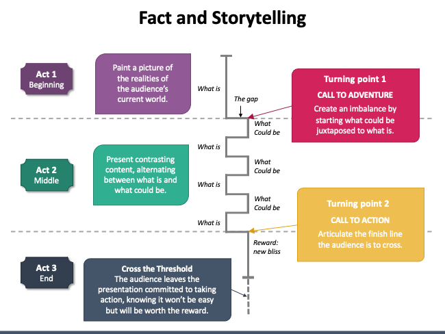
https://www.presentation-guru.com/wp-content/uploads/2016/05/Sparkline.jpg
If you are going to communicate your company’s or department’s vision or present an idea, product, or initiative, you can use this structure which follows a zig-zag pattern instead of a traditional linear one. Using this structure, you can zig-zag back and forth between ‘how things worked then’ and ‘how they would work in the future,’ giving momentum to your presentation. This structure focuses on concluding the slideshow on a high note.
Example : In 2007, Steve Jobs used the same structure for his keynote for launching the iPhone. He took advantage of the power of the unexpected to create a suspenseful opener and tease the audience. He threw light on what smartphones looked like and could do then and what they would look like and would do in the future. He finally demonstrated the iPhone in a very dramatic way.
Watch Steve Jobs’ full keynote below:
The Bottom Line
Some presentations leave you informed or inspired. This is because the speaker crafted the slides in a simple and logical manner that made it easy for you to grab the key takeaway message quickly.
A thoughtfully organized presentation benefits the speakers as well by helping them stay on topic, remain calm, avoid awkward silences, and deliver their talk with confidence. By choosing the right structure for your presentation, you can convert your boring information/data into an exciting story that appeals to your audience, both emotionally and intellectually. If you are presenting for the first time or have no time to craft a presentation from scratch, you can use pre-designed, high-definition templates to give a structured look to your information. If you have something relevant to the topic you want to share with us, write in the “Comments” section below. And, if you like the blog post, do share it on your social media handles.
Leave a Response Cancel reply
Save my name, email, and website in this browser for the next time I comment.
Please enter an answer in digits: 14 + 10 =
You Might Also Like

12 Ways to Make an Engaging Slide Deck and Captivate Your Audience
Essential Tips to Find the Right Audience for Your Next Presentation

Expert Tips to Handle Distractions When You Speak on Stage

9 Tips to Craft the Perfect Title for Your Next PowerPoint Presentation
How to Structure a Professional PowerPoint Presentation
Structuring your slides cohesively.
When you have a wealth of ideas in your mind, it can be challenging to put them all together in a coherent way. This is also true for designing a PowerPoint Presentation . Many people have great ideas but cannot structure them into a cohesive PowerPoint Presentation. To end this, we’ve put together a few tips on effectively structuring a PowerPoint Presentation .
Creating an appealing presentation is crucial for a successful message. Design involves organizing information and engaging through elements like colour, typography, and graphics. A well-designed presentation conveys information clearly, leaving an impact. PowerPoint slide design captures attention and keeps the audience engaged. Well-crafted design enhances message delivery and aids in information retention. Consider the target audience to tailor the design. Professional design plays a key role in presentation success.

Structuring A PowerPoint Presentation – Agenda Template
Importance of PowerPoint Presentation Structure
The importance of structure in a PowerPoint presentation lies in its ability to organize key points and ensure clarity for the audience. By planning a clear structure, you can effectively guide your audience through your presentation and minimize the risk of losing your place or becoming distracted. Creating a good PowerPoint is crucial for engaging your audience. Plan content carefully and use attractive graphics. Consider your audience and customize the presentation. Use professional techniques for a polished result that resonates with viewers. A well-done presentation enhances communication.
A PowerPoint template is a pre-designed layout for creating presentations, offering customizable features for a polished look. It saves time by eliminating design work. Choosing the right template is crucial for businesses and individuals to convey their message effectively. In order to convey a message effectively, a well-designed and professional PowerPoint is crucial. This involves high-quality images, consistent formatting, and clear, concise content. Using design options and templates can create a polished presentation. Animations and multimedia can capture the audience’s attention and deliver the message effectively. Planning and organizing content, design, and delivery are important in creating a PowerPoint.
10 qualities of a Good PowerPoint Presentation
1. Clear and logical organization: A good presentation should have a clear flow, with each section building upon the previous one for the audience to follow and understand.
2. Introduction: A strong presentation structure starts with a clear and engaging introduction that grabs the audience’s attention and provides an overview of what will be covered.
3. Main points: The presentation should have a limited number of main points, typically three to five, that are clearly stated and supported with relevant information or evidence.
4. Supporting evidence: A good presentation structure includes supporting evidence, such as data, examples, or case studies, to back up the main points and make them more convincing.
5. Visual aids: Effective use of visual aids, such as slides or props, can enhance the presentation structure by providing visual representations of key points or data.
6. Transitions: Smooth transitions between sections or points help the audience understand how each part of the presentation relates to the overall topic and keeps them engaged.
7. Conclusion: A strong conclusion summarizes the main points and provides a clear and memorable ending to the presentation. It may also include a call to action or a key takeaway for the audience.
8. Engaging delivery: A good presentation structure is enhanced by an engaging delivery style, including eye contact, vocal variety, and body language that keeps the audience interested and focused.
9. Time management: A well-structured presentation takes into account the allotted time and ensures that each section or point is given appropriate attention without rushing or going over time.
10. Adaptability: A good presentation structure allows for adaptability by adjusting content or delivery based on audience needs or feedback, demonstrating flexibility and responsiveness.
Standard Presentation Structure
A Standard Presentation Structure will have the slides including: 1. Introduction, 2. Agenda, 3. Background, 4. Main Points, 5. Conclusion, 6. Q&A, and 7. Closing. Every PowerPoint presentation must have 3 important sections: 1. Introduction, 2. Body, and 3. Conclusion.
1. Introduction: The intro of a presentation is crucial. It grabs attention, gives an overview of the topic’s importance, and sets the tone. It should make the audience interested in listening. A strong intro sets the presentation’s tone, making it more likely for the audience to pay attention and remember the content. It provides a snapshot of what to expect and the objective. Include the title and a brief overview.
2. Body: Key points of PowerPoint should be covered in the talk body. Provide info/explanation in sections for audience understanding. Cover all key points with detail/examples. Prepare to answer questions. Conclude by summarizing main points & key message. When creating a PowerPoint, consider key points for the main body of your talk. Include essential aspects to ensure audience understanding. Covering key points in the main body helps keep the presentation focused.
3. Conclusion: The conclusion sums up the main points and message of your presentation. End your PowerPoint presentation with a clear, concise conclusion. It should not introduce new information, but reiterate key points. Include a thank you slide to show appreciation to your audience and provide contact details for future opportunities. Now that you know what’s covered in your presentation, it’s time to create it.

Structuring A PowerPoint Presentation – Standard Presentation Structure
When making a presentation, focus on these key areas:
1. Content: Presentation idea and concept are ready. Craft presentation content in three sections – intro, body, conclusion. Cover all arguments you wish to convey. Content is crucial for an excellent presentation. Ensure a well-crafted presentation covering all points for the audience. Plan, write, and organize your presentation. After planning content, create slides or visuals to convey your message effectively. Keep the audience in mind. Great content ensures a successful PowerPoint presentation.
2. Text: Slides need clear & easy-to-read text in sans serif font (e.g. Arial/Helvetica) for body & serif font (e.g. Times New Roman) for headers. Font size should be legible from a distance & text concise with bullet points & short sentences. Align text well for neatness & utilize white space to highlight key elements.
3. Sequence: Next step in PowerPoint: organize info into subsections, consider audience’s understanding. Outline is vital: intro, body, conclusion. Organize thoughts, ensure flow, boost audience engagement.
4. Narrative: You need a strong narrative for an impactful presentation. Conveying info isn’t enough – be creative. Make your message memorable for the audience. A great story makes your presentation unforgettable. You need a powerful narrative to impact your presentation. Tell a story that engages and keeps the audience wanting more. A good narrative helps make complex concepts more relatable. Focus on clarity, conciseness, and engagement.
Get started with your Presentation
PowerPoint slides are crucial for effective presentations. They captivate audiences and communicate ideas. Professional slides go beyond text and images, conveying messages clearly. Well-designed slides improve presentation quality. It’s essential to choose slides that align with the presentation’s message. Easier to structure your presentation with content, sequence, and narrative. Choose layout and begin slides. Follow planned sequence and maintain continuity. Engage audience and deliver message effectively. Keep consistent look while making some slides stand out. Ensure all slides align with presentation flow.
Slide Design
A slide presentation effectively conveys information visually. Plan content carefully for a smooth flow and clear message. Choose graphics, fonts, and colors thoughtfully. Include engaging visuals and concise text. Seek help from experts for a professional presentation. Professional PowerPoint design includes creating visually appealing presentations to effectively communicate information. A designer formats slides, selects images, and maintains an engaging flow. Well-designed templates enhance presentation impact and leave a lasting impression. Designers create customized templates aligning with branding. With expertise in visual communication, designers play a crucial role in successful presentations.
7 Design Rules to Follow
1. 7 X 7 rule: The 7×7 Rule in PowerPoint: each slide should have 7 lines or bullets with 7 words or less. This helps keep your presentation concise and clear for the audience.
2. 6 x 6 rule: To avoid overcrowding, use the 6 x 6 rule. Each slide should have 1 main idea with up to 6 bullet points. Keep bullet points concise to engage audience.
3. 5/5/5 rule: To improve presentations, follow the 5/5/5 rule: limit words per line to five, lines per slide to five, and avoid overloading slides. This keeps presentations concise, visually appealing, and easy to follow.
4. 10 20 30 rule: The 10/20/30 rule for presentations: 10 slides, max of twenty minutes, minimum font size thirty points; prevents death-by-PowerPoint.
5. 2 4 8 rule: The 2-4-8 rule guides effective presentations. Each slide: 2 minutes, 4 points, 8 words/point. Ensures concise, focused, engaging presentations.
6. 3 second rule: In PowerPoint, follow the three-second rule. Slides should convey the main point quickly, similar to billboards for drivers. Be concise and clear.
7. Thumb rule of making PPT: When making a PowerPoint, try one slide per minute. For a 15-minute speech, aim for 15 slides. If lots to share, focus on key points.
6 effective ways to improve Slide Designs
PowerPoint services are essential for businesses and professionals to communicate effectively. The demand for visually appealing presentations has increased with virtual work. Professional services offer expertise in creating dynamic presentations. They design templates and include multimedia elements to elevate presentations. Skilled designers ensure each presentation meets client needs. Designing slides professionals, often asked best ways make slides effective. Here are a few tips:

Structuring a PowerPoint Presentation – 6 Tips To Improve Presentation Design
1. Alignments: The key to a successful presentation is alignment. Your audience’s perception depends on the quality of alignment. Misaligned elements make your PowerPoint appear unprofessional.
2. Readability: When designing a presentation, prioritize readability over trendy fonts. Ensure fonts are legible and large for audience comprehension. Font choice reflects professionalism and credibility. A good font conveys trustworthiness, while a bad one may make you appear unprofessional and untrustworthy. Using a sans-serif font (Arial or Helvetica) and a dark color on a light background, or vice versa.
So, how do you choose the right font for your PowerPoint presentation? There are a few things to consider:
- Think about what kind of message you want to convey. Are you looking for something formal or informal?
- Consider your audience. What kind of font will they be most comfortable reading?
- Make sure the font you choose is easy to read.
- The last thing you want is your audience to strain their eyes trying to read your slides.
If you keep these things in mind, you should be able to find the perfect font for your PowerPoint presentation. To discover the best fonts you can use in a presentation, check out Compelling Fonts for Impactful Presentations .
3. Use Minimal Text: Text on slide overwhelms audience. Focus on key phrases & bullet points.
4. Use Slide Transitions sparingly: Stick to basic transitions like fades or wipes, and avoid using too many different types of transitions in one presentation.
5. Use Images of various shapes: Square and rectangle pics are dull for a presentation. To make yours stand out, use various shape images, remove backgrounds, or cut images into desired shapes. Ditch unnecessary elements for striking images. Avoid stock photos, use relevant, high-resolution pictures.
6. Use Maps & Charts: Maps & Charts play a vital role in improving slide designs.
Let us see in brief, the uses of Maps & Charts in improving slide design process:
10 amazing uses of incorporating Charts in a PowerPoint Presentation
1. Visualize Data: Charts are an excellent method of displaying data visually for easy comprehension. They assist in conveying sales, survey data, or any information efficiently.
2. Highlight Trends: Charts show trends in data. A bar or line chart can display trend direction and magnitude, helping audience interpretation.
3. Compare Data: Charts great for comparing data. Whether sales for products or department performance, charts help identify similarities, differences, and trends.
4. Summarize Complex Information: Charts simplify complex info by condensing it visually. Instead of overwhelming with text or numbers, a chart offers a concise summary that’s easier to remember.
5. Enhance Visual Appeal: Let’s face it, PowerPoint with just text is boring. Charts add visual interest and make presentations engaging. They break up slides and keep audience attention.
6. Facilitate Decision Making: Charts help decision making by offering a clear data overview. They assist in presenting options for strategies or assessing project success, enabling stakeholders to make informed decisions.
7. Support Persuasive Arguments: If you’re convincing your audience of a point, charts are powerful. By presenting visual data, evidence and support are provided for your claims, making your argument compelling.
8. Track Progress: Charts track progress over time, for sales growth, project milestones, or any progress. They help visualize the journey and celebrate achievements.
9. Simplify Complex Concepts: Sometimes, concepts or processes are hard to explain with words only. Using charts simplifies complex ideas and aids in comprehension. Flowcharts and diagrams are examples of simplifying information.
10. Improve Retention: Visual aids such as charts improve retention. They help in recalling key details. Charts enhance PowerPoint presentations by visualizing data, highlighting trends, simplifying concepts, and improving appeal. They engage and persuade audiences effectively.
7 creative ways Map can influence your PowerPoint presentation
1. Visual Aid: One primary purpose of map slide is as visual aid. Maps visually represent data, locations, trends, helping audience understand PowerPoint.
2. Geographic Information: A Map slide provides geographic information to the audience. It shows specific place locations, highlights regions, or displays routes in a clear and concise manner.
3. Data Visualization: Maps visualize data using various colors, symbols, or shading to represent data points, aiding interpretation and analysis.
4. Comparison and Analysis: Map slides help compare and analyze regions. Showing maps side by side highlights differences or similarities, aiding in a thorough analysis and topic comprehension.
5. Storytelling: Maps in PowerPoint are a great storytelling tool. They guide the audience through events and key locations in the story.
6. Planning and Strategy: Maps show planning and strategy in presentations like business plans, marketing strategies, or project timelines. They help visualize steps, locations, and goals, making it easier for the audience to understand the plan in a PowerPoint.
7. Engaging the Audience: Map slides engage audience & make presentation interactive. Ask audience to identify locations, trace routes, or analyze data to encourage participation.
Professional Presentation Design
Knowing how to structure a PowerPoint presentation well is crucial for impactful delivery. Confidence stems from a flawless flow. While organizing and aligning slides is doable, nailing the design is tougher. Design pros like Visual Sculptors infuse creativity that boosts visual impact. Mastery of impactful presentation structuring is vital for success. An organized presentation aids confident error-free delivery. While slide alignment is manageable, design finesse is challenging.

Structuring a PowerPoint Presentation – Professional Presentation Design
Having an impactful structure for your presentation is crucial for success. A well-organized PowerPoint ensures confident delivery without errors. While you can align and structure slides well, mastering the design aspect is more challenging. Freelancing platforms like Upwork , Fiverr , and Guru provide the options to explore the best design talents online that best suit your budget delivering top-quality designs. Professional presentation designers like Visual Sculptors can introduce creative design elements that enhance your presentation’s look and empower its visual impact.
1. What are the five rules of PowerPoint?
The five rules of PowerPoint presentations are: keep it simple, use high-quality images, limit text on each slide, use consistent formatting, and practice your delivery. By following these rules, you can create effective and engaging presentations that will keep your audience interested and focused.
2. What is PowerPoint and How is it Used?
PowerPoint is a software program developed by Microsoft that allows users to create visual presentations. It is commonly used in business and educational settings to present information in a clear and organized manner. PowerPoint presentations can include text, images, videos, and other multimedia elements to enhance the message being conveyed. They are often used for training sessions, sales pitches, and academic lectures.
3. What are the features of PowerPoint?
Some of the top features of Microsoft PowerPoint include slide templates, animations and transitions, multimedia integration, collaboration tools, presenter view, and the ability to add notes and comments. Other features include the ability to create charts and graphs, use SmartArt graphics, and customize the design and layout of your slides.
4. What are the 4 types of presentation?
The four types of presentations are informative, persuasive, instructional, and entertaining. An informative presentation provides information on a specific topic, a persuasive presentation aims to convince the audience to take a certain action, an instructional presentation teaches the audience how to do something, and an entertaining presentation is meant to be enjoyable and engaging.
5. What are the 5 parts of a presentation?
The 5 parts of a presentation are the introduction, agenda, main content, summary, and conclusion. The introduction should grab the audience’s attention, the agenda should outline what will be covered, the main content should provide the bulk of the information, the summary should recap the main points, and the conclusion should leave a lasting impression.
| Previous post |
| Next post |
Related posts

How to make Consulting PPT – Tips and Tricks

How to create Professional Business PowerPoint Presentations

How to create a Business PPT Template Design
Post a comment.
Submit Comment
Home Blog Presentation Ideas How to Write a Presentation Script
How to Write a Presentation Script

Delivering a successful presentation is a combination of a confident speech and professional-quality graphics. The first element is sometimes neglected, as presenters rely mostly on the slides and add an improvisation element to the speech. Truth is, if you aim to hone your presentation skills, you need to work on the speech. And for that to be a powerful asset, the answer is to learn how to write an effective presentation script.
This article will detail how to create a presentation script, which elements it should contain, how to relate the script to the presenter’s notes, and much more.
Table of Contents
What is a Presentation Script
How do you start a presentation script, how do you write a presentation script, how to connect a presentation script with presenter notes, recommended ppt templates to write a presentation script, final words.
A presentation script is a written guide that outlines what a speaker will say during a presentation. It includes the key points, transitions, and supporting details needed to communicate the message clearly and effectively. The script helps the speaker stay on track, ensuring the presentation is organized, concise, and delivered within the allotted time. It often integrates cues for visual aids and other presentation elements.

Defining the Purpose and Objective
Every effective presentation script starts with clearly understanding its purpose and objectives. Defining these elements early ensures your script remains focused, relevant, and aligned with your desired outcomes.
Your core message is the central idea you want your audience to take away from your presentation. It should be clear, concise, and memorable. To define your core message, ask yourself:
- What is the one thing I want my audience to remember?
- Why is this message important?
- How does this message benefit my audience?
Once you have a clear core message, everything in your script for a speech should support and reinforce it. This focus will help you avoid straying into irrelevant topics and ensure your presentation remains cohesive.
Next, the presenter should establish clear objectives for the talk. Objectives must be specific, measurable outcomes you want to achieve with your presentation. They give you a clear direction and help you measure the success of your presentation. Objectives can be:
- Informational: Educate the audience on a particular topic.
- Persuasive: Convince the audience to adopt a viewpoint or take a specific action.
- Motivational: Inspire the audience to feel or act in a certain way.
- Instructional: Teach the audience how to do something.
For example, suppose your core message is about the importance of cybersecurity. In that case, your objectives might include informing the audience about common threats, persuading them to adopt better security practices, and instructing them on implementing them.
Check our article on SMART goal setting for a practical approach to defining measurable goals.
Aligning the Script with Desired Outcomes
Once you’ve defined your core message and objectives, your script should be structured to achieve these outcomes. This involves:
- Prioritizing content: Focus on the information and arguments directly contributing to your objectives.
- Building logical flow: Ensure that each section of your presentation leads naturally to the next, creating a narrative that reinforces your core message.
- Incorporating calls to action: If your objective is to persuade or motivate, include clear, actionable steps your audience can take after the presentation.
By defining the purpose and objectives of your presentation script, you set the stage for a focused, effective, and impactful delivery.
In this section, we’ll explore section by section how to write a presentation script. The following image is a guideline of presentation script examples on how to create icebreakers for each section

Crafting a Compelling Introduction
The introduction is your opportunity to capture the audience’s attention and set the tone for the rest of the presentation. It should be engaging and clearly overview what the audience can expect.
If you are wondering how to start a presentation , key elements of a strong introduction include:
- Opening hook: Start with a statement, question, or anecdote that grabs the audience’s attention. This could be a surprising statistic, a relevant quote, or a provocative question.
- Purpose statement: Clearly state the purpose of your presentation and what you hope to achieve. This helps the audience understand why they should care about your words.
- Agenda overview: Briefly outline the main points you will cover. This will give the audience a roadmap of what to expect and help them follow along.
Let’s say your presentation is about digital marketing trends. In that case, you might start with a surprising statistic about the growth of AI technology usage, followed by a statement about the importance of staying ahead of digital trends, and then outline the specific trends you will discuss in an upcoming slide.

Organizing the Body of the Script
The body of your script is where you present your main content. It should be organized logically, with each section building on the previous one to reinforce your core message.
Break down your content into clear, manageable sections. Each section should cover a specific point or idea. Smooth transitions between sections help maintain the flow of your presentation and keep the audience engaged . Phrases like “building on that idea,” “another important factor,” or “let’s now shift our focus to” can help guide the audience through your presentation.
Use data, examples, case studies , and visuals to support your points. This will strengthen your argument and make your presentation more engaging.
For instance, in a presentation about social media’s impact on consumer behavior, you might organize the body into sections on social media usage trends, the psychology of social media influence, and case studies of successful social media campaigns.

Engaging the Audience with Stories and Examples
One of the most effective ways to make your presentation engaging and relatable is by incorporating stories and examples. These elements help illustrate your points, making them more memorable and impactful.
Consider the following strategies:
- Use personal anecdotes: Sharing personal experiences related to your topic can help establish a connection with the audience and make your presentation more relatable.
- Include case studies: Real-world examples or case studies can help illustrate how the concepts you’re discussing apply in practice. This is especially effective when presenting to a business or professional audience.
- Tell a story: Structure part of your presentation as a narrative, with a clear beginning, middle, and end. Stories are inherently engaging and can make complex information more digestible.
You can learn more about this technique with our article on storytelling for presentations .
Developing a Memorable Conclusion
The conclusion is your final opportunity to reinforce your core message and leave a lasting impression on your audience.
A strong conclusion should:
- Summarize key points: Recap the main points of your presentation to reinforce them in the audience’s mind.
- Reiterate the core message: Restate your core message in a way that resonates with the audience and underscores its importance.
- End with impact: Conclude with a powerful statement, call to action, or thought-provoking question that leaves the audience with something to think about or do.
If your presentation was about the importance of innovation in business, you might conclude by summarizing its key benefits, restating that innovation is crucial for long-term success, and ending with a call to action for the audience to start thinking about how they can innovate in their roles.

Get more insights on how to end a presentation with our article.
Although the presentation script is a fantastic resource for preparing your presentation and also for rehearsal, presenters cannot bring lengthy text pages with them and start reading if they feel lost. This is where presenter notes come in handy, and in this section, we’ll learn how to turn the presentation script into presenter notes.
The first step in this process is to go through the detailed script a couple of times, highlighting the main ideas, data, and messages to convey to the audience. You can follow the process as with meeting notes and apply the strategies explained in that article.
Now, we need to condense the information into simpler sentences, direct phrases, or keywords that trigger memory recall. These phrases will be added to the slides in the format of speaker notes linked to each slide. It’s crucial to mark the transitions from one topic to another in the presentation so we can articulate the speech or remember to emphasize a point.
Remember, if we suddenly need to include last-minute details, we can use visual cues or a printed version of our slides with extra handwritten notes.
Before we conclude this article, we want to recommend some PowerPoint templates that can help the presentation script creation process, especially for team collaboration, where the presentation goes through multiple iterations. Remember these designs also serve as Google Slides templates .
1. 6 Step Creative Timeline Diagram for Presentation Scripts

Say you need to create a sample script for a presentation or work with your team for a department presentation: this is where this best PPT template is beneficial. We can summarize processes or points that we intend the presentation to cover into six actionable steps that can be discussed within the team. The icons included help us to connect concepts with the steps we’re describing.
Use This Template
2. Product Timeline Script of Speech PPT Template
In sales and product presentations, we need to contextualize the dates on which we expect things to happen. By using this timeline PPT template as a visual aid, presenters can carry a printed version or digital version on another device to remind themselves of the milestones that a product or service is due in the near future.
3. The Presentation Experience Script PowerPoint Template

Although this template is tailored to sales presentations, this slide deck is ideal for writing a recap of the presentation script. You can add facts, questions, numeric data, and more.
4. Steps & Stairs Diagram Presentation Script Google Slides Template
This diagram template for PowerPoint and Google Slides is a highly visual 3D aid intended for defining the steps to write the script or to present processes. Use this staircase design template to summarize key information about your presentation speech.
Creating a detailed, professional presentation script doesn’t have to be a daunting process. As long as we understand the basis of how to structure what we intend to say, questions and answers about which content to include shall arise.
Follow the steps shown in this article and you will master the process to create your own presentation scripts in no time.
Like this article? Please share
Presentation Skills, Speech Filed under Presentation Ideas
Related Articles

Filed under Presentation Ideas • August 29th, 2024
How to Make a Presentation Longer: 7 Strategies to Master
Extend your talk in style. Join us to discover how to make a presentation longer while providing a high-end experience to your audience.

Filed under Google Slides Tutorials • July 25th, 2024
How to Hide a Slide in Google Slides
Hiding a slide in Google Slides is a task that takes less than a minute. Learn how to quickly implement this tool for your presentations in this article.

Filed under Education • July 10th, 2024
How to Memorize a Presentation: Guide + Templates
Become a proficient presenter by mastering the art of how to memorize a presentation. Nine different techniques + PPT templates here.
Leave a Reply
IMAGES
VIDEO
COMMENTS
Learn how to structure a good PowerPoint presentation with tips and examples from SlideLizard, a tool for interactive presentations and quizzes.
For many people the thought of delivering a presentation is a daunting task and brings about a great deal of nerves. However, if you take some time to understand how effective presentations are structured and then apply this structure to your own presentation, you'll appear much more confident and relaxed.
A good presentation drives action. Discover the top qualities of effective presentations to guide you in delivering a compelling one.
In this post, we'll cover the typical presentation structure in PowerPoint - what sections it should include - and provide some practical tips on how to arrange the slides and implement these ideas technically. Use these practical guidelines to organize your slides in a clear and simple way and save time on their development.
Learn the secrets behind a winning presentation structure for engaging your audience and delivering memorable talks with this article.
Looking for ways to structure your presentation? Here's a list of 7 ways to help you take your presentation structure to the next level.
Transform your lackluster PowerPoint into a captivating masterpiece! Learn step-by-step techniques to declutter slides, add visual elements, and achieve a professional finish.
Learn how to structure a compelling PowerPoint presentation with our detailed guide. Create a well-organized and engaging presentation for your audience.
And what could be a better way to understand the right way to design your presentations than learn it from a presentation company? In this article, we share the standard structure of an effective PowerPoint presentation, in addition to some practical tips on how to implement this structure technically, using PowerPoint.
Learn how to choose the best structure for your presentation to inform, persuade, inspire or motivate your audience with maximum impact.
Discover marketing leader Daniel Kob's tips for putting together a winning presentation, with step-by-step advice on how to structure your deck.
Learn how to structure PowerPoint presentation with our comprehensive guide effectively. Discover tips on slide organization, navigation, and more.
Structuring a Slide Presentation Defining your structure is charting the path that the audience will take through your presentation. A poor structure is disorienting and leaves the audience wondering how they will get to their destination (or what the destination even is).
Structure Your Presentation Like a Story. To win people over, create tension between the status quo and a better way. After studying hundreds of speeches, I've found that the most effective ...
Do you want to discover how to construct an excellent presentation for your clients? In this blog post, learn the classic struct of presentation and the seven ideas to structure your next presentation.
Here are some writing, design, and presentation tips to help you navigate PowerPoint and nail your next PowerPoint presentation.
An onboarding presentation to inform new colleagues about the most important company information A presentation for your company's anniversary Presentations for school or university A presentation of research results for a science conference Regardless of the topic or occasion, you need a clear and well-thought-out presentation structure.
How to structure any presentation No matter what your topic's about, there are effective ways to set up your presentation structure. A well-delivered presentation is memorable, logical, and will impart your knowledge and expertise to your audience.
From outline to introduction, wording and closing section: Learn how to create exceptional PowerPoint presentations for work, university and school! Learn professional phrases and a good presentation structure.
Learn how top consulting firms use slide structure to create insight-rich presentations for their clients.
The purpose of a PowerPoint presentation is to aid comprehension. However, traditional PowerPoint slide design is flawed: slides packed with unfocused and text-heavy bulleted lists can confuse or disengage your audience. You may have endured one of these ineffective presentations yourself.
If you are not sure how to organize your slides to create an impact on the audience, you have landed at the right place. In this blog post, we have provided some outstanding ways to structure your presentation. Let's dive deeper!
Learn how to structure your PowerPoint presentation effectively to captivate your audience and deliver a compelling and professional presentation.
Typical structure of a Presentation Script ... Steps & Stairs Diagram Presentation Script Google Slides Template. This diagram template for PowerPoint and Google Slides is a highly visual 3D aid intended for defining the steps to write the script or to present processes. Use this staircase design template to summarize key information about your ...
Free Google Slides theme, PowerPoint template, and Canva presentation template. Designed for business professionals, this blue and beige presentation template offers a simple yet effective way to illustrate Amazon's organizational structure.